With 18 years of UX experience under her belt, Adi Mazor Kario is a true veteran in the UX industry. Currently, she’s the UI and UX Architect for Wizard UI Consulting, a design boutique with the aim to create happy users. Adi is also a Google UX Mentor in the Google Campus of Tel Aviv.
We sat down with Adi to have a designer chat, hoping to learn more so that we can all work towards becoming better designers. Here’s what Adi has to say:
Thanks for sharing your time with us! Could you tell us more about yourself and your work?
I’m Adi Mazor Kario. I’ve been a UX architect for 18 years now and I enjoyed every minute of it! I have a BA in design and MA in cognitive science so I have the academic background though most of my professional knowledge came from numerous hands-on UI/UX projects
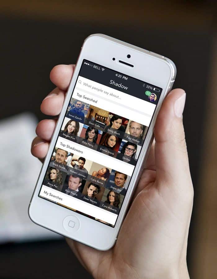
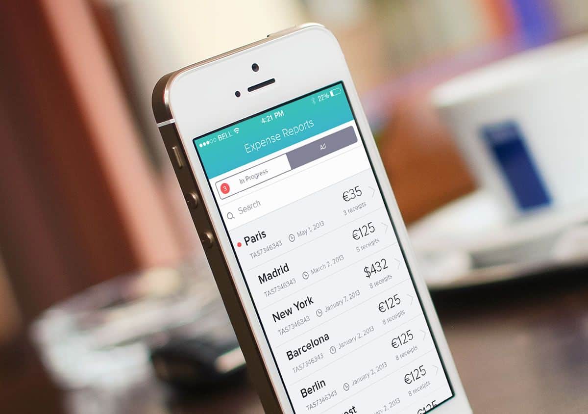
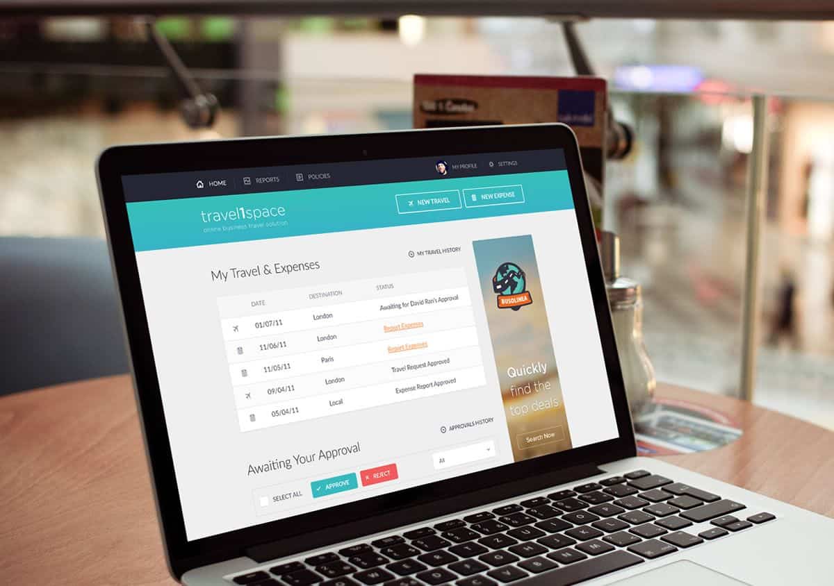
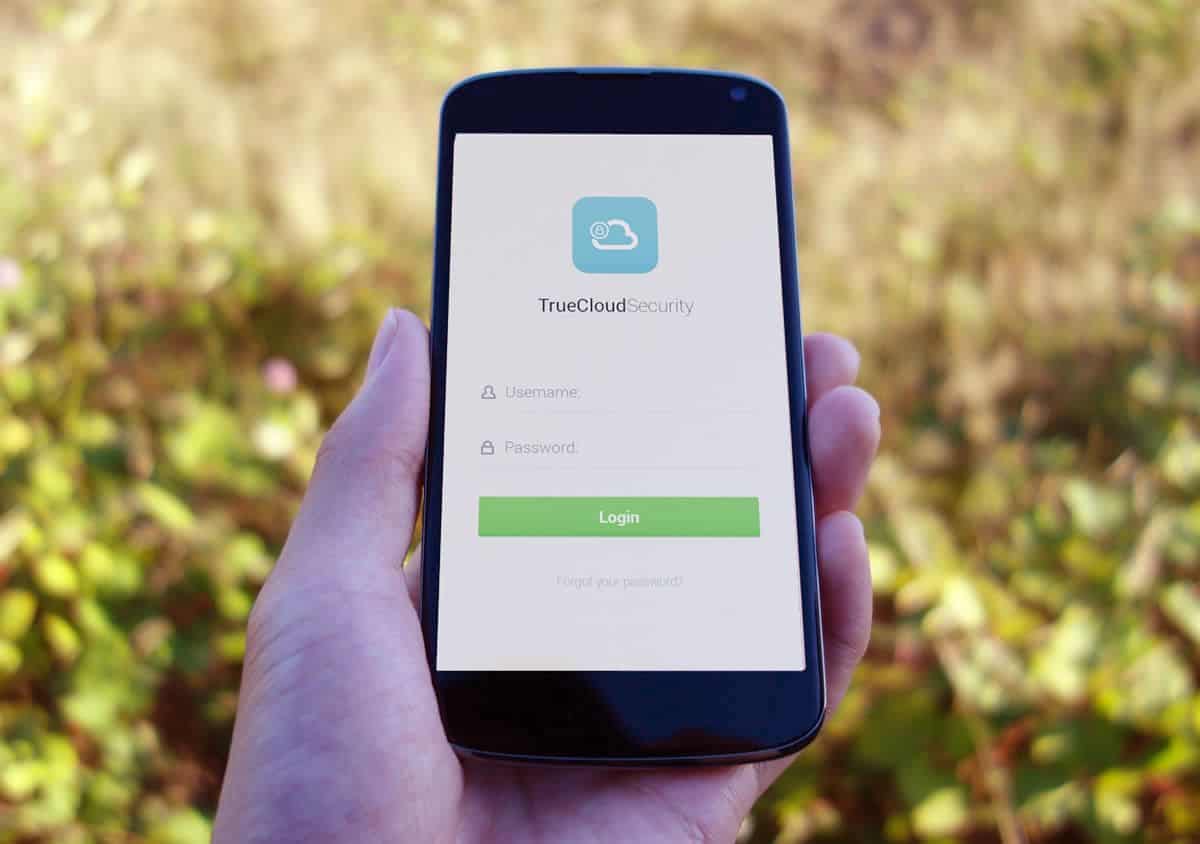
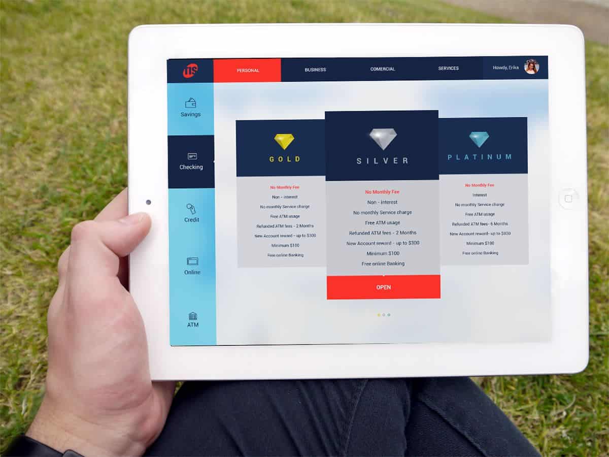
I’ve managed over the years both as an in-house designer and as a UX expert consulting. My portfolio includes applications from various fields: security, finance, medical, consumers, social and more. However, I’m best managing complex & specialized UX projects. I’ve designed apps for almost any platform; desktop, web, mobile, multi-platform and more- here are some examples of projects I am proud of:
Social Search App by Adi Mazor Kario from Wizard UI consulting
Business Travel App by Adi Mazor Kario from Wizard UI Consulting
What was one of your first designs and looking back today, what would you do differently?
One of my first projects was a desktop application for cellular networks engineers. Since it was almost 20 years ago, the technological options were very strict and dominant in the design; there were much less UI interaction options on the one hand. and users had less computer experience. Therefore, they were more tolerant. Looking back at it today, I cannot believe the progress we’ve made in UI design!!! We are doing so much better: the users are first, not the technological capabilities – and this makes all the difference.
How do you usually approach a new design project?
In each project I start with getting to know the UX needs through an analysis document: Users analysis, Use case, Main tasks, Object analysis, market and competition etc. This is the most important part of the project and the most fun part for me (as I learn new fields of knowledge and get to know and represent new user types). As I see it, in order to manage a successful UX project, I need to understand the users’ needs and expectations – this is the basis to it all! Therefore, it is VERY important to meet with real users as early as possible and throughout the process.
In the analysis document, I establish the UI requirements for the application, from the users perspective. The next step will be prototyping of the UX concept (navigation, orientation and main flow), detailed design and finally, graphic design (I collaborate with UX designers at this stage).
In your opinion, why is mobile app prototyping important?
From my experience, the most efficient way to collaborate on a UX project is by using a tangible, interactive prototype. I believe that it is the best way to convey ideas and to experience the users’ flows. I know that in many cases static screens wireframes are used, but I believe that once you interact with the screens in a working prototype, you can truly understand the user experience and how to make it better. This is true for all platforms, including mobile.
What are some of the most important things to consider when designing for mobile?
I think that in too many cases, people jump to the details of the UX: start with screens sketching and taking examples from similar applications. A good user experience starts with the WHAT and not HOW. What will the users do with the application? What do they need? What are their main goals? etc. Starting with a focus on the users’ needs and how the application will help them is a good start.
In mobile applications, many limitations should be considered: screen sizes, high disturbance rate, high users’ expectations for simple UX, multi-tasking in parallel to the app etc. These restrictions demand that you focus your app to the essence of the main use case. If you fail to do that, there is a good chance your UX fails too.
Finally, what advice would you give to aspiring UI / UX designers?
I would focus on these 3 tips:
– Start with the WHAT and not with HOW
– Understand your users’ needs and expectations
– Always learn more: the UX field is changing rapidly and you should be up to date!
Our Designer Chat series will be back in 2016 with even more insightful conversations with amazing UI/UX designer influencers. If you’re an experienced designer and you’d like to join us in conversation, reach out to us on Twitter @protoio
