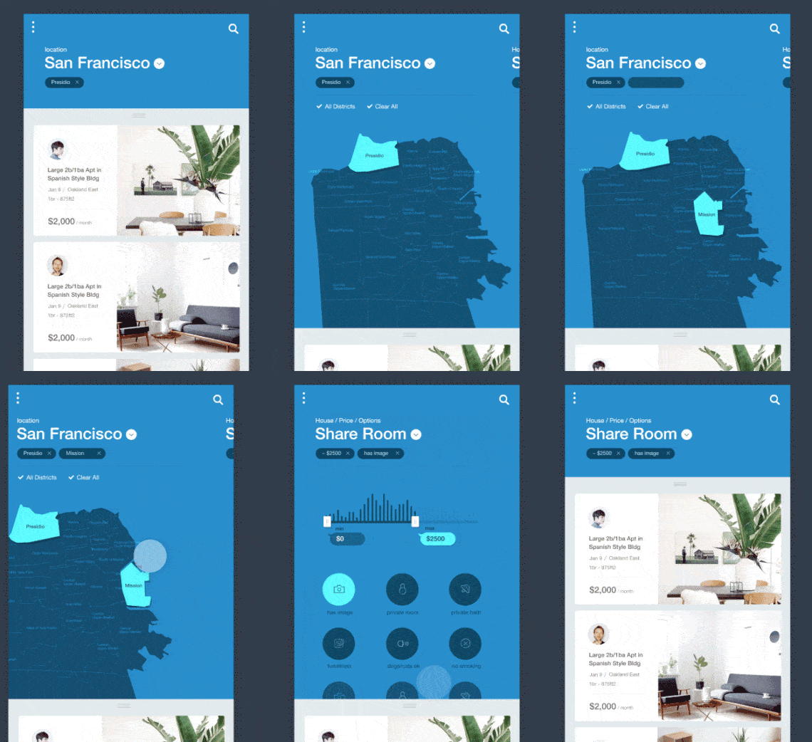
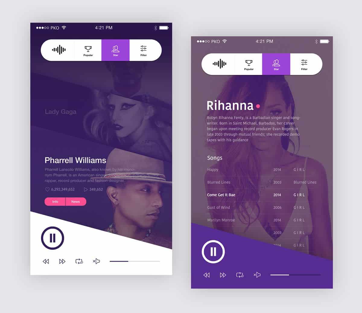
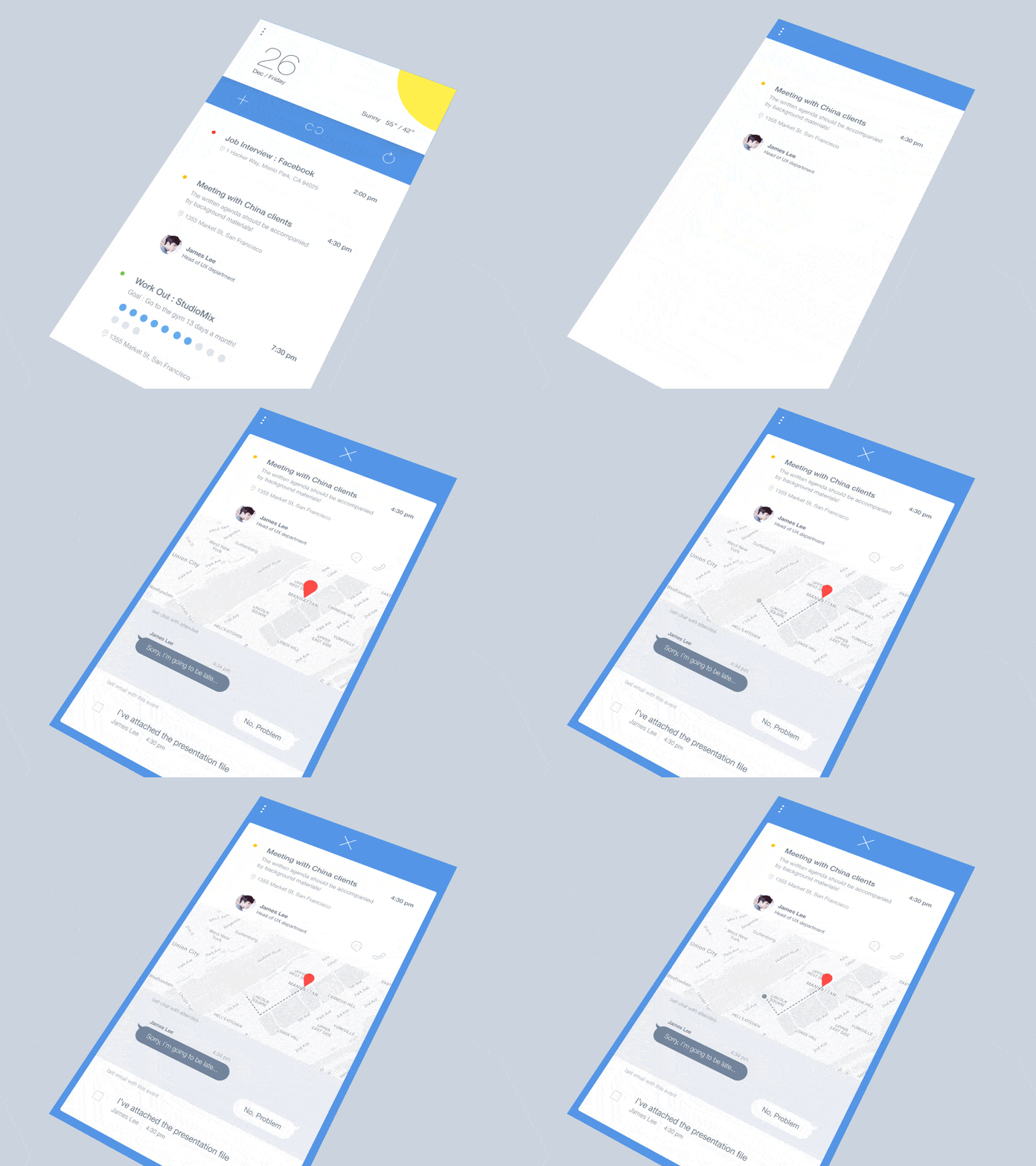
Although relatively new to the scene, Mika Park has already dazzled many of us with her outstanding talent that can be seen in her Dribbble shots. A former Lead UI Designer at one of South Korea’s biggest companies, Mika left her job in the pursuit of travel and adventure. Now a freelance designer, Mika agreed to sit down with us for a Designer Chat session. Here’s what we learnt from her:
Thanks for sharing your time with us. Let’s start off with a brief introduction to who you are and what you do.
My name is Mika Park. I’m a UX/UI designer born and raised in South Korea. I’ve worked with Hyundai and Naver (Korea’s top search portal company) as a Lead UI Designer. I left my job in March 2015 and traveled the world for six months. Now, I am currently based in San Francisco and Korea, and I work as a freelancer for companies all over the world. I am also working on personal projects featuring UX/UI design and interaction design that I publish on Dribbble and Behance.
How did you get into the design field and what was one of your first designs?
My major in college was Computer Programming and I started my career as a Java engineer. However, I’ve always been interested in graphic, interior and motion design fields. At the age of 25, I decided to change my career to design and created only three or four drafts, then applied to design agencies with them. Most of my portfolio were related to programming. For example, I created some interactive movie clips using Processing and an interactive website using Flash ActionScript. I definitely had a lot of advantage due to my background as an engineer at that time.
How important is prototyping to your design process? Could you also tell us more about your process?
A digital product is not an illustration, poster or painting; people use digital products, not watch them, meaning that there are many interactions between users and digital products. If users or clients are just staring at my prototypes for 5 to 8 seconds without any interaction or asking me for any assistance about how to use it, I know I need to check the whole user flow and structure, and redesign the whole thing. So prototyping is definitely an important step in my work process.
I think my design process is not much different from other designers.
First, I ask basic questions about things such as the main user target, complaints from current users, and competitor services to understand the project goals and the client’s needs.
Second, I prioritize features based on the user’s main tasks as I pursue digital services which focus only on a few features and emphasize them.
Third, I create 2 or 3 types of design styles for primary pages, then discuss the design tone and manner with my clients. After confirming the design style, I create all the pages of the main tasks for prototyping.
Using prototypes, I can get sufficient feedback from clients and potential users, then based on the feedback, iterate works to find a way to satisfy both of them.
Lastly, I improve design details and create a final document, including the design concept and basic design guidelines to help clients maintain their services.
We’re loving the amazing interaction designs in your Dribbble portfolio. Could you share with us your ‘secret sauce’?
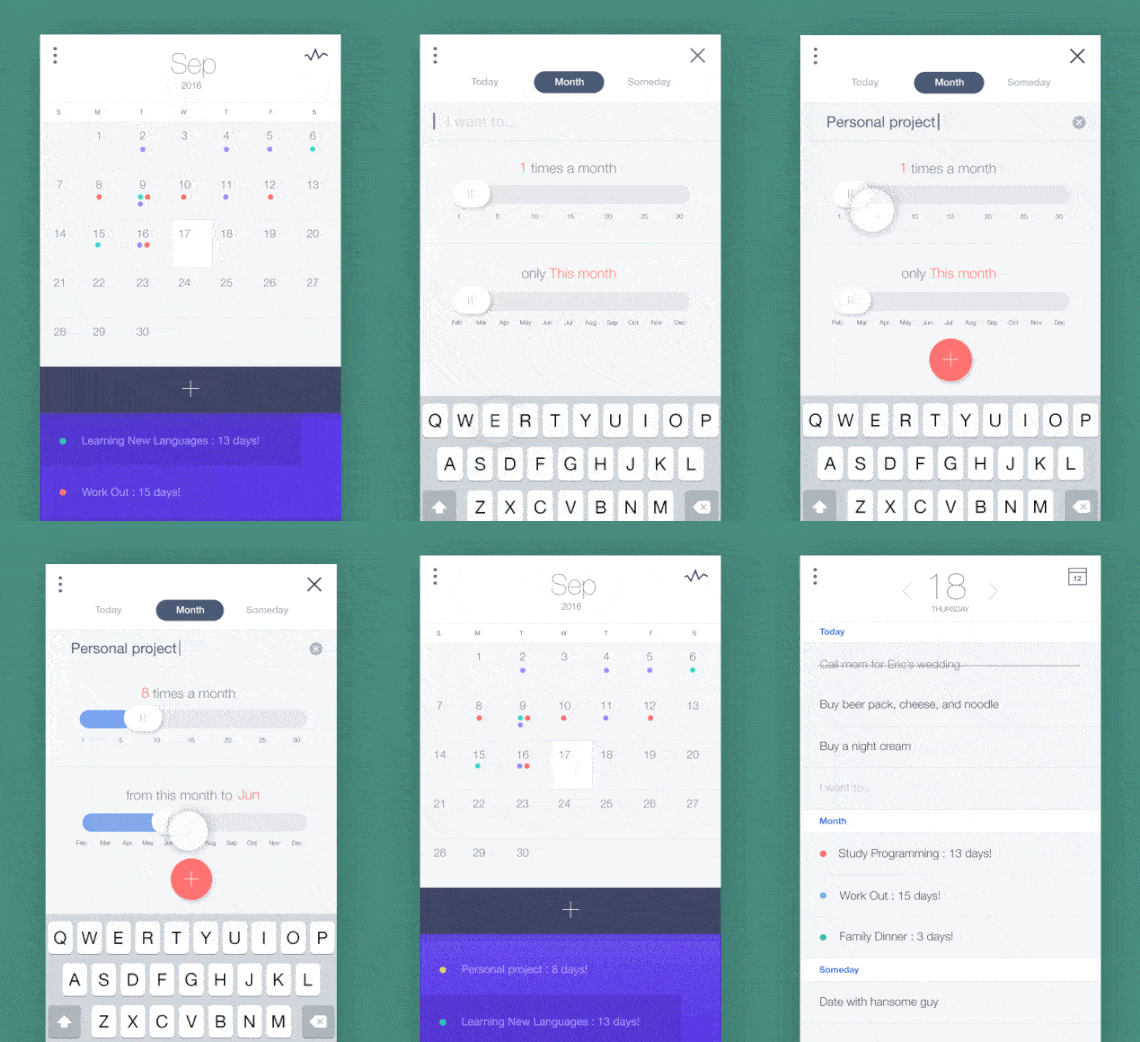
I prefer smooth and delightful interaction design styles. For example, certain mobile apps require three to five steps in order to complete a single task. Some interaction designs make users feel like there are only 2 steps and I think that is pretty good interaction design.
As far as I’m concerned, interaction designs need to help lead users to the next step easily or to give some hints of how it will interact with users. It doesn’t need to make users say ‘Wow’, just make the experience feel more comfortable and easy.
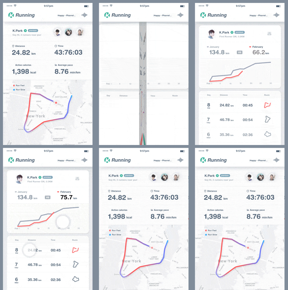
However, I use an unexpected interaction design for specific reasons, such as in the Running app below. There is only one main transition in this app and I want to give users a strong impression so that they remember it.
What do you think are some of the most important things to consider when designing for mobile?
Simple and Clear. I’ve learned this from various experiences of user testing and surveys when I worked at Naver. I think people can only see one thing at a time and most mobile users don’t have the patience to learn how to use anything too complicated.
Sometimes I meet clients who love their service too much and want it to have more features than any other competitive service. It just makes their service more complicated and that makes users scared of using it. I’d say that I don’t love the client’s product but I love to make users like their product. So I try to keep these in mind: Simple and Clear.
Given that you’re based in Korea and San Francisco, what are the differences when designing for Korean users and US users?
I started to work as a freelancer only a couple of months ago and most of my clients are based in Asia. As far as I’m concerned, when it come to differences between Korean and US users, Korean users tend to use digital products more for entertainment.
For example, let’s compare Google and Naver. Naver is the top portal search company in Korea. On the first page of Naver, there is a ton of content such as the news, sports, shopping and movies. It makes users spend their time on Naver for a while. It’s more like Facebook or Youtube.
What about chatting apps? Kakao Talk and Line are the most popular chat apps in Korea and they provide amazing delightful emoticons. Koreans like to use them not only to communicate with friends, but also to make friends laugh and have fun. As I mentioned, I don’t have quite enough experience to talk about all the differences between Korean and US users, but I’d say that these are the main ones that came to mind.
From your experiences, what are the main challenges to being a freelance designer?
I’ve worked with big companies that have in-house design teams for a long time. Most of the projects I’ve been involved in were verified by other departments in advance. Now, I get to find clients I really enjoy working with and projects I can do my best on. Because current projects lead me to my next one, they will remain as part of my portfolio for a long time. This means I don’t work only for my clients but also towards building my career.
Of course, I consider estimates, deadlines, and the client’s attitude. But I always ask myself first what I can do for the client’s product. After I check their current service or presentation of their new product and some really cool ideas pop into my head, then I decide to work with them.

