Here at Proto.io we live and breathe app design, so we wanted to bring together the best of the best of 2016’s mobile interaction design into one place. These 15 apps and concepts really keep the user in mind and aim to delight with smooth and intuitive designs.
Let’s get started and learn why these the mobile interaction designs below stand out from the millions of apps out there.
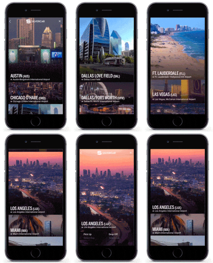
1. Silvercar by Silvercar
Silvercar is a handsome car rental app filled with subtle but effective mobile UI animations and bold, beautiful photography.
2. Health Tracker App concept by Eleken
The choice of bold colors is nicely balanced with the smooth UI animations and transitions, making it a pleasure to navigate and a breeze to read your health data.
Credit: Eleken’s Dribbble
3. Triple Bogey by Vince de Asis
Keeping your score while playing golf can now be done in style thanks to the Triple Bogey app concept by Vince de Asis. I especially love how the primary image shrinks to accommodate the score panel and how the applied filter renders the image as a beautiful backdrop, shifting the visual focus of the user.
Credit: Vince de Asis’s Dribbble
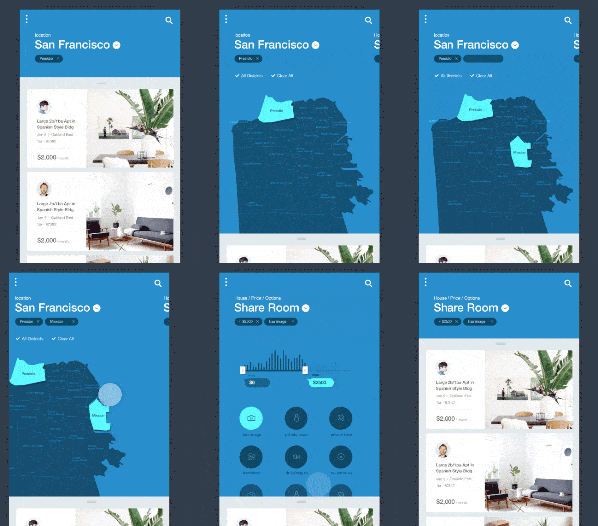
4. Houses for Rent App by K. Park
The slide-out effect of the tag when selecting neighborhoods is just lovely. Swiping right to change screens has just the right amount of ease-in. Together with the gorgeous UI design, this app concept provides a very generous dose of animated UI inspiration.
Credit: Mika’s Dribbble
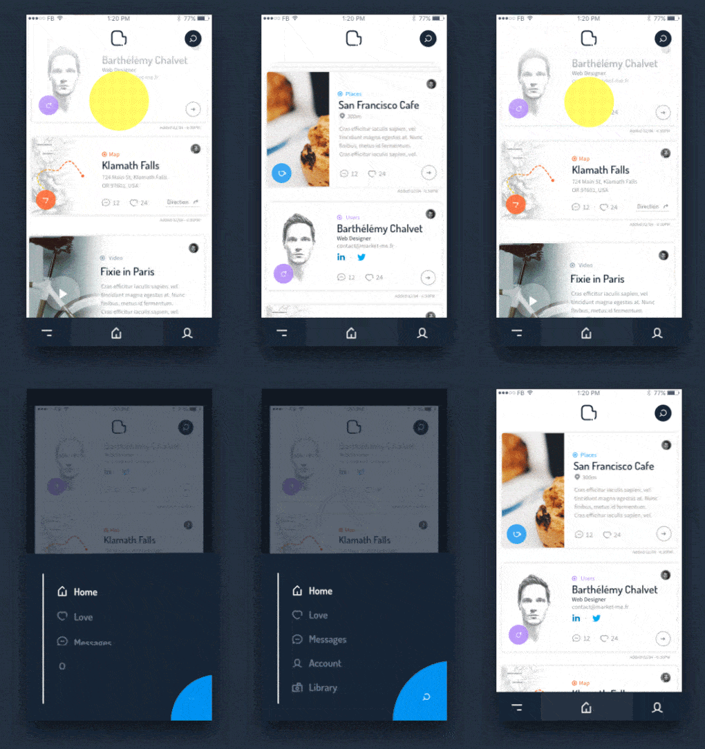
5. New Project for MarketMe by Barthelemy Chalvet
This unusual revealing of navigation options by designer Barthelemy Chalvet is a great example of spicing up common UI elements with a touch of great mobile interactive design. The menu slides up with a flashy lopsided animation. In addition, a blue search button finally appears at the bottom right corner of the screen in a blooming fashion.
Credit: Barthelemy Chalvet’s Dribbble
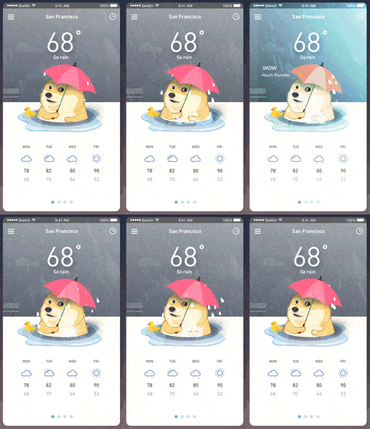
6. Cloudy with a Chance of Doge by Minh Pham
This weather app concept by Minh Pham featuring a lifelike illustration has a flash of lightning, the splattering rain, and the rendition of Doge holding an umbrella with the caption, “WOW much thunder.” They make it look like it’s actually raining on your device.
Credit: Minh Pham’s Dribbble
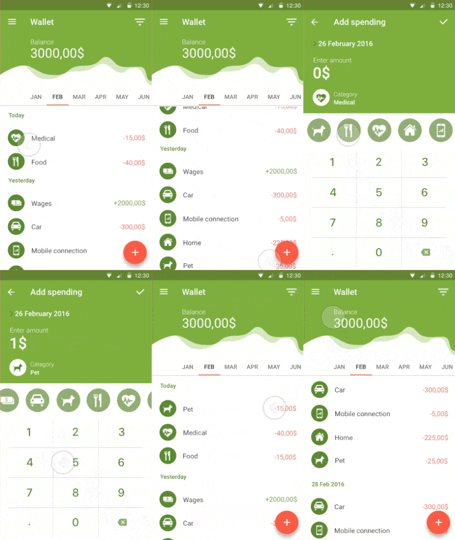
7. Wallet App Concept by Cleveroad
The UI design of the app concept sports classic Material Design style with well-placed mobile animations. The slider of icons for choosing categories is a good alternative to the usual list-style view. Screen transition to add a new expense is expeditious and effective.
Credit: Alex Riabushko’s Dribbble
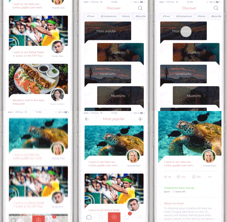
8. BUCKiTDREAM by BUCKiTDREAM Inc
Whether you’re a loner or a regular sharer, BUCKiTDREAM is still a beautiful app to keep track of your bucket list and gain more wins in life. From this shot taken from Lukáš Straňák’s Dribbble, we see a series of smooth screen transitions. I’m particularly fond of the transition to the “Discover” view where the chatbox-style list with the dark overlay appears.
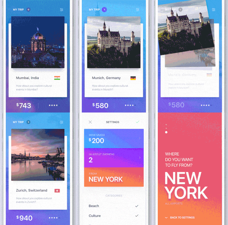
9. Swipe to Travel App Concept by Fantasy
This new Swipe to Travel app concept takes a slight departure from conventional travel apps. With an added touch of Tinder-style cards layout and swiping behavior, the result is a delightful mobile app to help the globetrotters among us decide their next destination.
Credit: FΛNTΛSY’s Dribbble
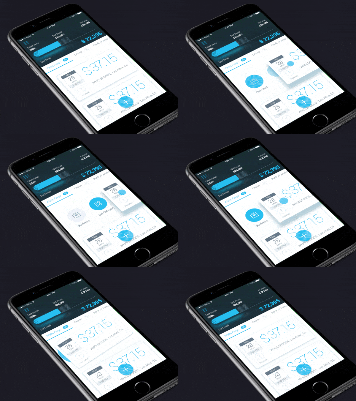
10. Finance App by Nikolay Apostol
This gorgeous example of motion design for a finance app by Nikolay Apostol has the action of swiping a card right and lifting it to reveal further possible actions that a user can take. Well-applied shadows and motion design are effectively combined to give meaning to an action without the need for textual content.
Credit: Nikolay Apostol’s Dribbble
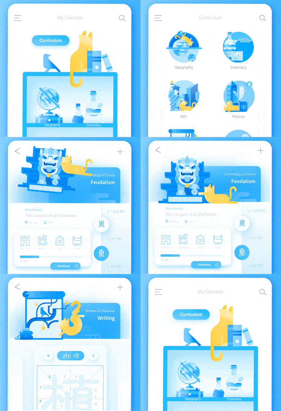
11. Animated UI Flow of Mr Meow App by Daz_Qu
Without a doubt, great motion design for mobile apps isn’t just about having elements bounce all over the place in your app’s UI. In this case, however, bouncing cats and Chinese guardian lions take the delight level up a few notches. Besides our already established deference to cartoon cats, the motion design for this app is particularly interesting due to the good use of easing.
Credit: Daz_Qu‘s Dribbble
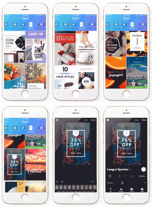
12. Canva by Canva
Using professional templates, Canva puts users in the driver’s seat with uncapped creativity. From customizable social media posts to designing your very own eBook, this app makes it easy to scroll through templates and edit the one of your choosing to meet your needs with all the tools you’ll need popping up below the template.
Get Canva on iOS.
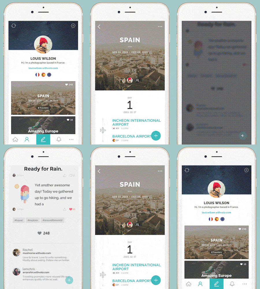
13. Volo by SK techx Co.
Volo is a travel companion app to keep all your travel memories together. It makes it easy to move between sections of the app, by tapping into certain memories and ever present pop-out buttons that allow you to add to your travel log in any part of the app.
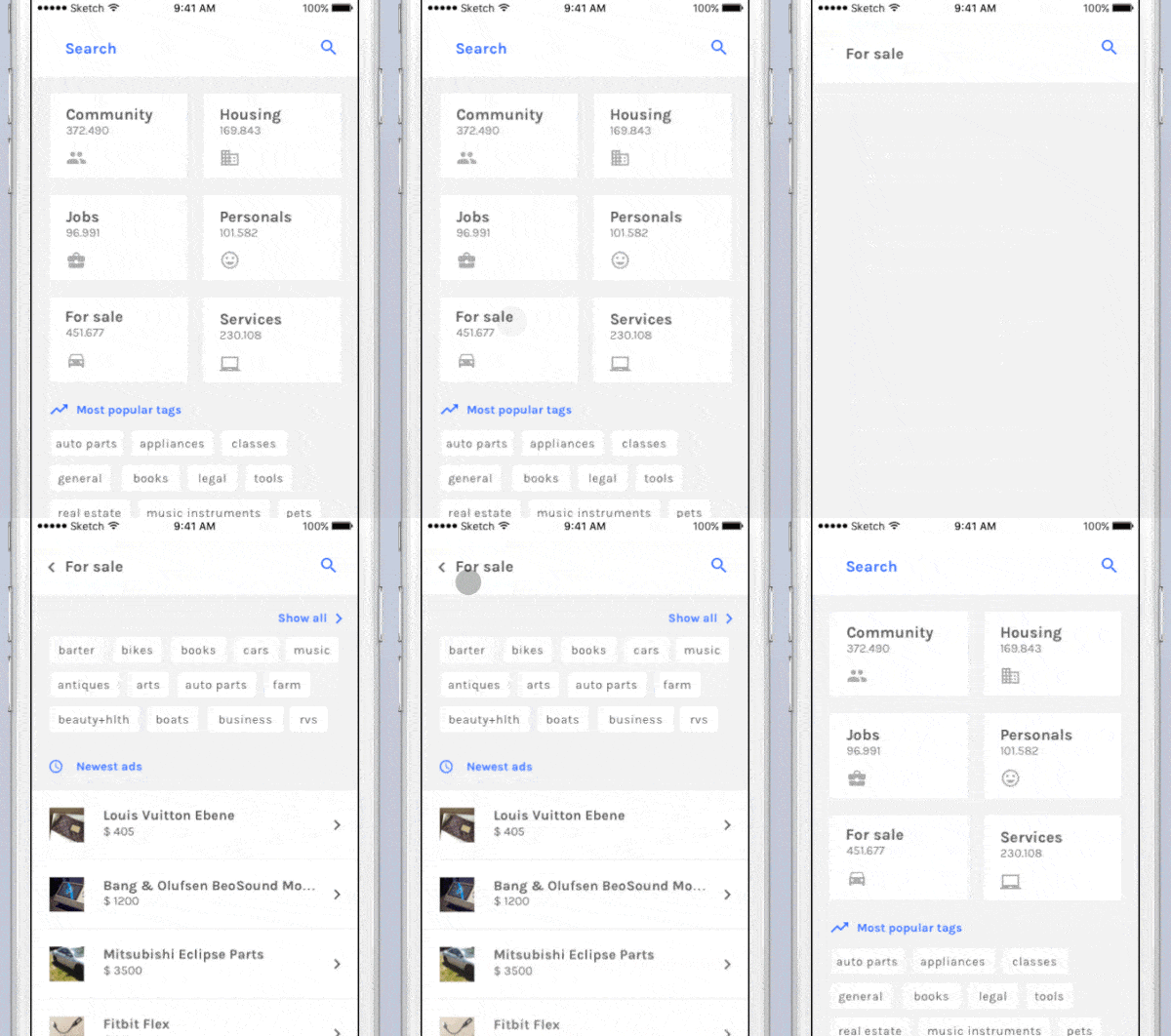
14. Craigslist App Concept Ivan Bjelajac for Bien
I think we can all agree the design of Craigslist is stuck in the past. Luckily Ivan Bjelajac gave us a taste of what life could be like if Craigslist released an app that put design first. His concept groups categories and once you tap through, it shows you top keywords within it, as well as recent listings with image thumbnails with natural transitions between screens.
Credit: Ivan Bjelajac’s Dribbble
15. Rukkus by Rukkus Inc.
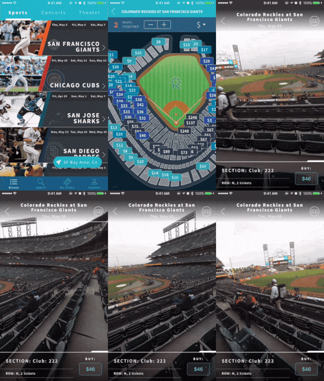
Rukkus offers interactive seat maps, as well as first person seat views in VR with Seat360. They prize efficiency with the ability to easily tap into specific events and make selections based on price and view. This app is a great example of a mobile interaction design that really understands how their users move through the app.
Get Rukkus on iOS and Android.
We would love to showcase your mobile animations and designs on our blog. Tweet us @protoio or send us a message via our Facebook page to be included in our next roundup of the best mobile interaction designs!
