Mobile app design is an incredibly competitive field. With 2.1 million apps available from Google Play (1.8 million in the App Store), designers must constantly strive to become better, faster, stronger — to create beautiful apps again and again.
Good designers don’t need a ton of special tools to create an amazing app design — they just need a few simple ones to help them do their jobs better. Everyone’s workflow is different, but we’d bet everyone needs a sketching tool, a user flow tool, and a prototyping tool.
We could have easily come up with a list of 50 tools to help you create the best mobile app designs yet, but we don’t believe you need that many. If you have 50 tools and only use 10 of them, what’s the point? A streamlined workflow is just as important as the tools inside it. If you were to cut your design tools down to your top five, which ones would you keep?
In the spirit of minimalism, we asked ourselves that very question and wanted to pass along our findings to you. Here are a few we’d say spark plenty of joy, and are completely worth the money.
5 Apps to Help You Create Amazing App Designs
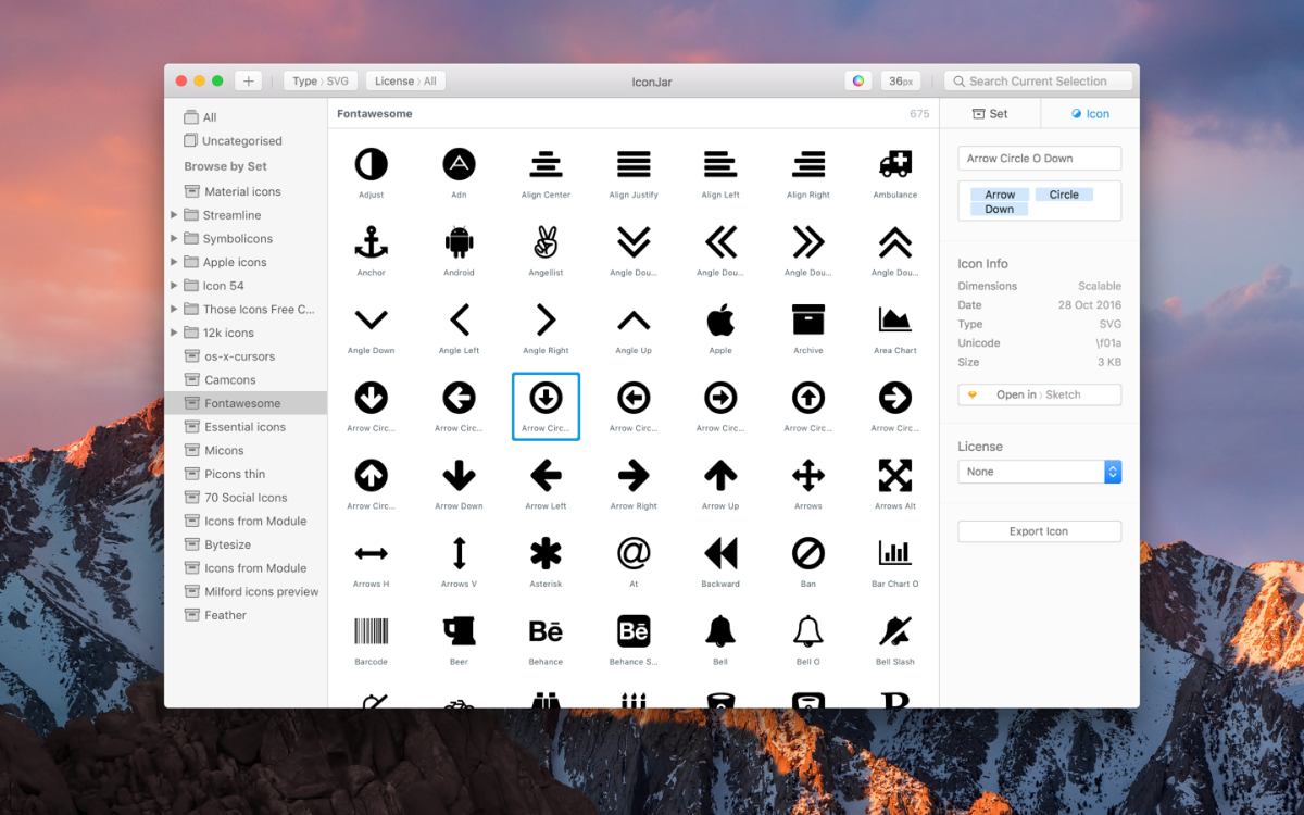
IconJar
Icons are paramount to mobile apps with good design (and really, all other digital design). At this point in Internet history, we’re so used to icons, we don’t even really notice them anymore, and at the same time, they’re second nature. We know the B stands for “bold,” the circle with the arrow stands for “refresh,” and arrows indicate navigation either forward or backward.
While some argue we’re overusing icons at this point, consider how strange this very webpage would seem if there were no icons at all. How boring and cluttered it would seem. It’s just a page of text — the circle with the arrow just says “refresh” now. The little star indicating a bookmark just says “bookmark.” If you’re having trouble picturing it, this Twitter user created a mockup. It’s a bit reminiscent of the early days of the Internet.
The point is, we need icons. Mobile app designers in particular need icons to create amazing app designs because of the space limitations involved — you only have so much screen real estate on a smartphone or a tablet. And to help mobile app designers more easily create amazing apps, IconJar is your caped crusader. The one who swoops in and takes care of the problems you didn’t even realize were a problem.
IconJar keeps all your icons in one place so you can just drag and drop whatever you need into your design whenever you need it. It’s a brilliantly simple app that will seamlessly integrate into your workflow. You can import custom icons and then export them in just about any format necessary. This tool is something every mobile app designer should have in their stack.
The only downside to IconJar is that it’s only available for Mac, but users will be happy to hear it’s very affordable and it’s a one-time fee. There’s no subscription required. You can even try it for free before you buy.
Canva
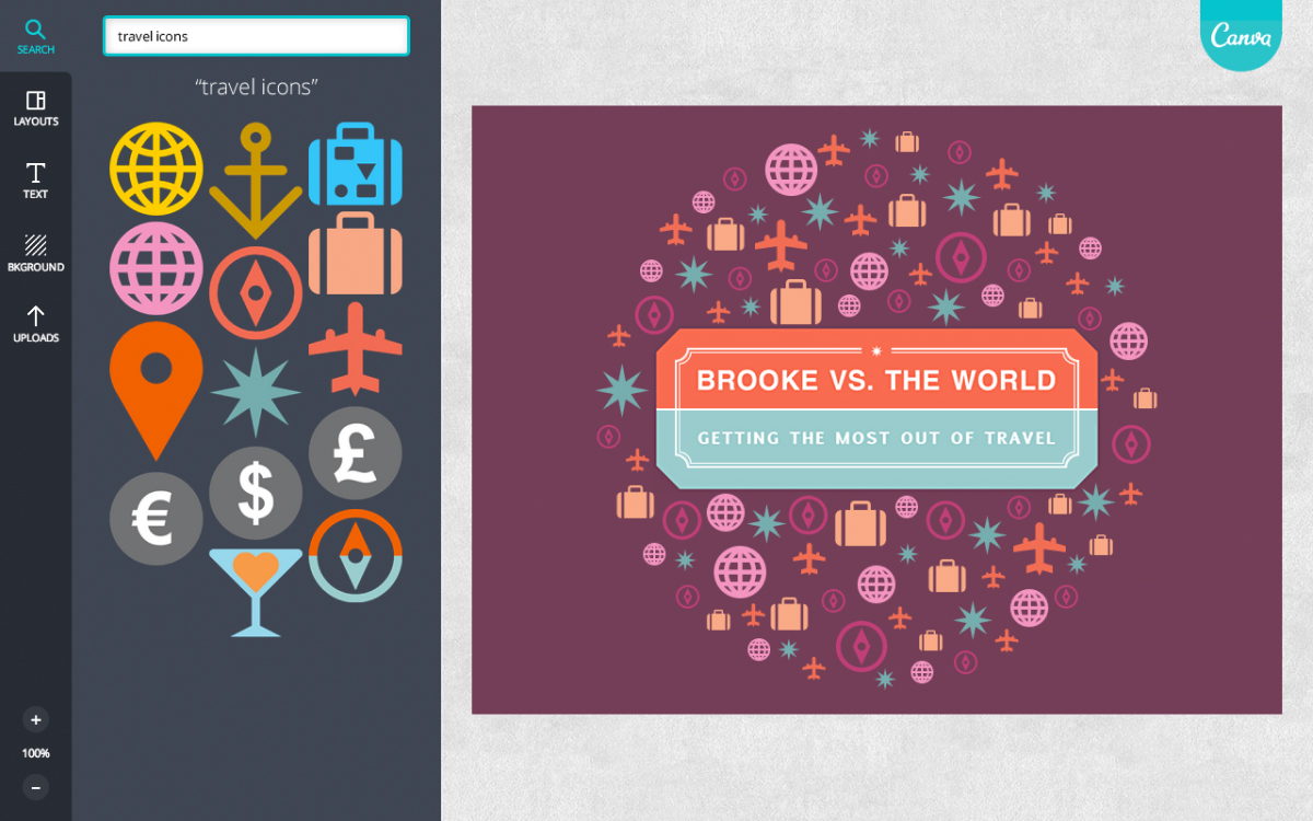
Chances are, you’ve heard of Canva. It’s a simple graphic design tool that anyone — even people without graphic design experience — can figure out. It’s the tool of choice for social media marketers for a reason: it’s quick and it’s easy. It may not be the typical go-to for mobile app designers, but it’s a great tool if you’re looking for a digital way to put some thoughts down onto… well, not paper, but a screen.
Sketching on paper is great. Some would argue there are plenty of benefits to physically putting pen to paper, but then there’s the matter of getting it into your computer where you can manipulate it. There are ways of doing it, sure, but isn’t it easier just to do it all in the computer to start with?
Canva lets you create all kinds of different things (like marketing materials, infographics, business cards), but for the purposes of app designers, it lets them create individual screens to demonstrate their vision, try color palettes out, and get visual feedback from others.
Apps with good design aren’t accidents — they’re carefully curated. Details are intentional and well thought out. Getting all those ideas together and working through them quickly in Canva can help you solidify your vision before you build out your user flows and start prototyping. This is particularly true if your design team is in a brainstorming phase to determine which project you’ll focus on next. What better way to choose a project than to see what it might look like when it comes to life?
Canva is available in a freemium-type model. There are basic features available to anyone, with affordable upgrades, such as stock photos. Beyond that, the feature list expands exponentially and if you’re going to be using Canva a lot, is completely worth it (especially if your specific needs don’t call for the Creative Cloud).
Concepts
No matter how far technology progresses, there will always be designers who need the physical act of sketching to get their creative juices flowing. Some of the best mobile app designs of all time have started off on a napkin, or the back of a piece of junk mail. If you’re one of the devoted sketchers left in the world, never fear: there’s an app for that.
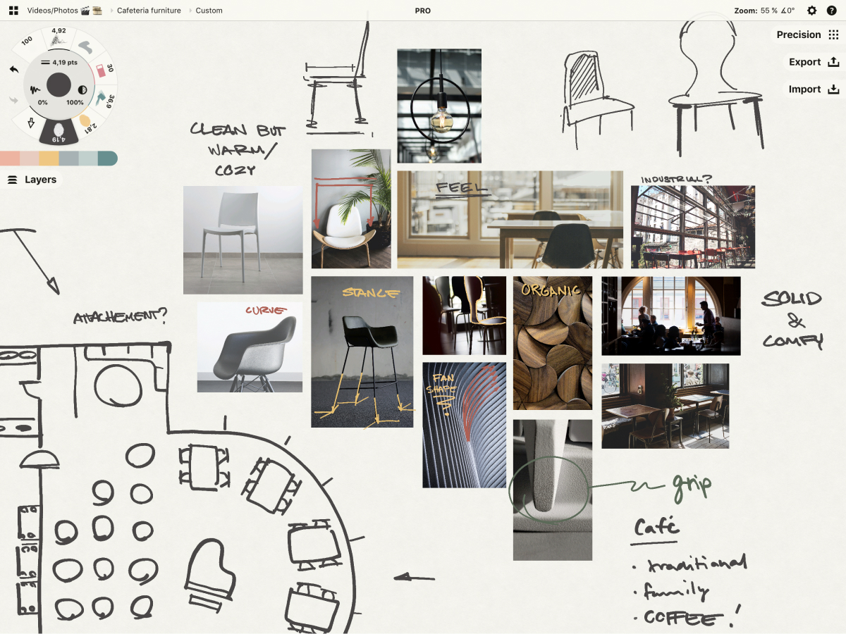
Concepts was built upon the principle that sketching is an integral part of the design process. The developers wanted to help designers communicate and explore designs without boundaries, and out of that idea came what they call an “infinite sketching tool.”
Mobile app designers can use Concepts to visually explore workflows and iterate on plans throughout the design process. The endless canvas and artistic brushes encourage exploration, while grids, guides, and drag-and-drop objects provide instant frameworks for workflows. (In case you didn’t already know, we love the drag-and-drop method, and any tool that incorporates it.)
As if there wasn’t already enough reason to love Concepts, everything you sketch is an editable vector. You can nudge lines into place, pick up elements of your drawing and duplicate or move them around the canvas, allowing you to interact with your app design on a deeper level and saving you time in the process.
Mobile app designers can also import existing images and PDFs, sketch with instant straight lines and shapes, edit with natural tools and gestures on unlimited layers, and share files with team members and clients for feedback. Concepts even has a built-in presentation mode that allows users to sketch live on larger screens for the whole team to see.
The ability to get live feedback and everything is editable? Sign us up.
Concepts is free to download and begin sketching. The sketching itself always remains free, but it’s the upgrades you’ll need to pay for, like exporting to vector and high-res formats. The cool part about it is that they let you choose a-la-carte items. If you know you’ll be using most features consistently, you can get a subscription (which they acknowledge isn’t for everyone).
Sketch
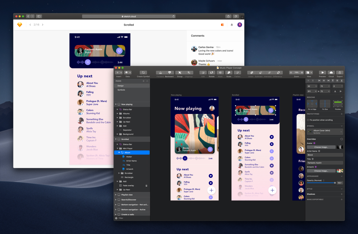
Speaking of sketching, you can’t talk about creating amazing mobile app designs without talking about Sketch. We’re big fans of Sketch around here for a few reasons — first of course, because it’s such a great tool for app designers, but also because it integrates so easily with Proto.io.
Their recently redesigned interface is more intuitive than ever before and the faster rendering times make a major difference in designers’ workflow. It’s definitely the best version yet.
The other awesome thing about Sketch is that they have an extensive online community where users can get to know each other. They even have meetups for Sketch users around the world where mobile app designers can get together to discuss their latest designs, troubleshoot issues, and make new friends. If there’s no meetup in your area, you can sign up to host your own, or you can just join their Facebook group.
The downside to Sketch is that it’s only available for Mac — PC users aren’t able to use it (no word on their future plans to create a Windows version). However, they run their pricing a bit differently. Sketch is available for one set annual fee that includes an entire year’s worth of updates. After the year is up, you’re allowed to keep the latest version you downloaded, but it won’t update again until you renew.
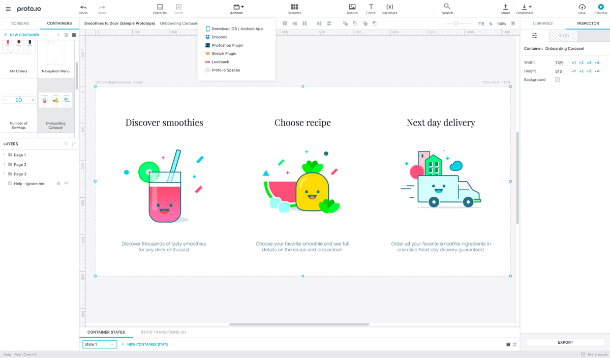
Proto.io
It might seem like we’re just tooting our own horn, but we’re inclined to believe our app has some pretty good design, too. And most importantly, it will help you work out the best mobile app design you’ve ever come up with.
Mobile app designers not only have to think about how their app will look for the end user, but how it will function. They have to think about the way users will move through their app, how many taps it takes to reach their intended task, and whether or not that path is clear for someone using the app for the first time.
Apps with good design will minimize the number of taps necessary and make sure their user flow is as streamlined as possible while maintaining functionality. But oftentimes when we’re storyboarding or wireframing our newest mobile app designs, it’s difficult to get a clear idea of how the UX is unfolding.
Creating a functional mobile app prototype is the best way to fully understand the user experience. You can work out the bugs early on so they don’t get passed down the line to your development team (where it’s more complex and expensive to fix), you can iron out the finer details of your user flow, and best of all, you can use it as proof of concept to secure funding for later stages of your business.
Another way Proto.io can help mobile app designers is through extensive user testing. Our tool allows you to send a link to anyone and everyone so they can tap their way through your mobile app design. The more people who test your prototype, the more feedback you can get, and the more likely you are to create an amazing app design that does exactly what your end user needs it to. And more good news: we offer a free full-featured 15-day trial so you can check it out before you subscribe — no credit card required.
The Secret to Creating Apps with Good Design
We’re going to let you in on a little secret: the best mobile app designs aren’t always the “prettiest” or the most stunning. Don’t get us wrong — they’re often gorgeous in a way that makes us study them and look for design elements to steal borrow for our next mobile app designs. However, the real secret to apps with good design is that they’re highly functional.
The most amazing app designs do exactly what the user needs them to do. No amount of pretty pictures or intricate transitions will help your app if the user can’t get what they need from you. It doesn’t matter how long you spent painstakingly building it if the user is aimlessly tapping around looking for information they seek.
The most important thing about any mobile app is that it helps the user accomplish a goal, no matter how big or small. That’s what makes good design. Above all else, put function over beauty, because that’s what will give your app longevity and keep your users loyal.
What apps do you use every day to create amazing app designs? Let us know by tweeting us @Protoio!
