We are headed into summer and designers around the world are finishing up their school work, headed for bright design careers. While new grads get ready to jump into the design world, they have also been pumping out some great mobile app designs as interns and contractors alongside established designers they have been able to learn loads from. Here are the mobile app designs that have sparked our interest this month.
1. Bluprint: Watch + Learn by Sympoz Inc.
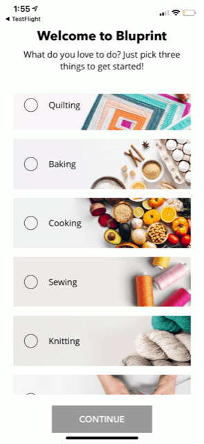
Crafting is all the rage, but getting out to classes to learn a new skill can be cumbersome. Or worse yet—there might not be any applicable classes in your surrounding area. Bluprint brings all of the crafting classes you could want straight to your phone. The mobile app color scheme is candy coated, as you can expect. It is complete with angular tiles and buttons. The background shifts from white to a dark gray, based on whether you’re exploring content generally or drilling down into episodes of specific crafting sessions. This crafting app packs a lot of content into a bright and colorful package that is a delight to use for novice crafters and mobile app aficionados alike.

Source: Bluprint
2. Future by Future
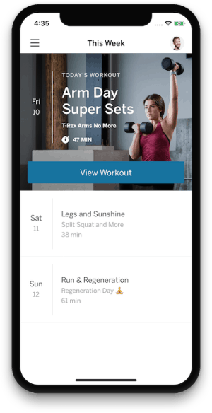
Sticking to a workout routine can be tough for many of us, but what if you had a virtual coach reminding you of your workout plan and checking in to make sure you complete it? Now that’s a different story. That’s exactly what Future is doing, all with the help of a sleek mobile app that serves as the hub for the entire fitness experience. The app uses a simple black and white base with crisp images and blue buttons that pop just the right amount. It keeps the design clean, with minimal text to help users direct their attention toward messages from trainers and their workout schedule.
Source: Future
3. Luminary by Luminary Media, LLC
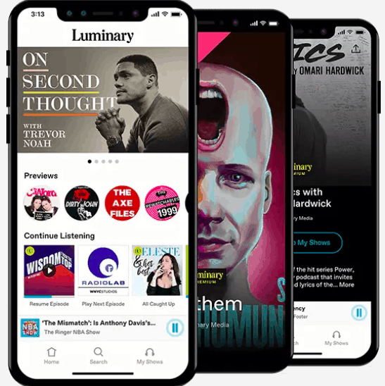
Podcasts are all the rage when it comes to commutes, going to the gym, or really any other opportunity when you’ve got a chunk of free time. Luminary is a newcomer in the podcast app race and its design is one component that is giving it a leg up. Scrolling through options offers up a header image with podcasts you might like, complete with preview clips to swipe through and tiles that feature episodes you haven’t finished below. This clean layout is able to entice listeners to explore new podcasts and further engage with the ones they’ve already started.

4. Noted. by Digital Workroom Ltd
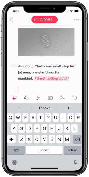
Note taking, whether for school or work, has been fragmented at best. Jotting down notes in a notebook has the advantage of allowing you to draw out flows and charts, but lacks the searchability of typed out notes. Noted is the best of both worlds by allowing users to type notes, create audio notes, and add in pictures of whiteboarding sessions. In order to make sure users can focus on their meetings and classes, it has a very minimal white background with pink accents for features such as changing the amount of noise reduction on an audio recording. This useful app packs in features that the physical world brings to note taking, including helpful icons along the bottom of the screen to add text, highlight, add photos, and more.

That wraps up the apps for May, but if you’d like to explore some of our other favorite mobile app designs, check out our April installment.
Feeling inspired? Sign up for free with Proto.io and prototype your own app in minutes.
If you enjoyed this curated list of great mobile app designs, share it with your social network! Do you have a suggestion for the next edition of our Top 5 Mobile App Designs series? Reach out to us via Twitter @Protoio or on Facebook.


