Sleek mobile interaction designs always catch our eye here at Proto.io. When we notice a designer creating a mobile experience like we’ve never seen before, we can’t help but share it out with our readers. This month is no different. We’ve rounded up our favorite app concepts and provided them here for you. Scroll down to see these fantastic designs and why we chose to include them in our monthly roundup.
1. Billboard by Dimest for Hiwow
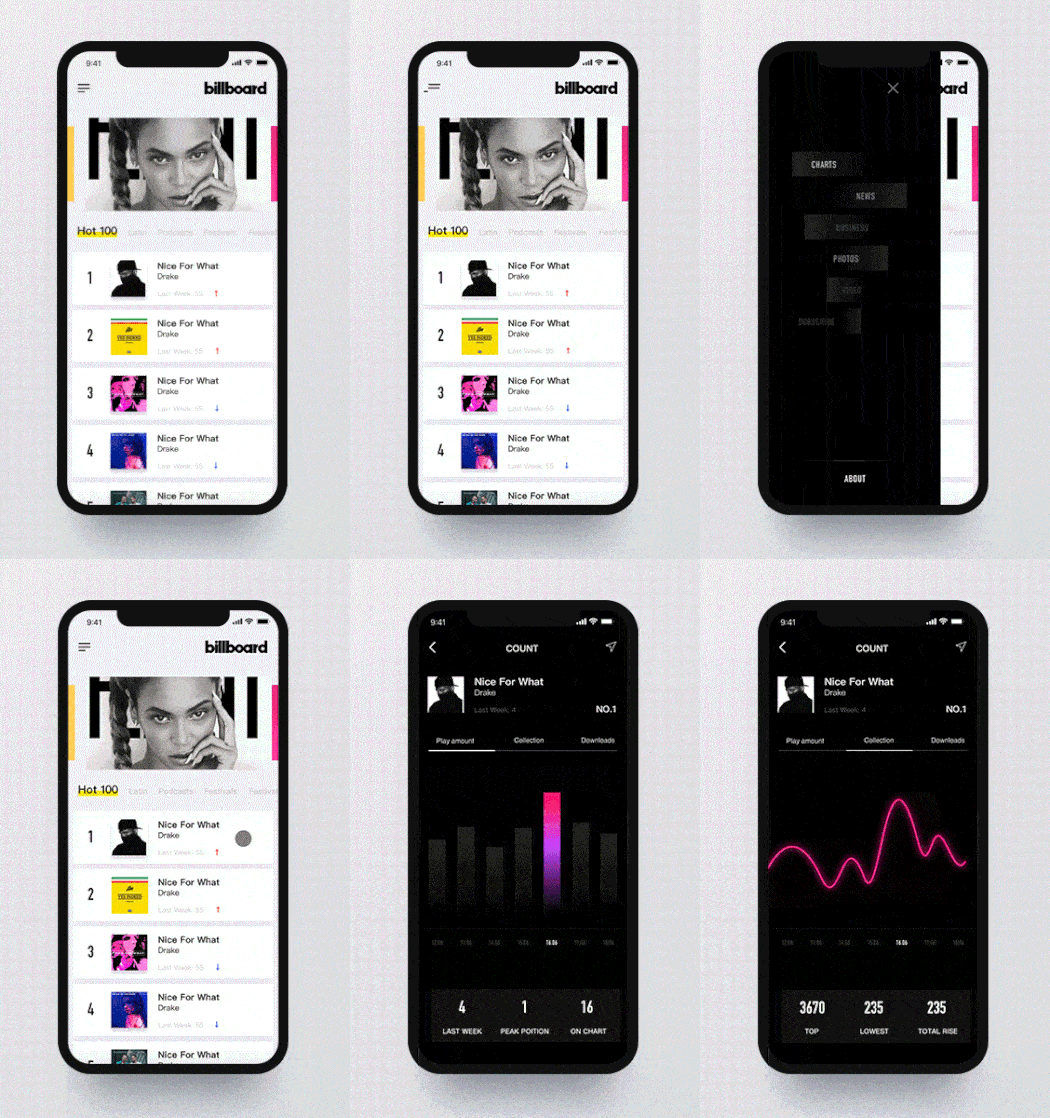
This app concept centers around the most popular songs on the Billboard music charts. It offers many different exciting opportunities for interactions, such as tapping the menu button in the top left of the screen. Instead of displaying options all at once, the designer added in a little extra flavor by having the options move right and left from the middle of the screen and ending in a staggered, checkerboard-like layout. Another mobile interaction aspect that I enjoyed was swiping left on a song to get more information. Tapping into the different sections near the top of the screen brings a custom animation for each, with a graph populating the number of times the song has been played to bring it to life. Overall, with an app concept that wants to show what songs are the coolest, luckily this one also has a chart topping design to match.
2. Furniture E-Commerce App Animation by James G. for Queble
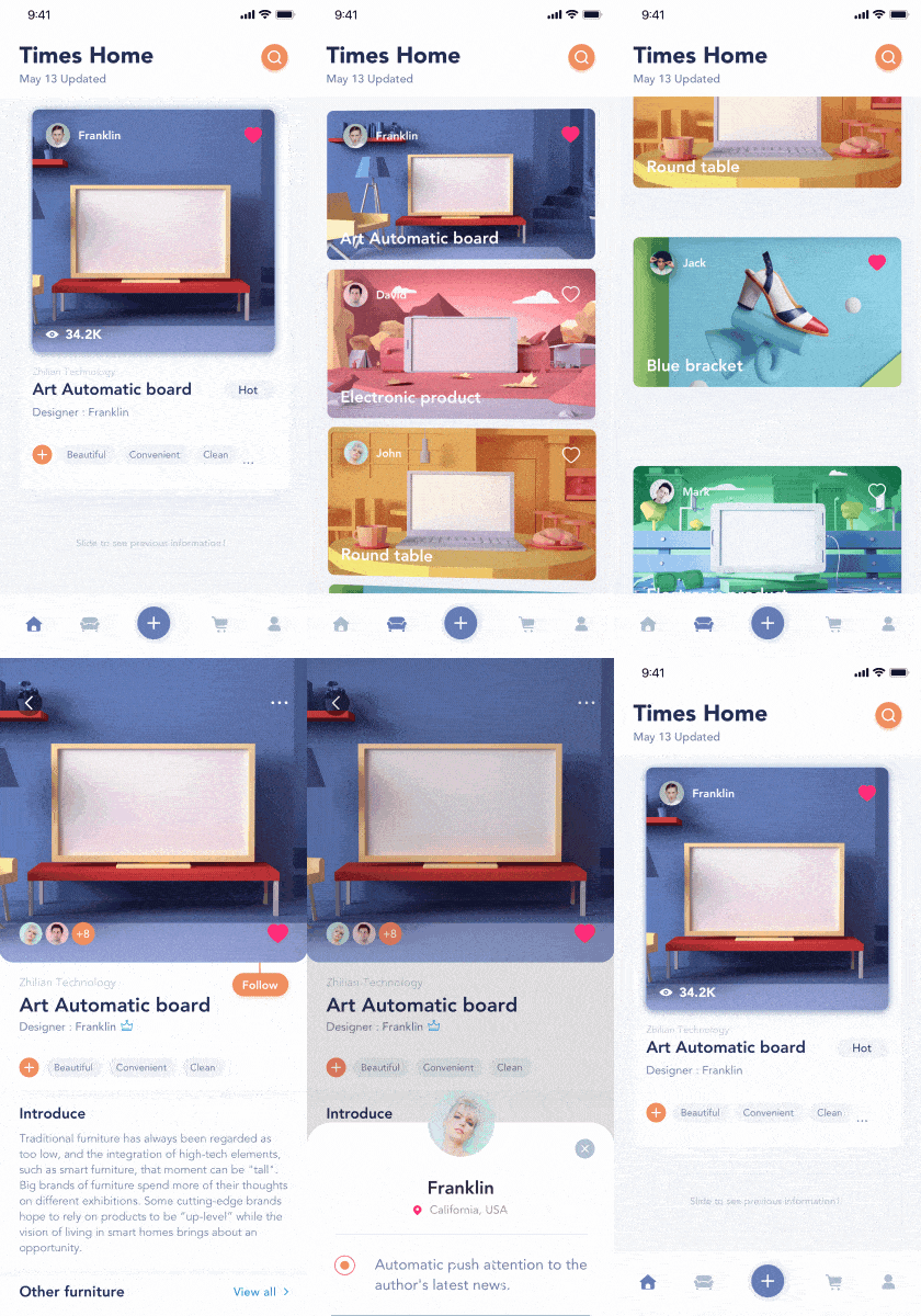
Buying furniture online is not nearly as helpful as trying out chairs and being able to touch a new bookshelf in real life. But this app concept aims to flip the script and bring a bit of fun to the online furniture buying process. First, the designer created a flow for swiping through products that feels like the user has a stack of cards in their hands and is looking at each one in turn—making card-based design almost literal! Next, scrolling through products in the feed allows users to tap into a specific piece of furniture to learn more. The “follow” button falls down from the product image after it loads. Tapping that follow button spins it around and brings a message to the bottom of the screen to confirm the follow. These small motions make this mobile interaction design even more enjoyable for users.
3. Reader App Interactions by UI8
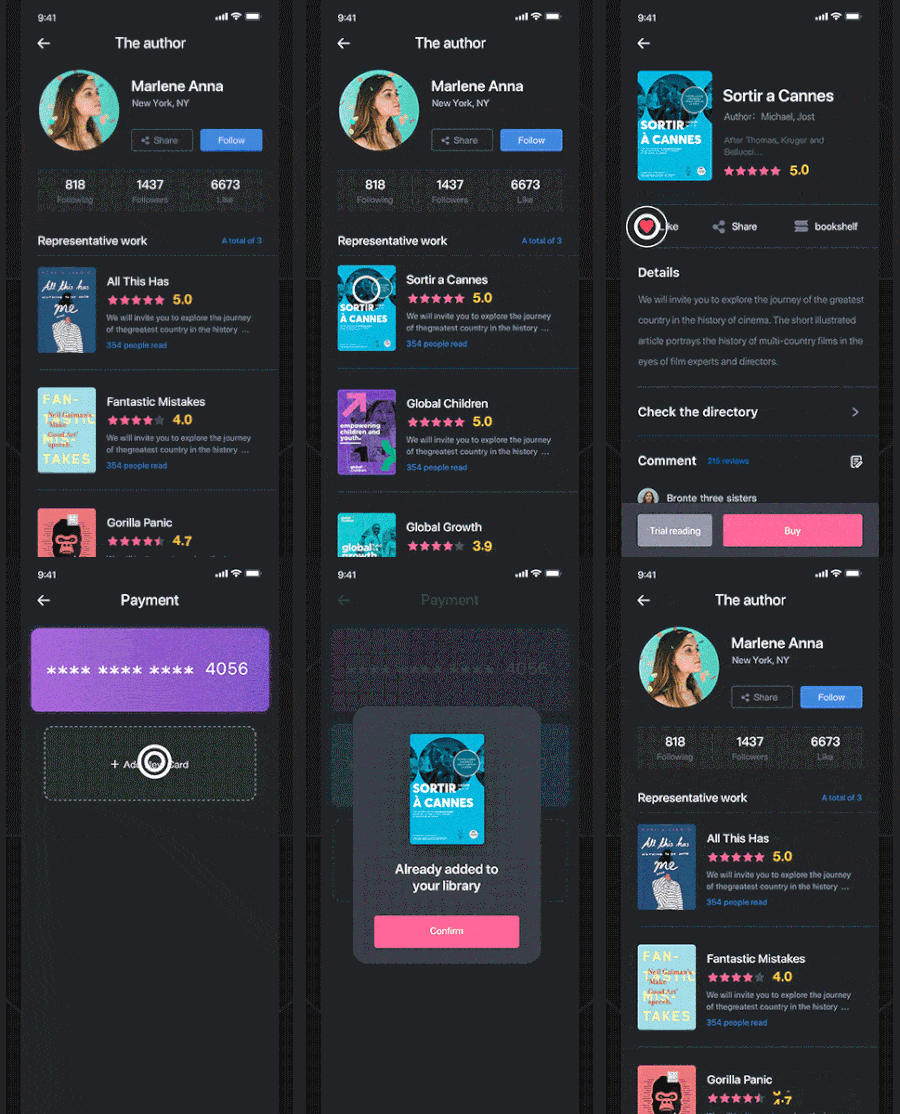
Reading apps are a delight, as they lead us to books that teach us more about the world and help us mentally travel to faraway lands. This app concept has a number of micro moments of joy. For example, when the user taps into a specific book from an author’s offerings, the cover art zooms to the top of the screen and below it the star rating populates slowly from left to right. Next to it, the number rating moves in a circular motion, increasing until it lands on the user rating for the book in question. After reading the information on the book, a user can choose to “like” it, which makes the heart icon reverberate. Lastly, tapping “buy” brings up the credit cards the user has on file, and adding a new one flips it onto the screen. Choosing the appropriate credit card flips the book cover back onto the screen with a confirmation that it will be added to the user’s library.
4. Stream Music App by Kévin Gautier for Norde
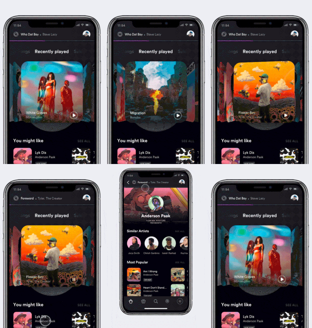
This music streaming app concept brings back memories of old school jukeboxes, with album covers that would flip in and out of view as you moved the controls from right to left. Swiping through the recently played songs allows users to go one by one, or skip through several at once with a faster movement. The bottom right corner of each album cover allows the user to play it. Unlike most music streaming apps, this concept displays the song that is playing at the top of the screen to show the user what they’re listening to as they explore what they might play next.
5. Spec Solo by Rahul.Design for Balkan Brothers
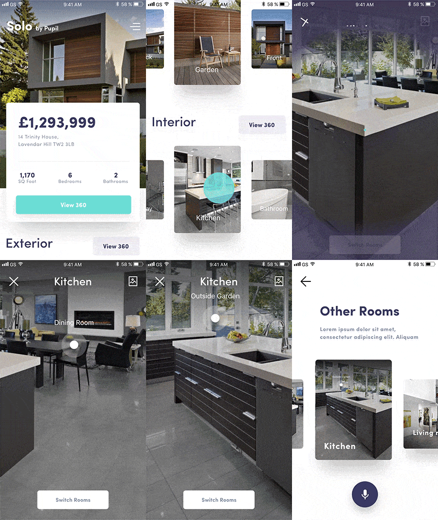
Buying a house is a harrowing process, with so many listings looking perfect online, just to disappoint once you see them in real life. This app concept introduces a 360 degree view of real estate listings so house hunters can get a better idea of what the house is actually like. As the user scrolls through houses, swiping up on a listing reveals floating cards with numerous 360 degree images that show different areas of the home. Tapping into one of them brings users to an image of the house with the instructions to move their phone around to see more of the image. The app even labels what rooms a user is looking at, as they move their phone to get a different view. This takes mobile interaction design to a new level and is helpful in the house buying process at the same time.
That’s all for June, but be sure to check out our last edition, featuring the best mobile interaction designs of April 2018.
Feeling inspired? Sign up for free with Proto.io and prototype your own interaction design in minutes.
Proto.io lets anyone build mobile app prototypes that feel real. No coding or design skills required. Bring your ideas to life quickly! Sign up for a free 15-day trial of Proto.io today and get started on your next mobile app design.


