Welcome to the May edition of our favorite mobile app UI designs! This month we’ll go over apps that serve a number of functions, such as finding you a cheap price on an Amazon item or finding a date that you actually connect with Without further adieu, let’s get right into the mobile app designs you have to see to believe.
1. Spring by Spring NYC
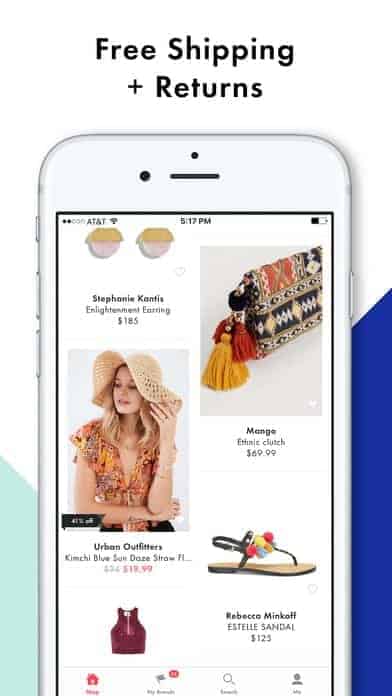
Malls are having issues these days. Right and left stores are closing down, even on busy streets! But Spring thinks they have the answer in the form of eCommerce. They have a different shopping platform that brings together 1,500 brands with a number of price ranges that are affordable for just about anyone. Retailers ship out the items directly to customers, but Spring offers shoppers free shipping, returns, and handles customer service. Spring is like shopping at your favorite department store, but from a sleek app with responsive customer support. The mobile app UI is crisp and minimal— just what we’ve come to expect lately. When searching through products, the mismatched tiles give it a bit of a magazine column feel, which certainly lends itself to their fashion-loving target market.
2. Current by Finco Services, Inc.
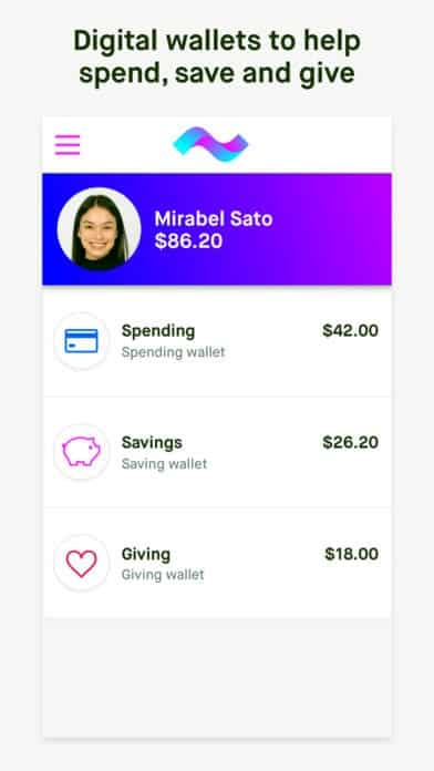
Teaching your kids about finances sets them up for success as adults and Current has taken on the task of helping with this. Using their debit card and accompanying app, parents can set up recurring allowance payments, one time sums, and track spending along with their child. It allows parents to decide what kind of purchases are appropriate and even gives kids the ability to round up when they spend and get a head start on being savers or philanthropists. The app’s design is colorful to keep it fun for both parents and kids, but still has the straightforward and clean layout of financial apps we’re used to.
3. Appetence by Appetence
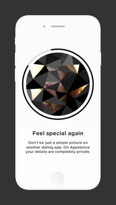
In the era of swiping through endless photos to find a date, it can all seem like such a drag. Getting a “match” doesn’t feel as exciting as the first few times and Appetence aims to change all that. They take it back to the art of the conversation. Users get matched based on common interests, like other dating apps you’ve used before, but with one big catch. You can’t see the other person’s photo until you’ve received 50 “likes” from them throughout your messaging history. In turn, they can only see their profile photo once they’ve gotten 50 likes from you. It’s an interesting take on mobile dating to be sure. The messaging feature is fairly standard, but my favorite aspect is the profile picture. It is covered by a geometric shape until you deem it the right time to reveal your entire picture. This makes it a truly unique mobile app UI design when it comes to dating apps.
4. FaceApp by Wireless Lab OOO
FaceApp has taken the tech savvy world by storm recently. It’s been met with notable controversy, but overall it’s a fascinating take on AI. It uses artificial intelligence to alter portraits to make them younger, older, a different gender, smile, or “hotter” (as you may be able to tell, this was the feature that got them in the most trouble). The mobile app UI design is quite simple and very familiar for any Instagram lovers. It features a list of filter options you can swipe through at the bottom and the photo you uploaded changes accordingly. FaceApp operates well within the UI we’ve grown used to when it comes to apps in the social media space.

5. nugget by Nugget
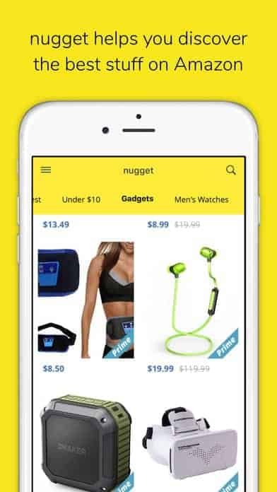
Shopping on Amazon can be overwhelming. If you go to the site with a certain product in mind, after searching for it, you’re immediately inundated with thousands of options. There are just so many products on Amazon, which is why nugget was launched. It helps shoppers find the best deals on Amazon, while also making sure they’ll be fulfilled by Amazon with free shipping and top notch customer service. This mobile discovery app cuts through the noise for bargain hunters in a number of categories. The design is clean, bright, and cuts to the chase. It features helpful product images, the discounted, and original price to help shoppers see how good of a deal they’re getting. As on Amazon, you can click in to get more product information, then save to your favorites (or “nuggets”) and it takes you right to the Amazon app to purchase with a single click.
6. Addy by AppsYouLove
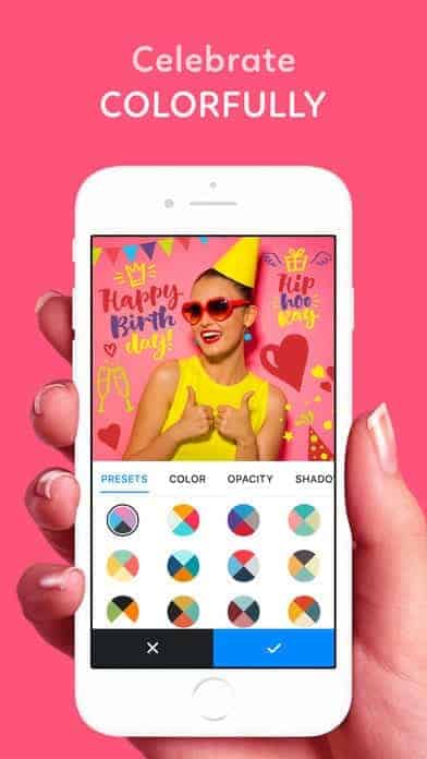
Addy is a photo editor that’s a ton of fun. It delivers the filters we’re used to and also adds in colorful backgrounds, stickers, and customized text to bring any photo to life. The sheer number of options of fonts, stickers, and color palettes is impressive. I appreciate how animated the app is and how the creators were able to fit in so much without making the mobile app UI design cluttered at all. Instead, you can toggle through the categories and swipe through the drop down options that appear. All in all, it’s a top quality photo editing app that provides a well-thought-out way to spice up images.
7. Mindbliss by Mindbliss
In the stressful world we live in more and more people have started to see the value of meditation. Taking a few moments (or more!) to get away from your Slack messages and email alerts is beyond healthy. Mindbliss is a meditation app that aims to improve your sleep, lower anxiety, and improve your self-esteem. While this may seem like a tall order, they accomplish their task with a beautiful mobile app UI design. After downloading, you can meditate with audio from a number of famous meditation teachers. You can also choose meditations and breathing exercises based on what you’d like to work on, such as relationships. Mindbliss does a great job of keeping the layout of the app easy to navigate. The color palette changes based on the type of meditation you choose, meeting the mood you’re in and making this a highly effective meditation app.

8. Honeydue by Wallet IQ
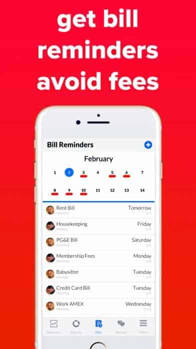
Sharing expenses with your partner is definitely not the most exciting part of the relationship, but we all have to do it anyway. That’s where Honeydue comes in. First of all, they need a pat on the back for their app name, it’s beyond perfect. The app is quite useful to keep track of spending, what bills need to be paid, and more. We’ve all heard the intense stats about how many couples fight and split up because of money. Honeydue cuts that out and makes sure that relationships are equal and transparent—at least from a financial standpoint. The layout of the app is perfect for seeing everything you need to easily. It’s mostly white with a few pastels, which makes it stand out that much more when there are red highlights under the bill due dates on the shared calendar feature.
Get Honeydue on iOS.
That wraps up the apps for May, but if you’d like to explore some of our other favorite mobile app UI designs, check out our April installment.
Feeling inspired? Sign up for free with Proto.io and prototype your own app in minutes.
If you enjoyed this curated list of great mobile app designs, share it with your social network! Do you have a suggestion for the next edition of our Top 10 Mobile App UI series? Reach out to us via Twitter @Protoio or on Facebook.
