Spring is in full swing and along with all the flowers popping up, there are a bunch of new apps that are growing as well. Here at Proto.io, we sift through exciting new apps, as well as ones that have been around for awhile, to find the mobile app UI designs that we can’t keep to ourselves. This month we bring you 10 apps that range from butlers to navigation systems and we’re sure you’ll find inspiration in them. Let’s jump right in and discuss why they stood out:
1. Uptime by Area 120
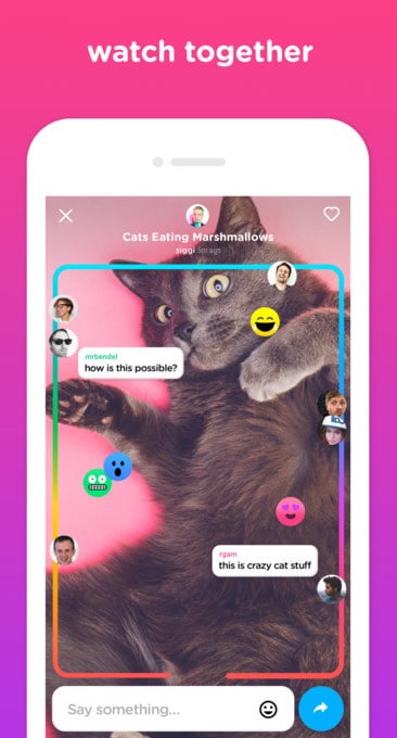
With all the buzz around Facebook Live and Periscope, socializing online in real-time is all the rage. Uptime is a new app that makes watching videos a social experience. You and your friends can all watch the same video together and interact with reactions and comments flowing between you. Some comments are only available when you’re watching videos at the same time, but others stay put, even if someone watches the video you’ve posted later on. There’s also the option to follow curators if you want to be inspired by the latest and greatest videos you might not have heard of before. This social app takes video to the next level by helping users share videos easily and meet new people. The UI is super colorful and animated as if watching videos couldn’t get more enjoyable. This design makes Uptime stand out from other companies that have attempted to make co-watching apps in the past.
2. Soon by Matt Mazzeo
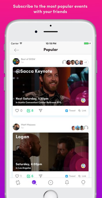
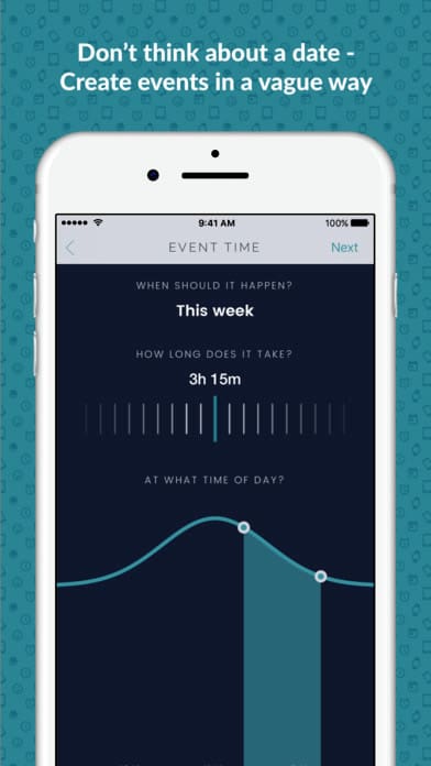
Hanging out with friends and going to events is always fun, but keeping track of all your social engagements is not. Getting a calendar invite from a friend can feel downright weird when you typically just see them roll in for work-related meetings and events. That’s why Matt Mazzeo and friends stepped in to make planning and discovering events more social and fun. Sure, Facebook events is pretty good at wrangling friends, but not as much suggesting events. Soon makes events into cards on a feed (which we’re pretty used to these days, compared to our run of the mill calendar) that you can scroll through to see what’s coming up for you and people you follow. The mobile app UI design is colorful, image-based, and even allows event creators to add a song to play when users click on their event. Soon is a brand new app and it will be interesting to see if it catches on. One thing we can say for sure is that it’s an interesting take on the typical calendar, with trendy design and a more social core.
3. PABLO by Hi Pablo Inc
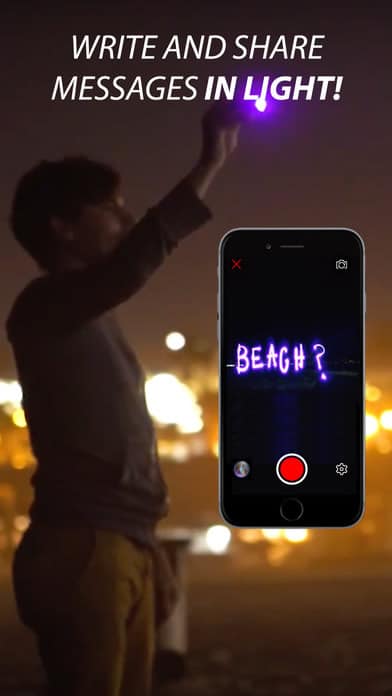
PABLO is a very simple app that helps users take creative pictures and videos using light painting. Basically this means making an image, words, or effects with just the camera on your phone and a color filter on your flash. There is a community feature included, so that you can share and discover new ways others are using the app. I appreciate that the creators of this app didn’t complicate it with unnecessary features. Instead, it stays true to its mission of helping people make unique pictures and videos. To help with that, the mobile app UI design is uncomplicated and easy to understand.
4. Complete by 24me
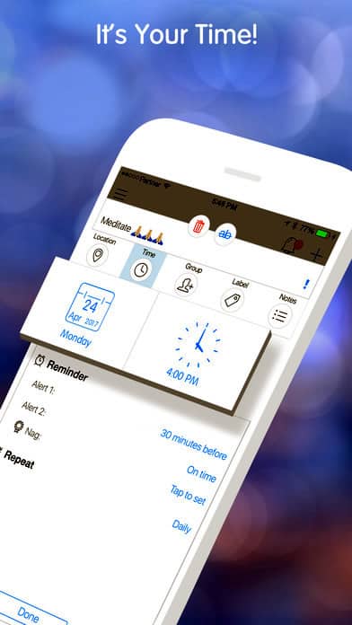
24me brought together many productivity functions into one app, aptly named Complete. It has to-do lists, reminders, grocery lists, and more to help you remember what you need to do and accomplish it on schedule. This app caught my attention because I use a few different apps to keep track of my shopping list, weekly recurring reminders, and personal tasks. The idea of centralizing it all is very appealing. Not to mention, the design is very approachable so that you can tap into it, do what you need to do, and get on with your day. With delightful icons and clean and crisp mobile app UI design, this is a great tool to boost productivity.
5. myAlfred by myAlfred
If you’ve ever wanted a butler or personal assistant, myAlfred is for you. It helps improve your work-life balance by making time for the things you want to be doing, like working out or getting out with friends more often. This app is much more than a scheduler, as it is AI-driven and can coordinate with the people you want to hang out with, book a restaurant based on where everyone decides, and even call a cab to get you there. It constantly learns from your habits so it can schedule things that will make you happy. Not bad for just an app! The design is sleek with muted colors. It doesn’t try to pack in too much, instead, it just keeps things simple to understand what you need and provide it consistently.
Get myAlfred on iOS.
6. Squigglish by Iridesic LLC
Art you create within in app is usually 2D, maybe even 3D, but art that moves… that’s unheard of. Olivia Walch is a comic artist and mathematician and just launched a new app called Squigglish. With the help of math, she adds movement to typically stationary lines, allowing users to add moving doodles and drawings over images. The UI is very minimal for now, since the app is so new. It has just five different brushes, but it still proves to be a delightful mobile app UI. For those days that you want to make a picture more exciting or create something from scratch, Squigglish won’t disappoint.
Get Squigglish on iOS.
7. Neverthink by Neverthink
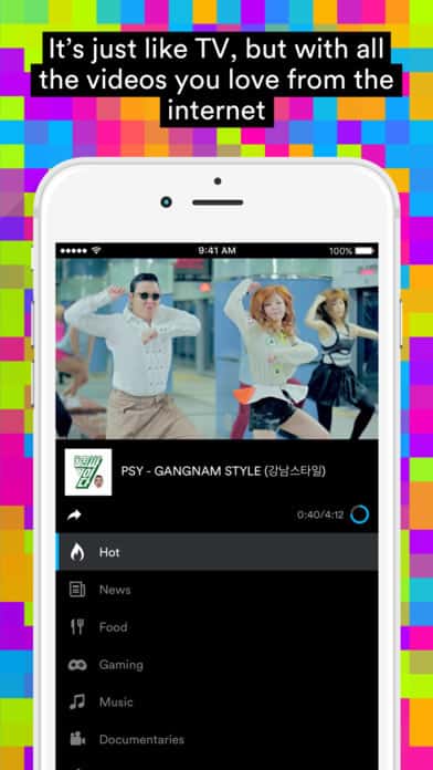
If you’ve ever had one of those exhausting days and just want to sit back, relax, and escape from your reality for a bit, Neverthink is the app for you. Maybe you need a good laugh, but don’t know of anything to watch. Neverthink has the perfect name because they provide a 24/7 stream of videos so that you never have to scroll through pages of videos to find one that pops out at you. Instead, the app curates videos for you based on the category you pick. The app designers understood that when you want to zone out, you certainly don’t want to deal with a clunky and confusing mobile app UI. It keeps it streamlined with channels to scroll through and videos playing at the top of your screen.
8. Medium by A Medium Corporation
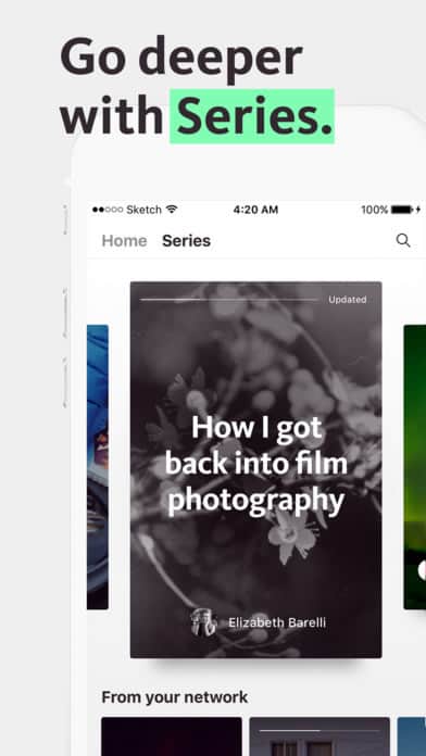
We all know and love the writing platform, Medium, but have you ever been reading a great article and not want it to end? Now they don’t have to. It seems like every company is trying to take a bite out of the Snapchat story pie and Medium is next up at bat. They just released their Series feature which lets writers keep writing as inspiration strikes. Stories no longer have to end. Series has a card-based design, so it’s easy to swipe through and get lost in the story. On top of this cool new feature, the Medium app is already a way to write blog posts that are formatted nicely and image-friendly.
9. Fit Men Cook by Nibble Apps Ltd
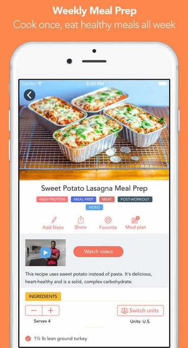
This app drew me in because of its amusing name and then I looked into it and the design was surprisingly spot-on. All of the recipes in the app fit with their philosophy of being tasty, budget-friendly, and healthy. It’s much more than a recipe app, as each recipe you select generates a specific shopping list. As an added bonus, you can tap each item once you’ve got it and have the satisfaction of seeing it crossed out. In terms of the individual recipe pages, the layout is easy to understand, with color coded categories, images, videos, and serving sizes all front and center. Changing the quantity or units is possible with the tap of your finger.
10. Waze by Waze
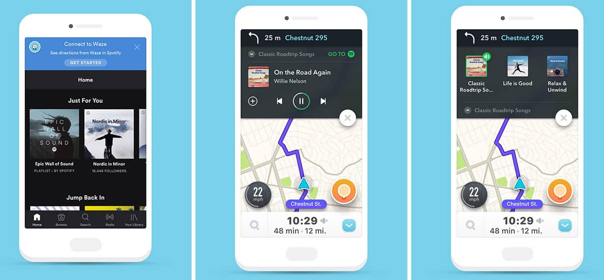
Driving and music have always gone hand in hand. Waze revolutionized how efficiently we get around, with animated maps that help us choose the best route. Now you can even integrate your favorite driving playlist through their new partnership with Spotify. This is helpful to make long trips more enjoyable, but also safer so that you don’t have to go through the hassle of switching between apps while you should be focusing on the road. This feature is only available on Android so far, but I’m sure it will coming to iOS soon. It simplifies the process of changing music with a little bar above the Waze map with options to stop or change the music, complete with album art. However, they keep the options minimal intentionally to keep drivers focused on the road.
That wraps up the apps for March, but if you’d like to explore some of our other favorite mobile app UI designs, check out our February installment.
Feeling inspired? Sign up for free with Proto.io and prototype your own app in minutes.
If you enjoyed this curated list of great mobile app designs, share it with your social network! Do you have a suggestion for the next edition of our Top 10 Mobile App UI series? Reach out to us via Twitter @Protoio or on Facebook.
