The new year is here and there have been some incredible apps coming out and rising to fame. For this month’s installment, I want to check out some of the top mobile app UIs that I noticed over the holidays and into 2017. They range from messaging apps to personal fitness apps and finance apps. What really brings them together is that they all have excellent designs that any app designer should take notice of when planning their own mobile app UI this year.
Here are my favorite app designs for January:
1. Wickr Me by Wickr
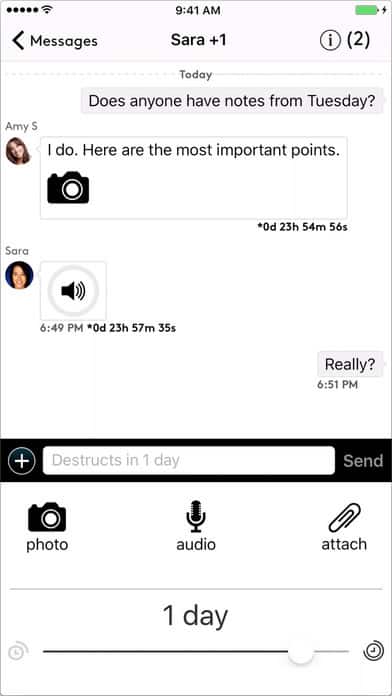
As with many effective mobile app UI designs, Wickr is very simple. It tackles secure messaging perfectly while keeping its design to a basic black and white. Whether users choose it for business or personal purposes, it is an effective way to send encrypted messages safely. It has group messaging capabilities, as well as one-on-one communication. What holds true throughout is that the message sender can control how long the message, image, or video can be viewed. Like Snapchat’s messages that only show up for 1-10 seconds, it digitally “shreds” deleted messages over time.
Source: iTunes
2. Hipmunk by Hipmunk
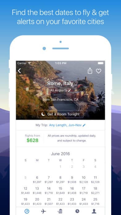
Seeing the world is an amazing thing, but no one wants to pay a fortune to do it. That’s where Hipmunk comes in to help users book their travel arrangements at the best price possible. The Hipmunk app stands out because you can do it all on their platform. This includes setting alerts for destinations you want to travel to one day, checking out reviews from other passengers, booking flights, searching hotel rooms based on what you want to be closest to, and more. The design aspect that I really like is that the app tailors your view based on what is important to you, such as the best time to visit a new city with a card based layout, or hotels that fit into a certain budget. It’s a truly customizable way to book travel arrangements.
3. Snapseed by Google
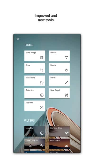
Snapseed is a comprehensive photo editing app by Google. It takes editing beyond the basic editing capabilities Instagram offers, which I really appreciate, to make photo editing on the go easier than ever. Many photo editing apps make the process clunky, but Snapseed keeps it simple, while still offering a plethora of options that are easily tappable to adjust. Of course, you can change the lighting and add filters, but the ability to refocus images and change the film style make their toolbox unique. Finally, the ability to go back and re-edit based on the saves you’ve previously made makes this app my favorite photo editor.
4. Pushbullet by Pushbullet
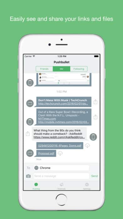
Pushbullet brings all your devices together. You’ll never miss an important phone call or forget to respond to a time sensitive text because you can get notifications and send messages from your phone, tablet, or computer. One aspect that is especially useful, in my opinion, is pushing links and files to your desired device or even sending straight to a friend who also uses Pushbullet. The app has a few different feeds that are separated logically into your conversations with friends, things you’ve shared between your devices, and publications you’re following. The personal feed is my favorite because it shows they’ve put significant thought into the mobile app UI with icons showing which device sent the link or file with the ability to download them all.
Get Pushbullet on Android.
5. PEAR by PEAR Sports
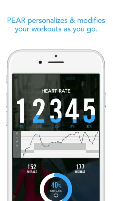
PEAR is a personalized fitness app that puts thousands of workouts with personal trainers directly into your palm. This app wowed me because it reacts to your health data in real time to tailor your workout to your specific needs. It takes on a number of workouts, like running, biking, and weight training, and offers an encouraging voice based on which one you’ve chosen. It syncs up with all the major fitness trackers and apps to keep all of your workout data easy to manage. On top of that, it’s as hands on or off as you’d like. Your trainer can guide you purely by audio if you’re doing yoga or something else that requires your hands at all times. If you’re running on the treadmill, for example, it offers helpful graphics of your heart rate, calories burned, and overall progress. Overall, it’s an incredibly useful app that takes into account the personal nature of fitness, with its customizable features and design.
6. Awesome Note 2 by BRID
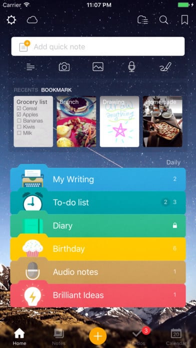
Awesome Note 2 combines scheduling and notes to perfection. Whether it’s for business or personal use, you can take notes that include images, voice recording, and even drawings. That way, no matter what your idea is or what format it comes in, the app will keep it safe. The design of the app is up to users with customizable icons and backgrounds that set the tone. You can set reminders for important days, manage your to-do list and more all in one place. Awesome Note 2’s design gets as granular as you’d like, with folders to organize your notes and to-do lists. It’s image and card heavy to keep everything in the right place and still visually appealing.
Get Awesome Note 2 on iOS.
7. Duolingo by Duolingo
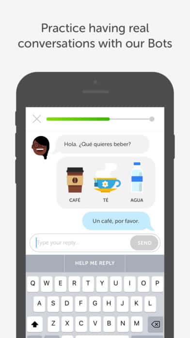
Learning a language can be tough and expensive, but Duolingo created its own category to flip the usual model. Through gamification, the app makes learning a language bite-sized and fun. It is an image-heavy app, as it’s much easier to remember a word in a new language when there’s an easily recognizable image next to it. The mobile app UI is animated, colorful, and appealing. They even incorporate “streaks” when users complete lessons each day to keep them coming back. When you take into account the ease of use and delightful design, it’s clear why Duolingo previously won Apple’s App of the Year.
8. Level Money by Level Money
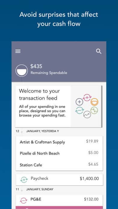
Personal finance apps can be a dime a dozen, but Level Money rises above the noise by keeping all of your accounts in one place. You might know your checking account balance, but what about your credit cards? And how does this all fit into your monthly budget? Level Money keeps you, you guessed it, level-headed about your finances. You’ll always know how much you can spend on any given day to stay on budget or what you’ll have to scale back if you decide to splurge. The design of the Level Money app is straightforward with muted colors and the occasional icon. It leaves the focus to the graphical representations of what you’ve spent and what you’ve purchased.
9. Qapital by Qapital
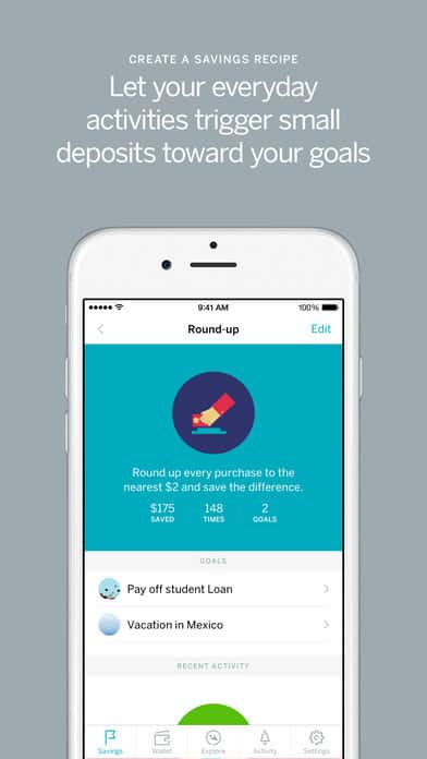
Let’s be honest, saving money can be tough when there are so many things tugging on your purse strings at once. Luckily, Qapital was designed to help users save without the pain. It accomplishes this by implementing little tricks, like rounding up to the nearest dollar when you make purchases and saving those extra cents you probably wouldn’t notice. This change adds up over time and is stored securely in an FDIC insured Qapital account. It even has “if this, then that” rules users can set so that whenever one action occurs, say your favorite basketball team plays, you’ll automatically put a small amount into your sports ticket fund. You can easily transfer the money into another account whenever you need. Looking at a picture of a beach can help you stay on course for your tropical vacation, so the mobile app UI is full of images you associate with specific savings goals. There is a nice balance between animated icons and pictures that represent what you’re saving for.
That’s all for January, but if you’d like to explore some of our other favorite mobile app UI designs, check out our December installment.
Feeling inspired? Sign up for free with Proto.io and prototype your own app in minutes.
If you enjoyed this curated list of great mobile app designs, share it with your social network! Do you have a suggestion for the next edition of our Top 10 Mobile App UI series? Reach out to us via Twitter @Protoio or on Facebook.
