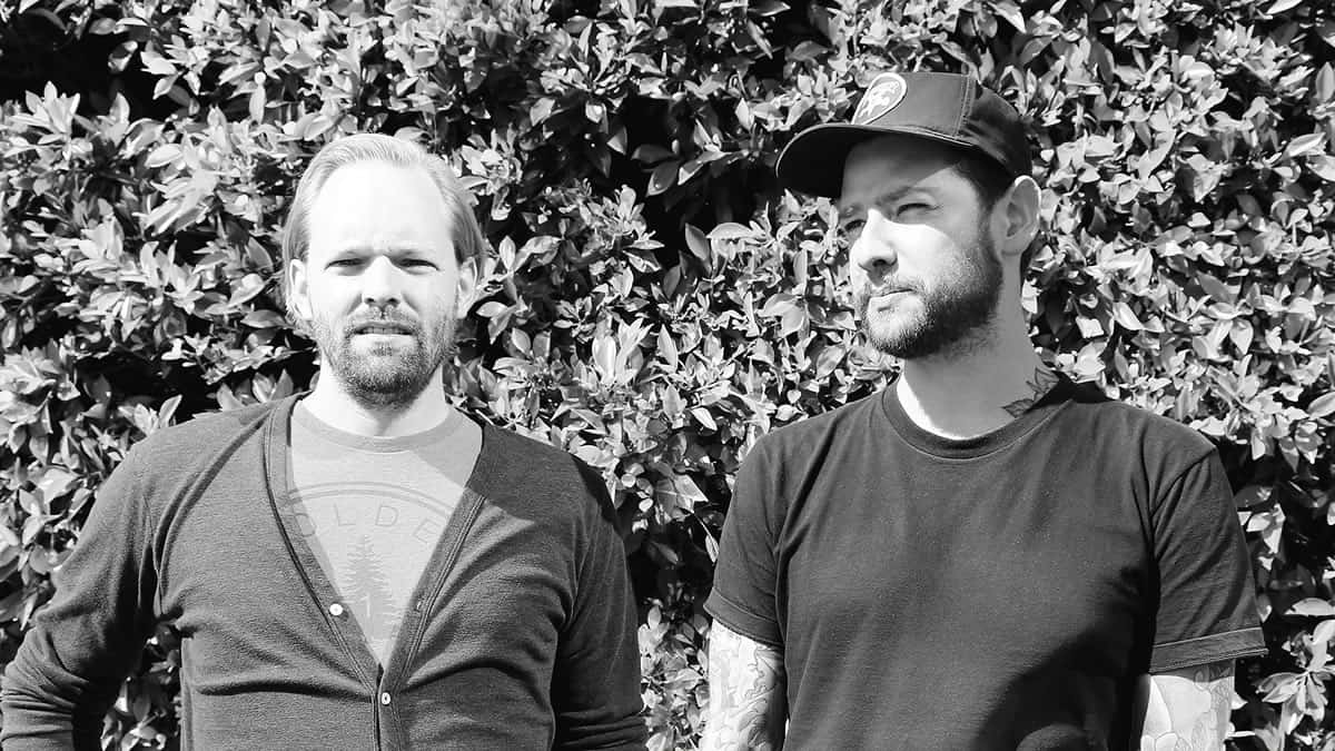
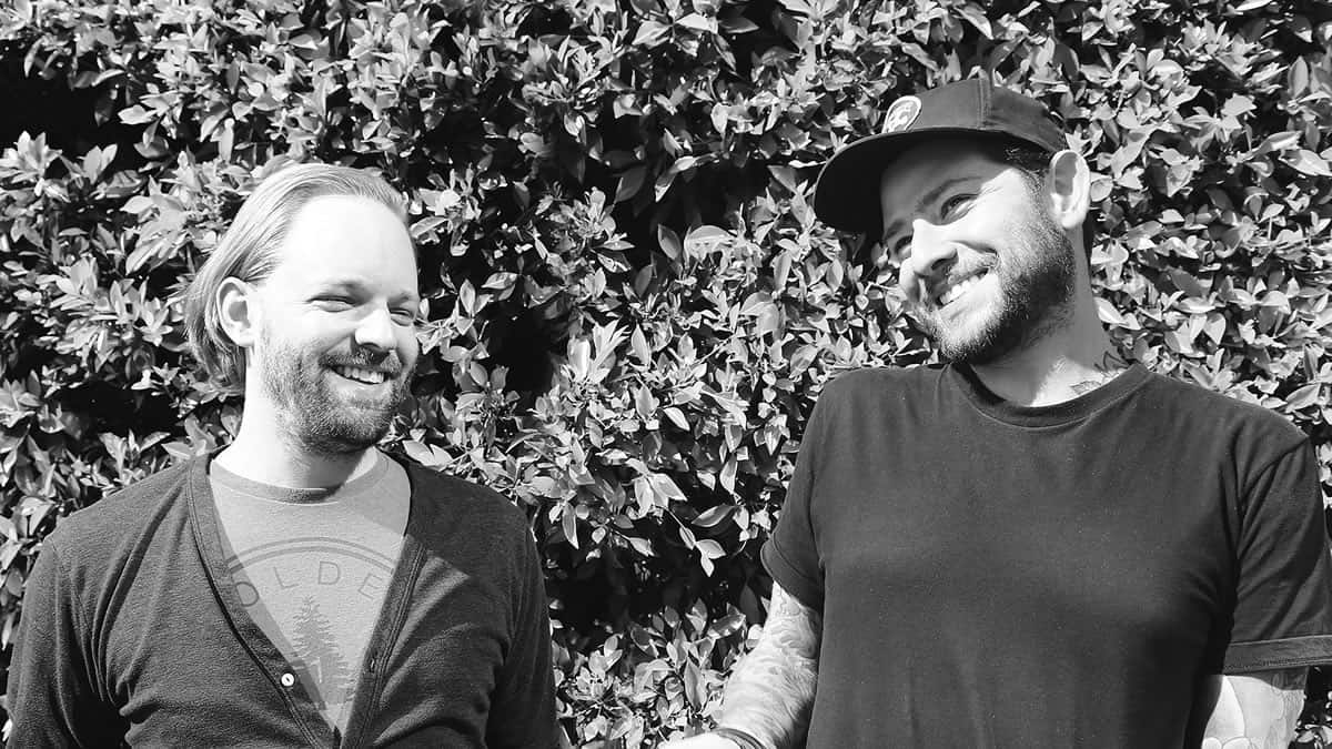
RED Interactive Agency is one of the most creative and prestigious agencies in the country, with clients such as ESPN, Formula 1, Netflix, BET, and Oprah. We had the pleasure of meeting both the Associate Director of UX, JP Arsenault, and the Creative Director, Rick Dias. These leaders at RED gave us insights on their design process, the challenges they face and the importance of prototyping at a digital-first agency. Here is our interview with them. Please note, we have lightly edited their responses for clarity.
Hi JP and Rick, it’s really an honor to meet you both; and thank you so much for sharing your time with us. So just to get started, can you tell me a little bit about your respective roles at RED?
JP Arsenault:
Hi, I’m JP, Associate Director of UX here at RED. I usually work on all kinds of UX and strategy related things. I have a technical background as a programmer for a number of years before I jumped over to UX; obtaining a master’s degree in human-computer interaction. My technical background helps me in terms of looking at things a little bit more from a technical perspective and how they fit together and work. Proto.io has been really helpful from this perspective as it has more programming capabilities. But it’s not just writing code, I can easily hand it over to someone that is not so technical.
Rick:
Hey, I’m Rick, Creative Director. I have a graphic design background, and I have been working in digital design for the past 15 years. I have worked for a number of advertising agencies and then small design studios. I have been working at RED for about three and a half years now.
At RED, I work with an experienced design team where we create mostly everything you can see on a screen. It’s not only websites but apps and whatever is interactive and lives on digital. Proto.io has been a great tool for us. Not only does it bring UX and designers closer, but it also brings the idea to life so that clients completely understand by the end of the presentation. Clients just play with it and they get it, while before that we had to explain and try to make them visualize what we had in mind. Now we basically just show it.
As a creative agency, what do you guys use Proto.io for? Is there a recent project you worked on that you would like to share with us?
JP Arsenault:
There are two reasons why we use Proto.io. One is trying to figure something out just for ourselves and the design team. For example, we have an idea and we just want to know if it works. Second is once we have an idea that we like, we want to communicate that idea, picturing the vision internally and with clients.
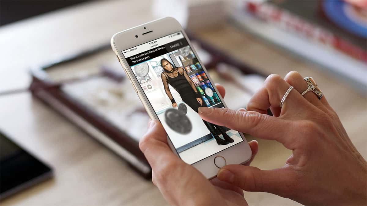
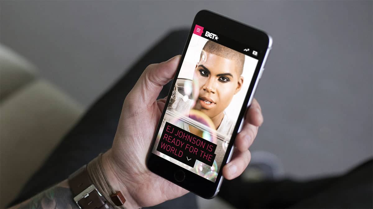
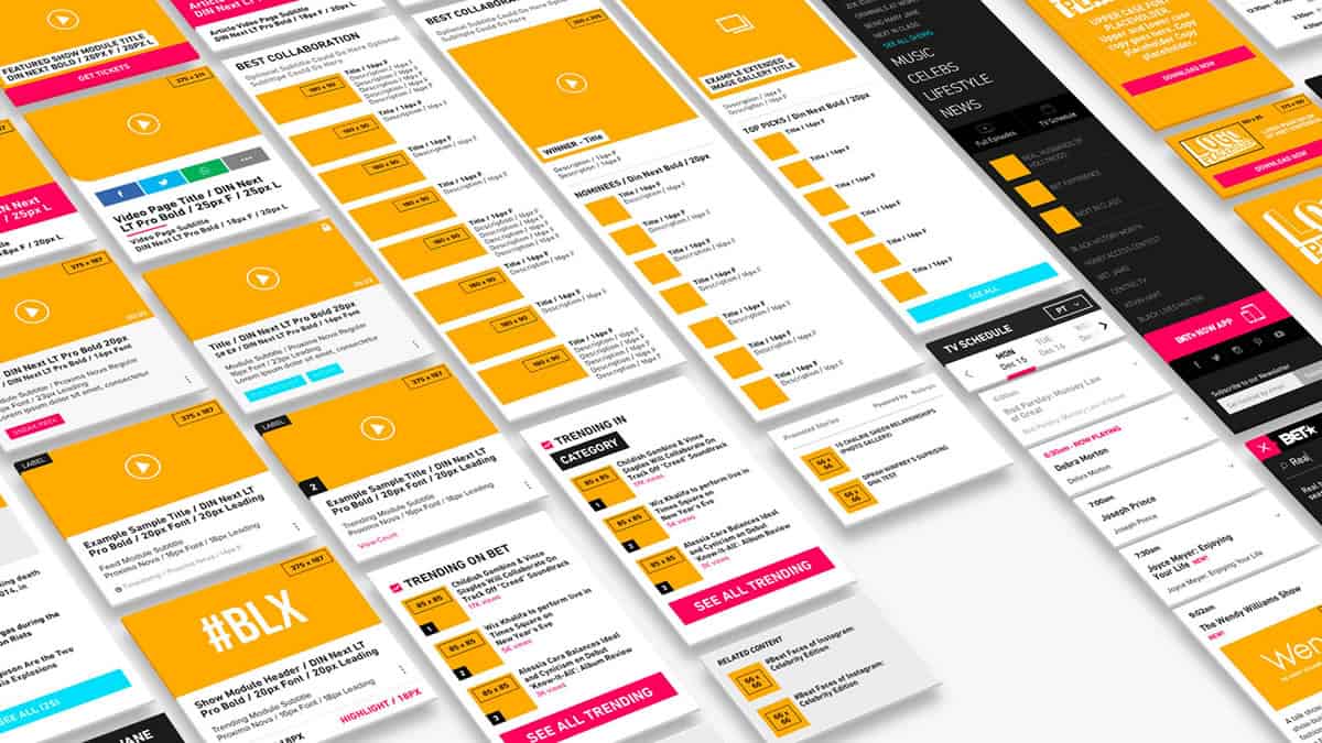
So we worked on BET.com which launched in April 2016, and we used Proto.io for both these reasons. We wanted to focus on a mobile experience, but we knew that almost all of their traffic was mobile so we wanted to make sure we had that nailed. We worked on a lot of navigational prototypes, trying to figure out how many screens of content people would have to scroll through to get to a certain thing. Some of it was very tactical, then going from Proto.io to wireframes or from initial coms, playing with it, and just seeing how it works. We would talk internally about it and make the necessary changes and adjustments.
When things got more advanced in terms of animations and scrolling behaviors, Proto.io really helped us to put together something that was a little bit more visually impressive to show the client and get their buy in. So basically how this would work between the two of us: either Rick or myself would start working on something and I would show it to the team and have a little discussion. Then we would put something tactical together just as a proof of concept, hand it over to Rick who would then take the idea and blow it into something much bigger.
Following on from the last question; would you mind giving us some insight into your creative process? How do you prepare yourselves to create something bold and unique every time? This must be a very liberating process and I’m sure there are a lot of people out there who’d want to understand it.
Rick:
Our creative process usually starts with immersive workshops, what we call the full day meetings with the client. If we take BET.com as an example, we traveled to New York and spent the entire day at their offices. We went through visuals, different keyword exercises, we talked about the structure, goals, and influencers. We then brought everything back to our office where we have a room for each project we are working on. The BET.com room was set up with a team that worked on the project; we had two producers, our director, some designers, and of course two UXs, JP, and I.
We usually start with sketches and wireframes, and a lot of meetings. Everyone works together, everyone is considered a creative here. It’s not about handing off tasks, even our producers put their ideas on the table. That’s what makes RED different and that is why so many are inspired by how creative we are.
When does prototyping come into the process?
JP Arsenault:
We will do some prototyping as necessary before figuring out what the vision is, depending on the phase and exactly what it is we are trying to convey. For example, the BET project had a lot of different parts. Firstly, we had the main BET.com redesign where we were mostly doing production, figuring things out for production level prototypes. But then we had some repeat engagements which were a little more creative, where we really needed something more powerful. I was doing more of the tactical work, how the navigation will work, function or how does it mechanically fit together. When we got into more creative layers then Rick would jump in and take the lead.
One thing that amazes me is the uniqueness of your projects…with such a wide range of clients, there is a huge range of diversity in industries you handle and the finished project. Do you follow specific core design principles or is it a unique process to each project?
JP Arsenault:
Well, we have our standard process and we try to apply it to every project, but in some cases, we will need to scale up or scale down based on what the client is asking for. Sometimes clients might come in and say we have done our research and we just want you to immerse yourselves in the research. Other times they will come and say they will do the production and just need the strategy. Then immersion and discover and all that kind of stuff will be much more important, in which case we may or may not do any kind of real structural things for them.
Rick:
From the first few meetings we already know what kind of visuals we will be needing. In some cases, we will need to prototype all pages in Proto.io. Let’s say we have to share a special visual that we cannot communicate verbally or with sketches, we would prototype and share just that one page. I would say 90% of the projects that we have been working on we have been using Proto.io using wires or full visuals, depending on the client.
What are some of your biggest challenges? How do you overcome them?
Rick:
I would say, especially now that clients are looking for interactive pieces, creating something that feels alive. They want to see motion, something exciting, and they are always asking for that “wow effect” that everyone wants. It’s really hard to communicate our ideas without showing visuals, that’s the biggest challenge. It’s challenging to preset static coms on a screen when we are working with a client that’s not here. When you are sharing a mobile layout on a 55 inch TV, it doesn’t have the same contrast or the same pixel rate. The biggest challenge is for them to visualize, have an idea of how it feels in the real world. That’s what prototyping does. It gives them a real perspective.
JP Arsenault:
There is actually a project that we have worked on recently, an app, and we had two different ideas on how the app’s navigational structure could be set up. So we were looking at two different ideas for navigating through this app and I was doing some initial testing with jpgs on a phone. The person I was talking to really preferred concept 2 and then I loaded up the Proto.io version of both of those navigational concepts. As soon as she started tapping around and scrolling, she was like, “Oh no, concept 1 is much better.” So there is a big difference.
We talk to a lot of non experts in UI and, in general, they know how to use digital, but they don’t necessarily have the imagination that we have connecting the idea to the final execution. We were able to communicate our vision to them as quickly as possible and get their feedback. Ideally, it’s positive feedback, but if it’s not, we obviously need to change it. If we give them something that they can play with, the feedback that we get from them is better.
How do you see the future of design and what are your thoughts on design processes? Do you think they’ll change over time?
Rick:
I think the future of design is going to be basically all digital. It’s not going to be device-focused, because now that you have people getting rid of cable, everyone is leaning towards streaming content. I believe in a little bit it doesn’t matter if you watch on a tv, on a tablet, on a mobile device. It’s all going to be digital, it’s going to be one approach. Digital will become the standard.
Something that we are all pondering a lot these days is: what are traditional advertising agencies versus what are digital agencies. It’s hard to be full on digital agencies because that’s the world we are starting to live in. It’s not gonna really matter what size, pixels you are working with, it’s more of the experience and not the pixel focused thing that had a little while ago. Everyone would talk about pixel perfection and it doesn’t really matter anymore because you can’t really see the pixels. Everything you design might live not only on your mobile device but also on your laptop. If you built an interface for a mobile device, that same interface will have to work with VR.
JP Arsenault:
I would say my training was very process oriented. I don’t think that that will ever fundamentally change, but the tools are obviously changing. And the design artifacts are changing, so the process needs to adapt tactically to kind of produce new things and tools. But understanding your problem and understanding your audience, building something for them, that is universal thinking. A couple of years ago the big challenges were understanding how to do responsiveness, how to deal with designs that needed to change, and we just do it so much now that it’s just like breathing almost. So every time the technology shifts you have to go through some growing pains and then just kind of keep on going.
Rick:
I think it’s becoming more natural because 10 years ago a website would be something that you deal with once you sit at your computer. Now a website or an app is the first thing you see when you wake up. It is becoming so natural. It’s all digital and you are living it in a way that makes you start thinking the same way. We have a variety of interfaces exploding all around us, so the vocabulary, the techniques, and all those kinds of things will need to be updated to address those as they start to become more.
What are your thoughts on the VR craze? Is it just a passing fad or do you believe it’s something that’s here to stay?
Rick:
VR has been under development for quite a long time now, 30 – 40 years. and comes back again and again. It seems like the hardware is always getting better, I don’t know if it has gotten to the point where it will be adopted in the mainstream for design work.
A good example of bringing digital into the real world is car exports. A lot of cars are coming in with digital dashboards that project on the windshield. It’s something that gives you more safety; you don’t have to stare away from the road. It’s expanding the digital world and trying to help us to be more productive, faster, and safer. It’s kind of hard to tell if VR is the thing that is going to stick. Personally, I am not sure about VR. It’s really exciting how it is coming back, but it might fade out. To be honest, I have more faith in AR than VR these days because it is going to be almost like the things that Google was trying to do with glasses. It extends your world, giving you a tool to use every day without even thinking about it.
JP Arsenault:
I see AR and VR ultimately as inevitable, but it’s going to take probably two things. One is the hardware side. It needs to be intuitive so people feel that they are actually getting value out of it. Then exactly that’s going to happen is hard to say. Certainly, it seems that it’s in a pretty good place sitting on your couch at home and you just want to kind of shut out the world around you.
One thing that helps experiences really catch on is that the more they accumulate, the more people feel comfortable with them. Otherwise, with VR, there are a few issues with dizziness, so there is still a long way to go to make that feel natural to humans.
Finally; what’s the one piece of advice you’d offer budding designers?
JP Arsenault:
Just keep making stuff, that’s how you stay sharp. That’s how you stay focused, and that’s how you keep perspective.
Rick:
Picking edge whenever you feel frustrated about an experience and how to make it better. If you are a UX designer, there are a lot of things that you could actually improve. It’s the reason why we have millions of apps in app stores; feeling frustrated about something and trying to solve it. Never stop trying to solve problems on a daily basis.
For designers that are starting right now, not only thinking about the solution to answer the problem, but also something that we do here that it is not easy to find is the passion. Someone that lives and breathes design, not only because of digital, but getting inspiration from everywhere. Most designers that we hired are inspired by digitals in general. Whenever they are getting excited about colors, that’s the beautiful inspiration that comes. It’s not necessarily focusing on the button. Whenever it gets a natural feel, it’s because it was inspired by the real world and that designer did a great job.
JP Arsenault:
I would also add that it is important to have hobbies. Living and breathing design is great, but lots of opportunities to see the world ultimately will help your design perspective, your design skills, and your design language.
Did you enjoy this Designer Chat session with JP Arsenault and Rick Dias as much as we did? Then don’t forget to share it with your fellow designers and let us know via Twitter @protoio or Facebook! If you feel so inspired that you would like to dive right into designing the next “App of the Year,” get started with our powerful prototyping tool that is bound to streamline your design process. Get your 15 day free trial now.
