Apps are fun tools to help us get more out of our smartphone experiences. The app revolution only started eight years ago when Apple launched the App Store. But in that short time span apps have really taken over. From getting us to where we need to go to entertaining us and connecting us with friends, apps are nothing less than amazing.
Beyond useful, the best ones have taken their mobile app UI to the next level with intuitive and visually stunning designs. Here is my roundup of this month’s top mobile app UI.
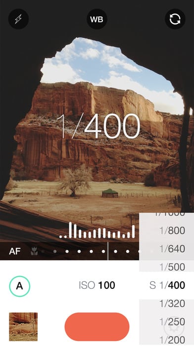
1. Manual by Will Global
Half the fun of having a smartphone is having a good quality camera on you at all times to capture the moment. Manual is perfect for the artsy designers out there that want to get their pictures just right. It has a super simple design that gives users full control over the exposure of their photos. Manual takes the things that photographers love to tinker with, the white balance and ISO, and puts them right into your smartphone with lovely icons and easy to adjust settings.
Get Manual on iOS.
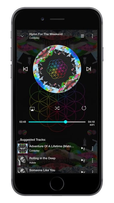
2. TIDAL by TIDAL
There are many music streaming apps out there, but I took notice of this one a few weeks ago. It’s design really got to me, as I watched the album cover of the song playing turn as if it were in a DJ booth. TIDAL is surprisingly busy in terms of its UI, but they make it work. From artists to albums to videos, there is a lot of content to display, but they do it effectively and make it visually appealing at the same time with bold colors.
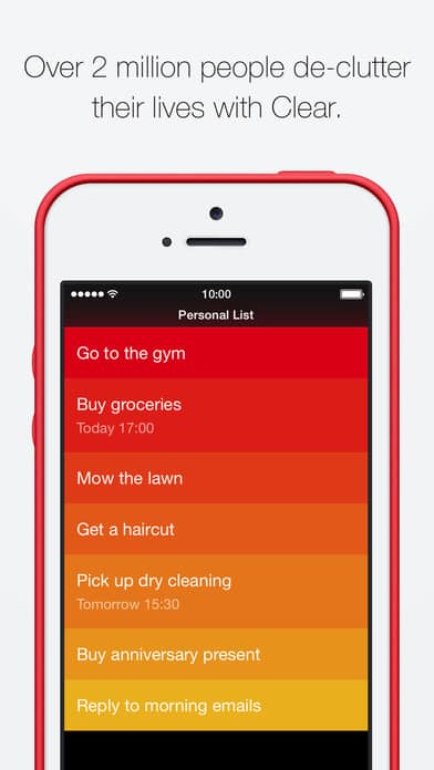
3. Clear by Realmac Solutions
If you’re like me, your to do list is always full. Clear keeps all of your action items together with a cheerful color palette. It is highly customizable with the option to change the theme and colors of different lists to easily tell them apart. Since a to do list can be a source of stress, Clear is a great choice for decluttering and reminding you of what you need to do. They manage to make a mundane task into a delightful UI.
Get Clear on iOS.
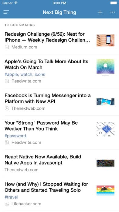
4. Raindrop.io by Rustem Mussabekov
Raindrop.io keeps all your bookmarks together and it has a few features that elevate it from other apps in its category. It allows users to keep all of their articles, screenshots, videos, and more in a safe place until they’re ready to check them out. What’s more, users can also organize the things they have saved with tags and make Pinterest-style inspiration boards. They come together in collections that you can work on and share with others, or keep it to yourself. I really appreciate the image-based UI that makes it easy to group bookmarks and stay organized.
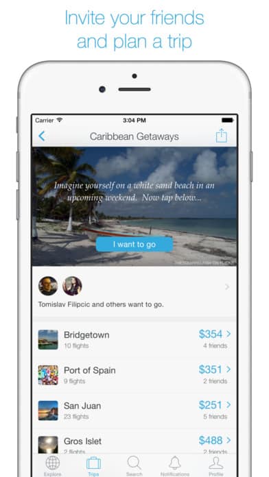
5. Hitlist by TripCommon
Travel apps are a big hit with me and this one takes it to the next level. It goes beyond researching places to visit and makes it more social. Users can put in the places they’ve visited and connect with friends to plan trips. On top of all that, the app looks out for the cheapest flights when you’ve decided on a location. I appreciate the bright and straightforward call to action buttons. The layout makes it easy to explore new locations and rally friends to travel with.

6. Hype by Intermedia Labs
Twitter recently announced that they were killing off Vine, but the creators are back at it again with Hype. Their new app makes it possible to have a live video broadcasted out to followers who are given the ability to comment and interact in other ways. It’s an incredibly creative app that is way more than just video. In fact, you can add music and gifs, just to name two features. Naturally, you can post your broadcast on Twitter and it even has the Instagram/Snapchat-esque ability to share something from your camera roll in a slideshow. I love how much personality Hype lets users show. Also, it tries to take on a lot and give users a bunch of tools to make their broadcasts their own, but it still manages to pull it all together in an uncluttered mobile app UI.
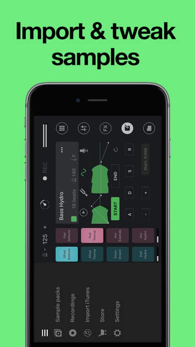
7. Remixlive by MIXVIBES
It seems like anyone and everyone is a DJ these days. Remixlive puts the ability to remix songs into everyone’s pockets. Editing small parts of songs seems like a complicated process, but Remixlive breaks it down and pairs the process with soothing muted colors. The colored sections of songs really stand out from the otherwise black and gray background. The Remixlive team effectively used contrast to pull out the color of the areas of the app that users will be most excited about–the sounds.
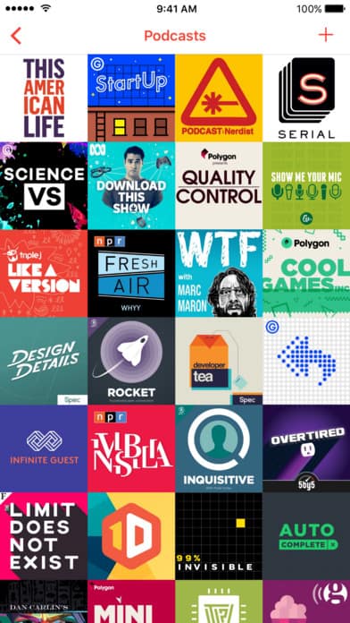
8. Pocket Casts by ShiftyJelly
Podcasts are all the rage right now and Pocket Casts capitalizes on this popularity. It groups podcasts by what’s featured, what’s trending, and what’s popular. This way you’ll always have something new to chat about when you meet your coworkers for coffee. One thing I liked was that once you click into a podcast, the color scheme changes to match the artwork for that particular show. That, to me, shows that they’re thinking of the macro and micro design.
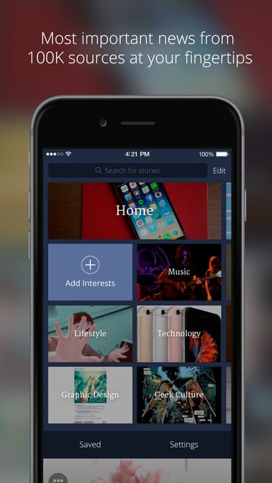
9. Uber by Uber Technologies
Uber’s iPhone app just got an overhaul and is now more intuitive than ever. The new order of steps for riders is especially helpful, putting the destination first and giving them different types of Ubers and upfront fares for each ride. Riders no longer have to toggle between Uber X and Pool to see the difference in price, now they’re grouped by economy and there is another section with premium options. I also like that it puts user preferences right at the bottom of the screen when you open the app with your frequent locations. Uber’s new and more simplified mobile app UI is a win for riders.
If you enjoyed this curated list of great mobile app designs, share it with your social network! Do you have a suggestion for the next edition of our Top 10 Mobile App UI series? Reach out to us via Twitter @Protoio or on Facebook.


