Fall is finally in full swing. As the days get shorter and temperatures cool down, the mobile space is just heating up. With a ton of new and exciting mobile interaction designs, 2016 is bound to end with a bang.
As you might know, we do a monthly round up of the best mobile interaction designs and we certainly won’t leave you hanging this month. As you carve up your pumpkins and think of what you’ll dress up as this year, this month’s round up will inspire you to do something a bit off the beaten path.
Let’s see which mobile designs made the cut this month!
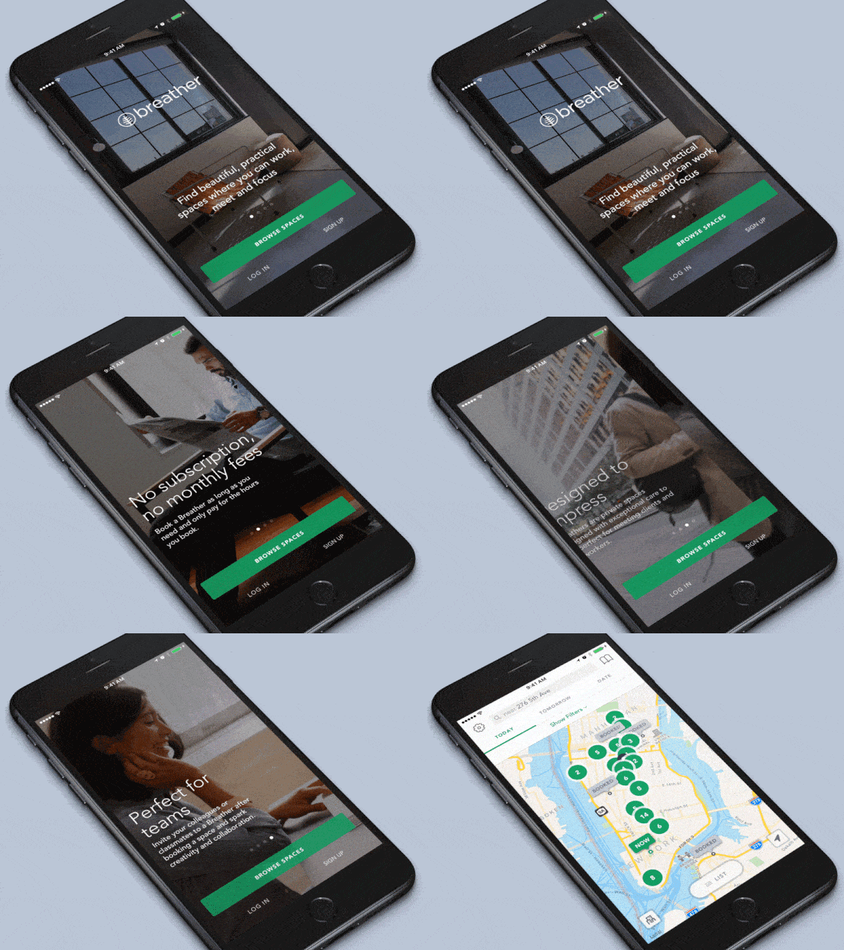
1. Breather 2.0 by Breather Products, Inc.
Breather is an app that helps users find spaces to work and meet in in a number of cities. These on-demand meeting rooms are helpful for both individuals and teams looking for a place to connect on the fly. They can be booked by the day or the hour. Naturally, an app that aims to help people be more productive wherever they happen to be needs to be seamless and efficient. Breather certainly delivers. While they have a new version of their app coming out soon, this initial look into the app is still delightful. As someone who loves marketing, even before someone signs up for the app, I appreciate that the call to action stays consistent as the images and messaging changes with the swipe of a finger. The very popular swiping motion is incorporated to give app downloaders a good idea of why they should use it. Then it shows where work spaces are available nearby. It’s a very effective way to prove the use case and they do it in a delightful way.
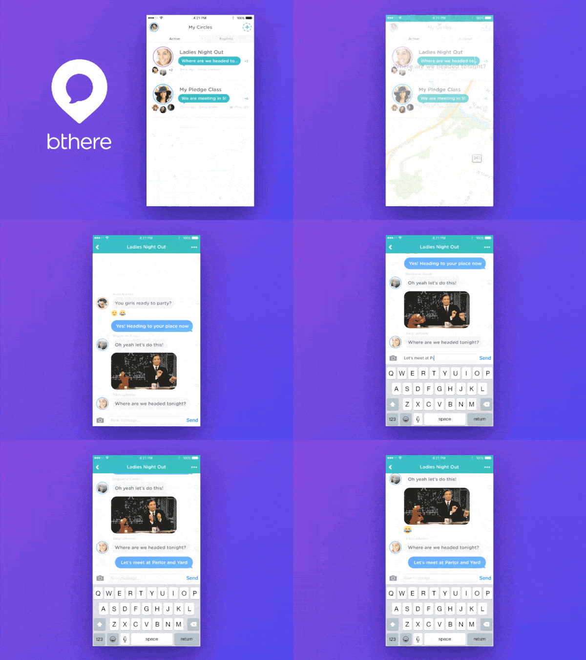
2. bthere by Benjamin Johanson
bthere just launched on the App Store and it’s sure to be a hit because it’s way more than just a social networking app. This communication tool helps friends get together by creating “circles” for different groups of friends. While you can chat and send gifs with the people included in those groups, it also takes it a step further. With geolocation tracking, you know when your friend is on their way, instead of having to ask for updates. bthere even has a “come get me” function in case one person in your group ends up in an emergency situation while out together. I love the bounce effect seen on several screens of this app. The app aims to get friends out and about together and the fun mobile interactions within it help convey this message.
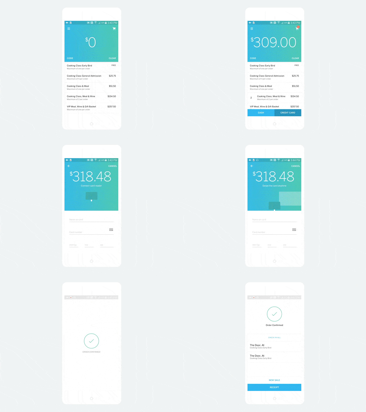
3. Eventbrite Organizer by Eventbrite
The behemoths in the ticket selling and event planning industry have long had a hold on the process as well as the look and feel of the experience. The words “delightful” or “pleasing” aren’t generally words that come to mind when thinking of the transaction, but Eventbrite takes it there with their Organizer app. What you see above is the flow organizers will experience as they sell tickets through Eventbrite’s revamped app. My two favorite interactions within the app are the drop down update of the order total when choosing the type and number of tickets. Secondly, I really like the animation of the credit card swiping, which pops up in the payment stage. Eventbrite is truly taking event planning to the next level. If you’re planning a well-designed event, shouldn’t the ticket sale process mirror that? Eventbrite answers with a resounding “yes!”
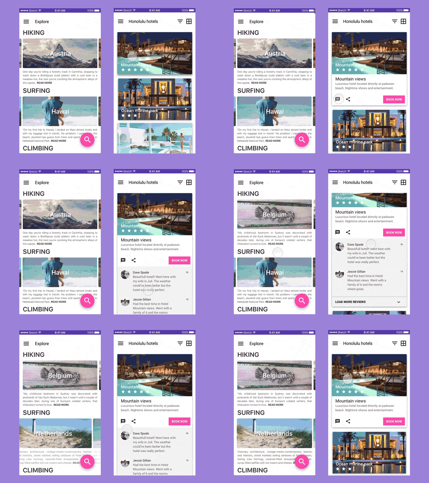
4. Travel App Concept by Erik van Eekelen
This is definitely one of those concepts that I wish were real! The organization is top tier, as it gives suggestions for destinations based on what activities you want to take part in. That’s great for us wanderlusters when love to travel, but get overwhelmed by all the places we want to go. I really like the swiping interaction through the lovely images while still on the Explore page. This is perfect for browsing destinations because it gives you a taste without taking you away from the screen you were on. Secondly, on the Honolulu hotels page I enjoy the multiple drop downs allowing users to get as many details as they want. This app concept really understands how travelers book trips, as it includes descriptions, reviews, the ability to share with your travel buddies, and finally, a very clear button to book the hotel once you’ve decided on it. This concept offers many ways of interacting and condenses a ton of information into clean animated interactions.
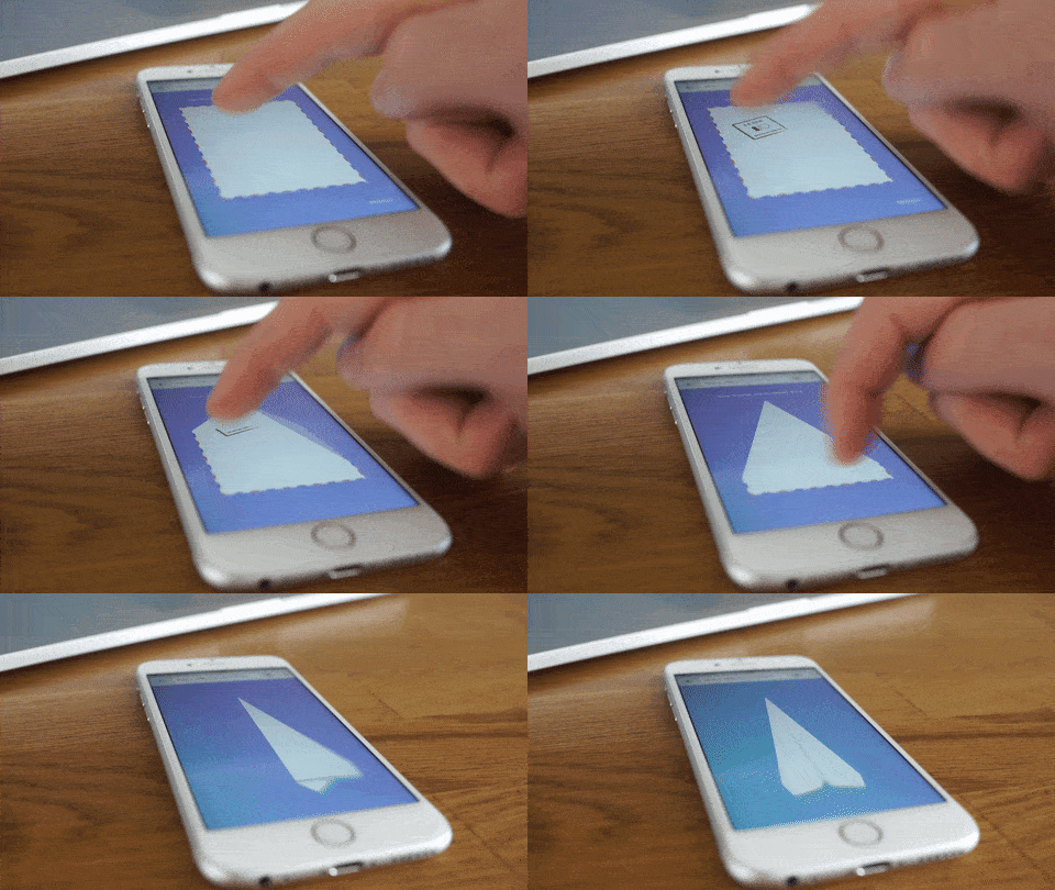
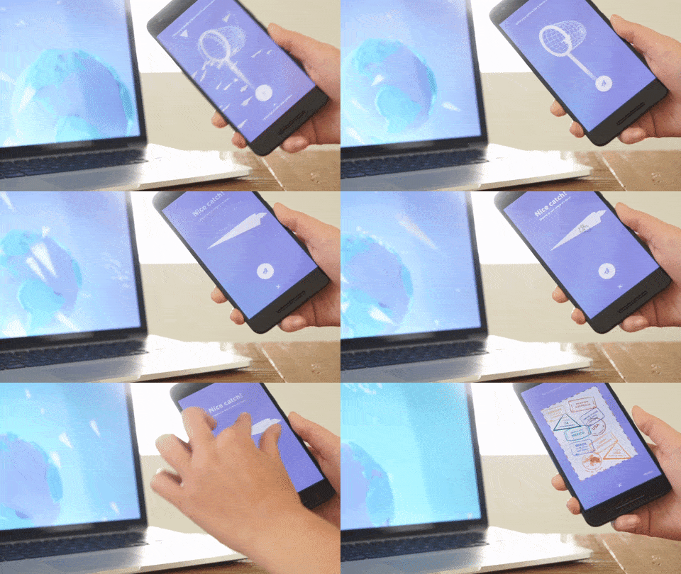
5. Paper Planes by Active Theory
This is certainly my favorite of the list. It connects people from all over the world in a way that could only be possible in 2016. The idea behind it is that using the app you can create your own paper plane, stamp it with your location, swipe to fold it up, and throw it into the Internet so it flies around the world until someone catches it with a virtual net on their own Android device. “Wow” is all I have to say! It’s a beautiful idea to bring people together in a moment of delight when they get a paper plane, see that people have stamped it from all over the world, and how many miles it has traveled. It’s a testament to what’s possible on mobile and how far connected experiences can go. Paper planes launched recently at Google I/O 2016 and if you watch the video below, you’ll certainly experience the sense of awe I did when I first heard about this app.
That’s it until the November installment. Did I miss some of your favorite mobile interaction designs? Feel free to tweet @Protoio or message us on Facebook with your suggestions!
Proto.io lets anyone build mobile app prototypes that feel real. No coding or design skills required. Bring your ideas to life quickly! Sign up for a free 15-day trial of Proto.io today and get started on your next mobile app design.
