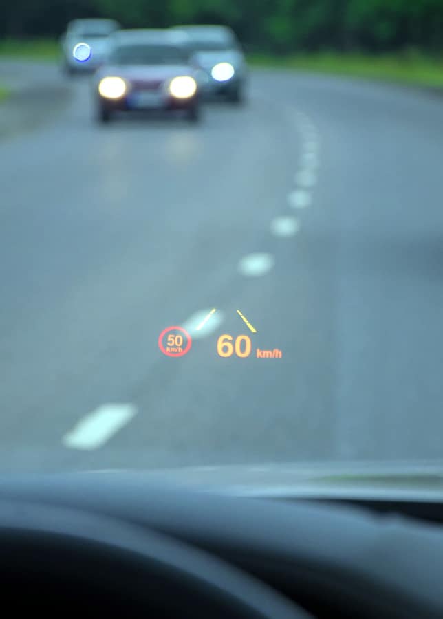
We are pretty obsessed with displays around here—from the impossibly thin, to the incredibly huge (and everything in-between). We have to be, since our business is mobile app prototyping, but it’s hard not to be these days when many people sit and stare at a screen of some sort for the large majority of their day. With that said, it’s understandable that we’re pretty excited for the heads up displays (HUDs) of the future.
If you’ve never heard the term “heads up display,” you’ve probably seen one without actually knowing what it was called. One of the most well-known examples is Tony Stark’s helmet display in the Iron Man and The Avengers movies. Quite literally, the name refers to keeping someone’s head up instead of looking down at a console. Rather, the information is displayed right in front of a person’s face to keep their attention.
History of the Heads Up Displays
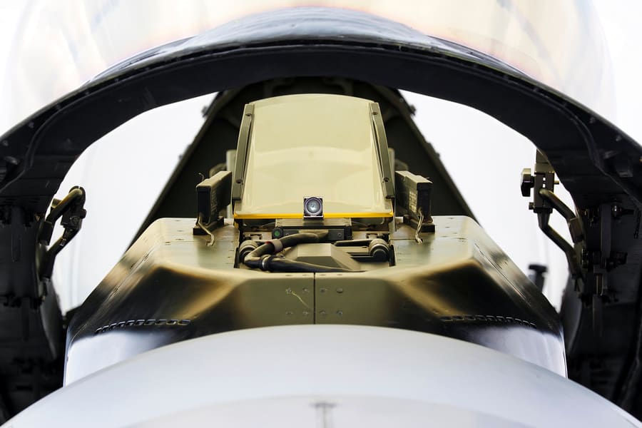
Heads up displays were originally designed to assist pilots during flight. It can be argued (and many do) that the inspiration for HUDs can be traced all the way back to an instrument called a reflector sight, which fighter pilots used to improve shooting accuracy during World War II. From there, the British Royal Navy and Royal Air Force developed a bomber called The Blackburn Buccaneer, which was developed in 1968 and flew for nearly 30 years.
Once the British began reporting success with heads up displays, it was clear that they wouldn’t be going away anytime soon. French test pilot Gilbert Klopfstein saw an opportunity to standardize HUDs so that pilots wouldn’t need to learn a new system with each plane that they flew. Once Klopfstein’s design was in place, the stage was set for HUDs to become standard in military use across the world—and with their addition to the Boeing 737 in the 1990’s, they spread to commercial airplanes as well.
Making Driving Safer: Putting HUD Technology in Your Car
For years, car manufacturers have been loading more and more information into their vehicle displays and now our dashboards are overloaded. We have speedometers, odometers, indicator lights (for oil, tire pressure, and engine), GPS navigators, radios, and a million other little knobs and doo-dads that no one understands because they didn’t read the manual. These devices give us information that we need, but they can also be a safety concern, as they take our eyes away from the road.
While heads up displays had previously made their way into military jets, race cars, and some luxury vehicles, HUDs in the regular consumer market were out of reach until General Motors (GM) stepped up to the plate. In 2012, GM included a heads up display in their GMC Acadia that featured speed, tachometer, turn signals, warning lights, and radio information (GM brought the first color automotive color HUD to the market with the C5 Corvette). But the innovation isn’t stopping there—GM is currently working on a full-windshield HUD.
Putting aside the wow factor of incorporating a new toy, investing in heads up displays serves a higher purpose for the car manufacturing giant. GM wants to use HUDs to make driving safer. Yes, HUDs would help keep drivers’ attention on the road, but the potential for this technology runs much deeper. Take driving in fog, for example. If you’ve ever experienced this, you know that there is little you can do to help yourself. Depending on its density, you basically just have to slow down and hope that it clears or pull over.
GM believes that if your entire windshield functioned as a heads up display, infrared cameras on your vehicle could “paint” the edge of the road ahead of you, helping you stay inside the lines when fog or rain are diminishing visibility. When combined with night vision technology, this could also mean that external hazards, such as a deer meandering toward the road, could be pointed out to the driver.
Mobile UI design folks don’t need to search too deeply to find the lesson in this example. Using heads up displays in this manner means that GM is trying to solve age-old problems (distracted driving, visibility issues) through tech-savviness and, in a way, UX design. GM found a combination of problems (multiple displays that distract drivers and cause safety concerns) and then found a creative solution with a techie twist.
The most successful products, be they mobile apps or physical objects, were created to solve a problem or fulfill a need—sometimes a need that the consumer didn’t even know they had. When applying this to mobile UI design, it is crucial to remember that usability is key. Customers need to get into the app, find what they are looking for, and accomplish their task without wasting time.
Heads-up displays teach us the importance of putting pertinent information right in front of the user—perhaps in the form of popups (Reminder: Your bill is due soon!). User-friendly mobile apps flow well (“billing” should probably be under “account,” no?), so hiding what they are looking for deep in menus or on pages that don’t make sense will frustrate users. It might even cause them to delete your mobile app.
Even more relevant, whenever you’re working with a UI meant to be used on the go, you need to be conscious of what that actually means. Is someone going to be running while checking their pulse or calorie burn via your app? If so, use big text, and don’t clutter the UI with buttons that can’t be hit without coming to a complete stop. Always be aware of your user—and always ask yourself, what are they actually using this for?
Enhancing the Video Game Experience: Wearable HUD Technology
Given the seemingly endless possibilities for heads-up display technology, we are not at all surprised that wearable head-mounted displays like Vufine have been so successful. The video game industry has been similarly using HUD technology for many years and is breaking into wearables to be totally immersive, just like cell phone manufacturers.
After Vufine’s one month on Kickstarter, they raised nearly 500 percent of their goal and were chosen as a Kickstarter Staff Pick. Since then, Vufine has been growing both from a human and financial standpoint and expanding their product line.
Most recently, Vufine has seen a boom because of Pokémon Go. You can plug your mobile device into the Vufine, attach it to glasses, a headband, or a baseball cap, and find the rare Pokémon without burying your head in your phone. This adaptation has been so popular, in fact, that they began producing the Vufine in new colors to correspond with each Pokémon team (here at Proto.io, we are obviously Team Instinct, with a smattering of Mystic).
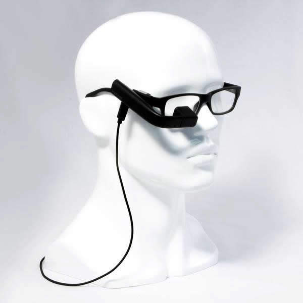
But according to Nadhiya Govindaraj at Vufine, their biggest market by far is drone pilots. As Ken explains in this video, having the Vufine means that he has access to a “second screen” without carrying around an external monitor. He can use the GPS on his phone while letting the Vufine act as his camera monitor, which helps him work faster and more efficiently—since he’s not switching back and forth between applications.
Again, the take-away for mobile UI design teams is simple: when heads up displays are used properly, they are contributing to (rather than distracting from) an experience. In the case of the drone pilots, devices like the Vufine are still getting back to the roots: they are solving a problem. But they are also creating a truly immersive experience for the user.
Pokémon Go is already an immersive experience—if you’ve ever watched someone playing, this isn’t a surprise to you. Heads down, totally engrossed. By putting on a wearable, you are providing the player with a new perspective and a heightened UX. In addition, the gaming experience now becomes more social because you are able to look up and around with your friends (and perhaps also, makes it a bit safer).
Heads Up Displays: Here to Stay
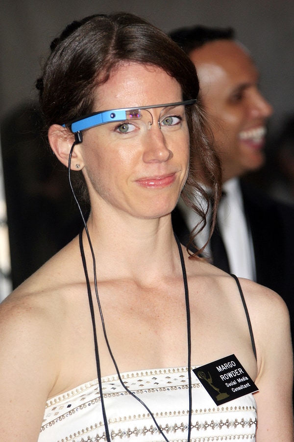
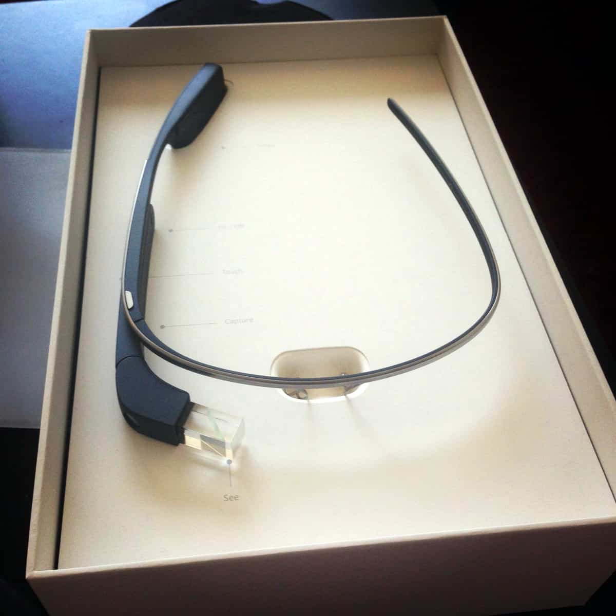
Heads up displays are making their way into every aspect of our lives. From planes to cars to video games, it’s likely that we will see the integration of HUDs continuing to expand into even more industries. Perhaps Google Glass 2.0 will be the invention that makes heads up displays seem less “techie” and more accessible. Maybe GM will perfect their full-windshield HUD and open up a whole new world for us. Wherever this technology takes us, we can’t wait to be a part of it.
Are you working on your new mobile UI design? We can help, no matter what your goals are. Our easy to use drag-and-drop design makes your job easier and more efficient. The best part is that we make the handoff to the programmers seamless thanks to a visual design that is already established for them. Sign up for a free 15-day trial of Proto.io today to get started.
How are you finding inspiration from heads up displays for your next mobile IU design? Let us know by tweeting us @Protoio!
