What’s the first thing you do in the morning? For better or for worse, I check my phone. I check my email first and then get updates from friends on my favorite social media apps. Sure, many experts say you shouldn’t do that, but more than likely you do the exact same thing.
Apps give our favorite devices purpose and make them unique. With apps they’re so much more than pieces of metal, glass, and plastic. Studying the most successful apps of all time can paint a vivid picture of who we are as a society and what works best in the design community.
Last September App Annie released it’s list of the most successful apps of all time on iPhone and iPad. It tracked back to July 2010 and had some interesting insights into what products Apple customers find most useful.
The definition of the most successful apps can vary, so I’ll discuss both the most downloaded and highest grossing apps in terms of worldwide revenue. Afterall, some of the greatest apps are free and others show their power by how much users spend on them. (Note: App Annie’s data did not include games, so that’s why you won’t see Candy Crush here.)
Without further adieu, here is the list of the 5 most downloaded apps:
- Facebook Messenger
- YouTube
- Skype
The first thing I noticed while looking at this list is that Facebook dominates. Three of the five most successful apps on this list are owned by them, so clearly they’re doing something right. Secondly, all of these apps are social in nature. Whether we’re having an interview over Skype or commenting on a friend’s picture on Instagram, connecting with people near and far comes first.
While this list of the top five most downloaded apps is very Facebook-centric, the most successful apps defined by the highest revenue make up a somewhat more diverse group.
- Pandora Radio
- LINE
- Zoosk
- Pages
- Spotify
This time, music takes the cake with social apps still having a very significant presence. Now that we’ve discovered the most successful apps, which ones should designers keep on their radar for inspiration?
1. Facebook Messenger
Facebook safely owned the most downloaded list and for a good reason. With an estimated 1.71 billion monthly users as of Q2 of 2016, their choice to make mobile messaging through their platform a separate entity was destined to make it a smash hit.
According to Facebook, 900 million people use Messenger each month and the website boasts that 1 billion people use it overall. So what keeps them coming back?
- It’s Multipurpose: Messaging on Facebook used to just be between friends when they happened to be on the website or using the Facebook app. Now it functions as a more customizable SMS platform. That means that responses are often much more timely than your average Facebook message. Beyond that, users can chat with businesses to get support using scannable Messenger Codes and use personal shopping assistant bots.
- It Doesn’t Try to ReInvent the Wheel: Back in June Messenger’s update showed that they were wising up to the way that people actually interact with each other. As the most successful app for communication, this is a key insight to improve the overall experience. Now on the home screen users can see recent messages, as well as their favorite people, and who is online now. Facebook is understanding that they need to fit their app in with how people already communicate, instead of fighting a hard battle to change the way they do things. Doesn’t it just make sense to pick up conversations where you left off, talk to your best friends, and chat with people who are already on the app as well? Facebook seems to think so and I agree with them.
What designers can learn from Facebook Messenger is that it’s going to take a few tries to get it right. But you have to start by understanding how people will use the app you’re creating. You should build your app on the way your target user already does things to make it more intuitive. If your app flows naturally, adoption will be more likely and easy.
2. Spotify
Everyone needs a soundtrack to their life and since 2008, Spotify has satisfied that need. Sure, it’s no Rdio (we miss you dearly), but its design has come a long way and made its interface easier to navigate for its 100 million active monthly users.
As of June, it was the only music subscription service to sustain that incredible number of users, but Apple Music is growing at a pace that keeps the current king of streaming on its toes. With that said, its design has to have something to do with keeping all of those users coming back because they definitely have alternatives.
Here’s what makes it one of the most successful apps:
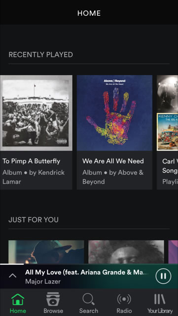
- It’s Easy to Use: Following a March suggestion from Google to Android app developers to leave behind the controversial hamburger button in favor of navigation bars at the bottom, Spotify was praised for doing just that on its iOS app. While it isn’t necessarily the most attractive update, it made it much easier for users to move through the app without interrupting the experience. Instead of a pop out menu that requires a tap before a user gets to click the button they were looking for, those commonly used buttons are now ever present at the bottom. In addition, while playing something, the song information and controls will appear at the bottom for easier access when in-app.
- It Makes Data-Driven Decisions: The choice to do away with the hamburger menu had numbers to back it up as well. According to TechCrunch, “The company tested the tab bar on iOS to see how it impacted user engagement. It found that users with the tab bar ended up clicking 9% more in general and 30% more on actual menu items.” If that isn’t a reason to switch things up, I don’t know what is. Without testing a new menu placement with less items on it, Spotify would have never figured out that they could drive significantly more traffic to their content while keeping users engaged and coming back to their iOS app just as often and for as long.
You might be the brightest designer out there, but industry standards and rules of thumb can only get you so far. User testing will tell you more than you could ever guess on your own and get your app closer to qualifying as one the most successful apps of all time.
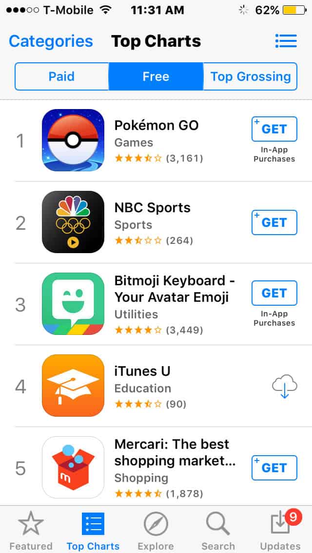
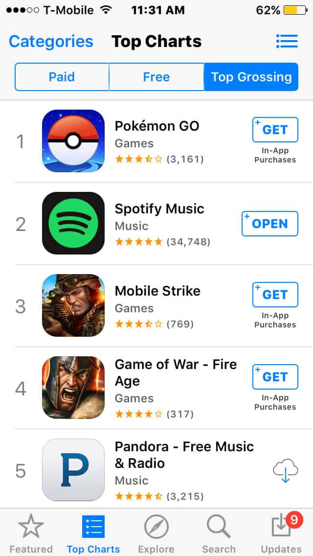
3. Pokémon Go
Ok, so it’s not on the list, but I’m sure it will be all over App Annie’s list of top games this year. I didn’t get into games in this article because that’s another ballgame entirely, but it’s hard to ignore this one.
It’s just weeks old, but it has become nothing less than sensational. Since it’s release, it has reached 100 million downloads and generates $10 million in revenue a day. Not too shabby for a newcomer to the App Store. In time we’ll see if it create a permanent spot for itself as one of the most successful apps ever.
Here’s why I think it’s so successful:
- It’s Built on Nostalgia: When Pokémon Go came out, children of the 90s (and many others) swooned because their beloved game had come back and now they could play IRL with just their phone and their feet.
- It’s Everywhere You Go: In the first few weeks after it was released it was easy to tell what people were doing when walking around like zombies, eyes glued to their phones. I saw families, groups of teenagers, and adults alike walking around stopping at odd spots on the street and in parks flicking at their screens. Even though I hadn’t downloaded the app myself, I knew exactly what they were doing and, because of the previous point, it warmed my heart a bit.
Of course phenomenon like Pokémon Go are few and far between, but its presence has certainly supercharged the app economy.
Main Takeaways from the Top Apps for Designers
With 2 million apps on the iOS App Store and 2.2 million available for Android users, standing out from the noise takes continued effort. Getting people to install, create an account, use your app, and continue returning is no small task. Many apps can temporarily rise to the top based on buzz, but it takes a lot more than that to stick.
Here’s a brief recap of what we’ve gone over:
Naturally, the most successful apps revolve around their users. If your app aims to help users communicate, learn how they’re communicating already on other platforms. Once your app fits neatly in with their way of life, it will be a convenient addition.
In order to find all of this out, it’s necessary to talk with your users or prospective users to learn exactly what they want. Testing the ideas that they come up with will expose the best way to implement changes to your app.
But the testing doesn’t stop there. There is no such thing as a perfect app because consumer needs and expectations are always changing. The longer these apps top the charts, the more designers can learn about the blueprints of most successful apps.
