In this month’s edition of the Top 5 Mobile Interaction Design series, we look at a number of app concepts that incorporate motion in an effective and amazing way. Many of these apps take familiar user interface elements and transform them into a unique experience by determining the way they move, come together, or disappear from sight. What makes for great mobile app interaction design is not the creation of something grandiose and new. It is the amount of attention paid to the little details that can change a familiar encounter into an exciting adventure. In no particular order, here are this month’s top 5 in mobile app interaction design.
1. Allo Transition by Sharon Correa
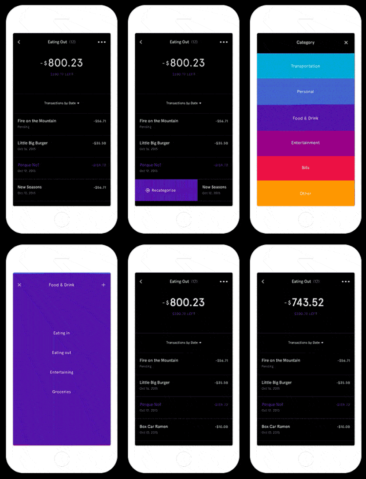
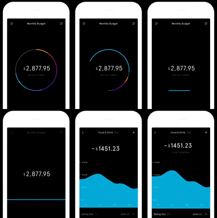
With the recent announcement of a new smart messenger app from Google at I/O 2016, the team behind this lovely mobile app interaction design featured here might have to rethink the name of their upcoming app. Nonetheless, the sneak peeks that they’ve been uploading to Dribbble over the past months have been dazzling. A collection of shots by Sharon Correa, Clarke Harris, and Jordan Sowers reveal a beautiful app that will make your money work for you. I’m amazed by the gorgeous animations and the ease of transition found in the shots below. The colors are intense and vibrant, contrasting well against the dark background. I would sure love to try out this app once it’s been launched.
2. Swipe to Travel App Concept by Fantasy
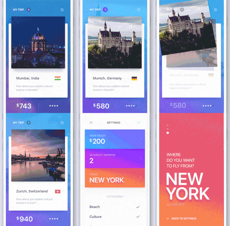
The team at Fantasy is behind some of the most celebrated mobile app interaction design found on Dribbble. This new Swipe to Travel app concept takes a slight departure from conventional travel apps. With an added touch of Tinder-style cards layout and swiping behavior, the result is a beautiful mobile app to help the globetrotters among us decide their next destination. Together with an amazing and fresh color gradients and just about the smoothest screen transitions ever, this app concept is but one of the many great examples of mobile app interaction design by Fantasy that we could all learn from.
3. Opening Screen for Banking App by Platform
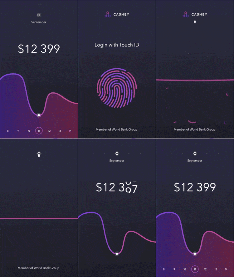
Apple Touch ID has indeed brought about a big change to mobile login and user authentication. I’m no fan of the passcode system which I find cumbersome and frankly, tapping four numbers on a screen that’s rather visible to bystanders is not the best way to secure one’s phone. It’s less likely that someone else would have access to my hands without my knowledge so I must say that I’m fond of Apple Touch ID. Nonetheless, it could be implemented by designers and developers in a more creative way. Such as this opening screen for an upcoming banking app by Platform. The default feedback for Touch ID is no feedback at all, which makes sense since most users want to access their devices and apps quickly. However, Platform’s way of incorporating Touch ID feedback with the home screen of the banking app is pure genius. Lovely transitions and gorgeous animations, this is one fine showcase of great mobile app interaction design.
4. BUCKiTDREAM by BUCKiTDREAM Inc
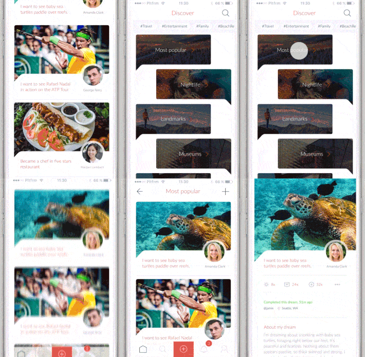
An app to create your dreams and share your bucket list, it’s the ultimate motivational app for people who believe that no man is an island. Humans are social creatures and sharing goals socially makes us accountable and more likely to succeed, as research has shown. Whether you’re a loner or a regular sharer, BUCKiTDREAM is still a beautiful app to keep track of your bucket list and gain more wins in life. It’s also another amazing work of mobile app interaction design by Platform team, that was responsible for the purely design aspects of the project (and none of the implementation). From this shot taken from Lukáš Straňák’s Dribbble, we see a series of smooth screen transitions. I’m particularly fond of the transition to the “Discover” view where the chatbox-style list with the dark overlay appears.
5. Everyday Life App Concept by luking
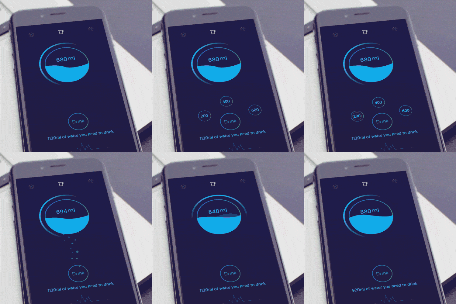
One of the nicknames I used to have back in the day is “water bucket”, thanks to my preference of water over any other beverage. And yes, I still do have vices as good old coffee would come next in the list. Although I know that I do drink a lot of water daily, it never once occurred to me to track the actual amount. This gorgeous app concept caught my eye, not only for the outstanding mobile app interaction design but also for the very original idea behind it. I love the bubbling effect that appears after the user has recorded the amount of water taken and the wave-like animation of the rising water consumption level. The simple but effective animations convey a great deal of meaning to the user for this very use case.
The days of static mockups are long over. Motion and interactivity are the defining characteristics of a successful mobile app. Don’t leave your mobile app interaction design to the end. Start with it. With Proto.io, you can create fully interactive high-fidelity prototypes, no coding needed. Sign up now for a free 15-day trial.
Would you like us to feature your amazing mobile app interaction design? Tweet us @protoio or message us on Facebook!
