Finding fresh ideas for a new mobile app design project can be time-consuming. At Proto.io, we understand that as crucial as design inspiration could be, it’s also important to keep up productivity levels especially when working in teams. That’s why we created our powerful prototyping tool to help design teams improve their workflow. Every month, we also round up the best of beautiful mobile UI to inspire you to go forth and create stunning app designs. Here are this month’s top 8, in no particular order.
1. INKS by State of Play Games
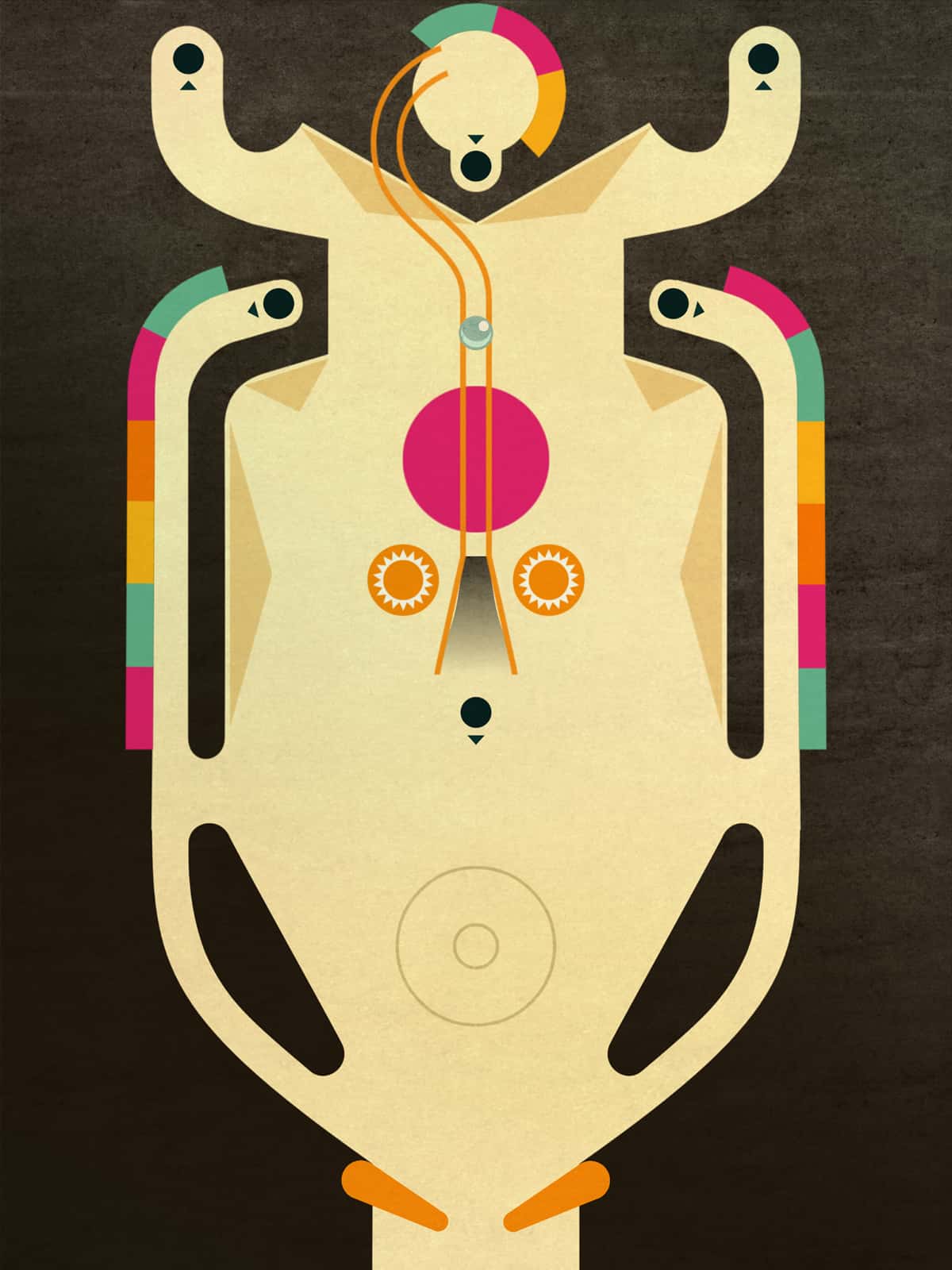
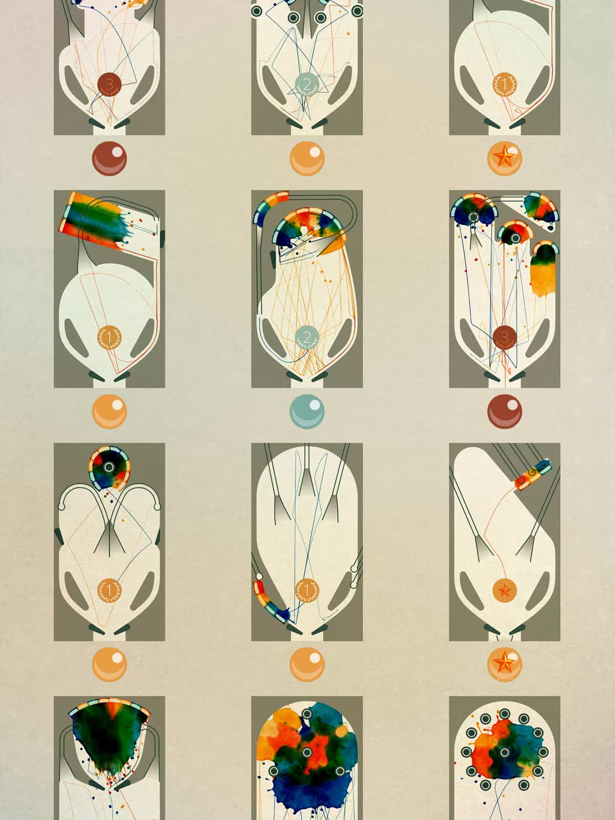
From the talented team behind the BAFTA-winning Lumino City featured in a previous edition of our monthly mobile app UI series, comes a fresh and updated rendition of pinball. INKS revamps the classic game with a splash of vibrant colors and the beautiful mobile UI becomes a canvas for players to create a unique work of art. The gameplay is very much like the conventional pinball, only that that experience of the game is not quite the same. You’re no longer competing just to score points but the game teaches you to pay attention to the trajectory as much as the end goal. In essence, it’s interactive art in the form of a game. INKS’ beautiful mobile UI engages the user to make it even more uniquely beautiful.
Get INKS on iOS.
2. Whittl by Whittl Inc.
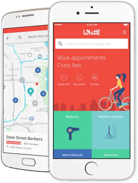
In our mobile age, it would seem slightly outrageous that we still have to make phone calls to book appointments with the hairdresser or the masseuse. The truth is that we still do and Whittl wants to change that, city by city. An app with a beautiful mobile UI and a mission to make the lives of many busy professionals a lot easier. You can book appointments with any of the businesses on the app, at your own convenience and pay online. I like the custom graphics for the various categories as they do a much better job than the popular line icons would for this particular case.
3. Model 15 App by Moog Music Inc.
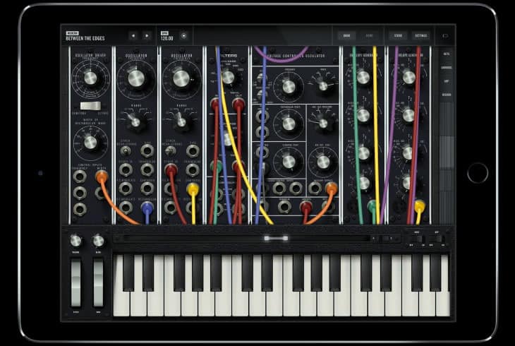
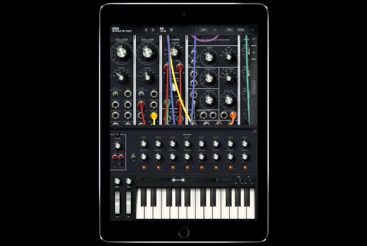
Music aficionados and sound board geeks would be most excited by this new arrival by Moog Music. Model 15 App is the first Moog modular synthesizer and synthesis educational tool created exclusively for newer iOS devices. The Model 15 App not only recreates the sound of a hardware Moog Model 15 modular synthesizer but it also comes with all the conveniences of a digital app, like easy sharing of presets and recordings. I know, I hear you saying, “Could someone explain all the industry speak to us, ordinary folks?” Let’s just put aside our blissful ignorance and agree that the Model 15 App’s beautiful mobile UI is one of a kind. It’s like having hardware in a software that’s meant to mimic hardware.
Get Model 15 App on iOS.
4. Personal Festival App by Prakhar Neel Sharma
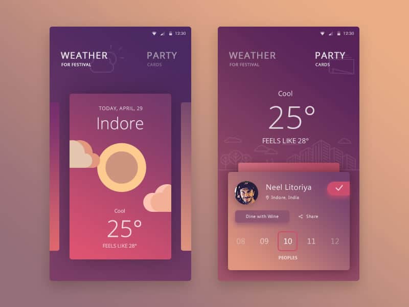
Dribbble is a real gem for finding design inspiration of all sorts. We can get new ideas for our next design project and learn from the masters, which is a proven way to becoming a better designer. This month, I stumbled upon this Personal Festival App concept by Prakhar Neel Sharma and was blown away by the beautiful mobile UI before my eyes. The color palette is gorgeous and I love the wonderful use of gradients. The party organizer app combines weather app functionalities for picking the perfect spot for outdoor functions.
5. Lunar by Fortyfox
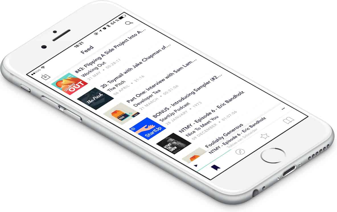
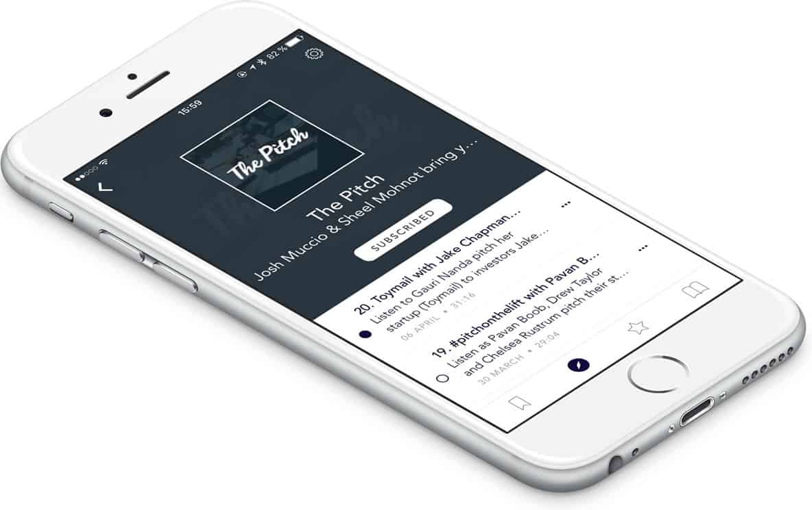
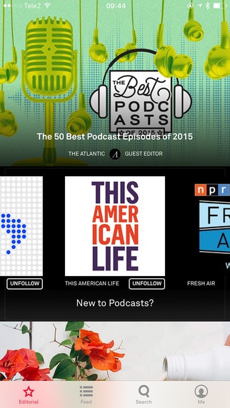
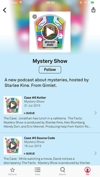
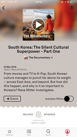
Being a more visual person, I’m not much of a podcast listener but it always strikes me as a great way for one to pick up on the latest discussions and news while on the go. If I had to pick a podcast app, Lunar would be quite on top of the list of options. It has a beautiful mobile UI sporting a clean, minimalist design. You can stream your favourite podcasts, discover and subscribe to new ones based on your interests. The feature-packed app is elegant and makes for a great podcast listening experience for all.
Get Lunar on iOS.
6. Airtime by Airtime Media
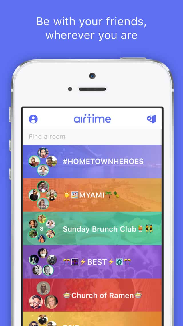
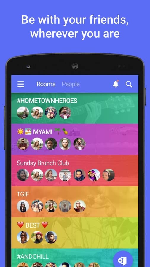
Serial entrepreneur, Sean Parker, has relaunched Airtime, the former chat roulette website that unfortunately fell flat. Airtime has been revived as a mobile chat room for groups of friends to experience real-time content with each other. The idea of the app is to simulate what it’s like to be in the same room as your favorite people, even though you might be miles apart. The app is huge, full of features and can be a little daunting for new users. But the excitement of virtually sharing space and time with others ie. hanging out can be very appealing. Not to mention, the beautiful mobile UI filled with vibrant and fun colors that make the app a pleasure to use.
Get Airtime on iOS and Android.
7. Google Photos Redesign Concept by Florian Schulte
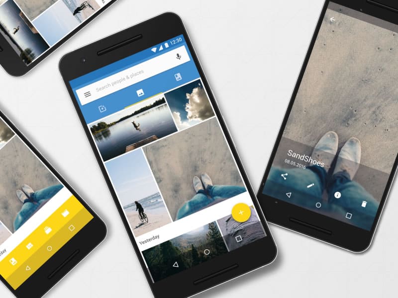
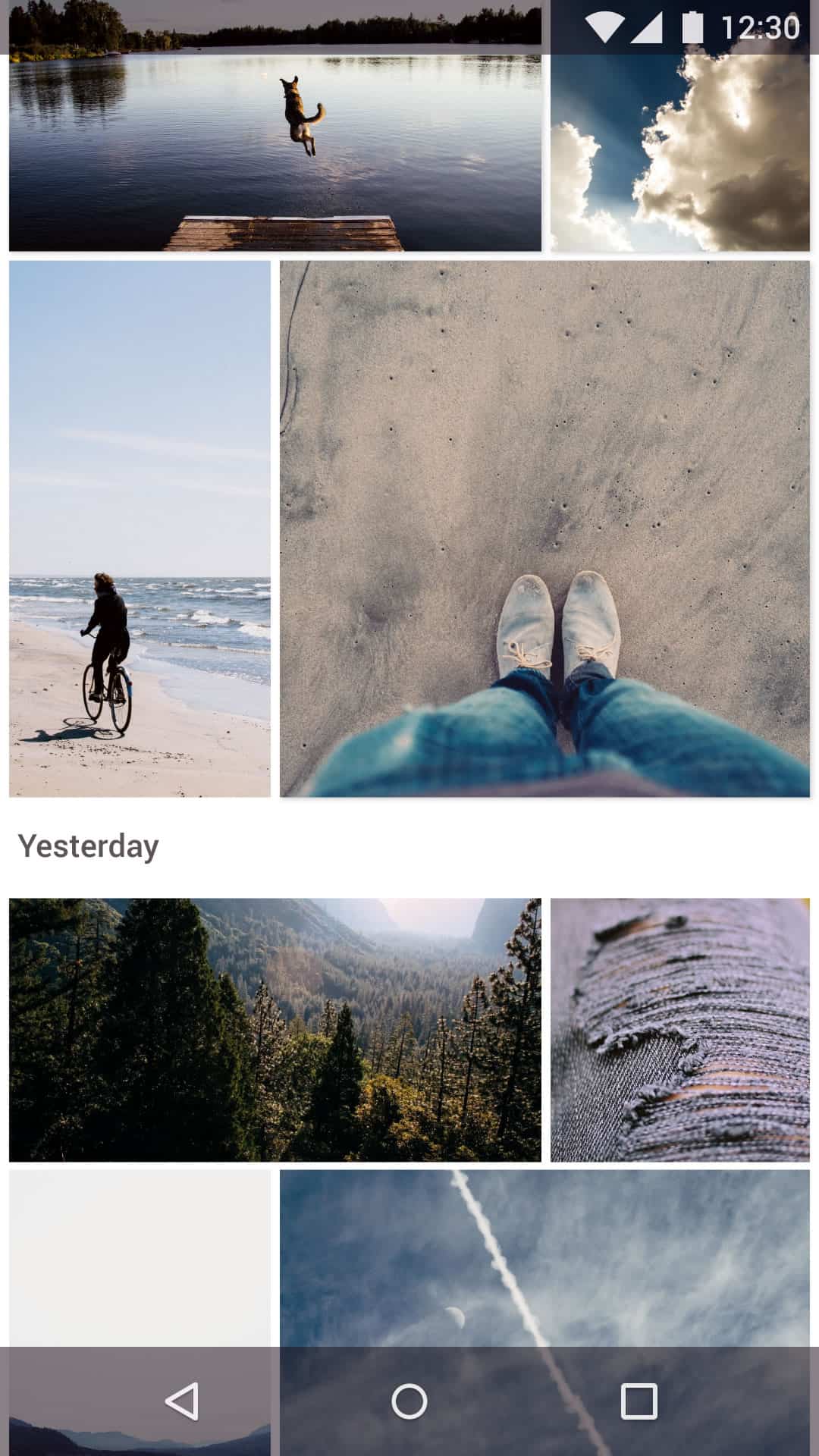
The thing about Google’s Material Design is that while it provides a much-needed unified user experience across Android-powered devices, it also tends to make most apps look and feel exactly like Google’s apps. Which is no crime on its own but just looking at the range of apps by Google, one can’t help but think that perhaps some could use a little spicing up. This lovely find on Dribbble does just that with Google Photos. While maintaining the standard Material Design style, Florian Schulte has done a wonderful job to spruce up the app. The redesign concept’s beautiful mobile UI comes with a different type of list view for the feed and full screen image view with overlay menu options.
8. Aurora by Opinion Podcasting Ltd
Another podcast app that would make it into my list should I pick up the habit of listening to podcasts, Aurora is an example of beautiful mobile UI of a rather classic and delightful sort. There’s nothing unconventional or particularly bold about the app design but it simply works for the best experience. And sometimes, that which simply works is just what we need and want from a beautiful mobile UI. The sliding horizontal carousel and full screen overlay together with the clean layout and blurred background effect are common UI elements we see in many apps. Yet, they all come together very nicely in Aurora, making it a pleasant experience to use the app.
