We got together with Dmitry Tsozik, Creative Director of SFCD, a digital design and app development firm with offices in New York and San Francisco. SFCD is specialized in supercharging startups, helping enterprises innovate and working with other agencies. The SFCD team has worked with many big players in the industry and their apps are being used by millions of users across the globe. As Creative Director, Dmitry has worked in most of SFCD’s projects and acquired years of experience and expertise as a designer and creative thinker. Here’s what we learnt from him.
Thanks so much for sharing your time with us! Let’s start off with an introduction to who you are and what you do.
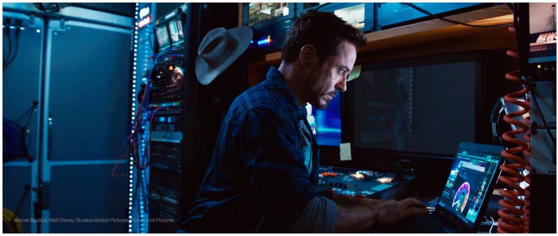
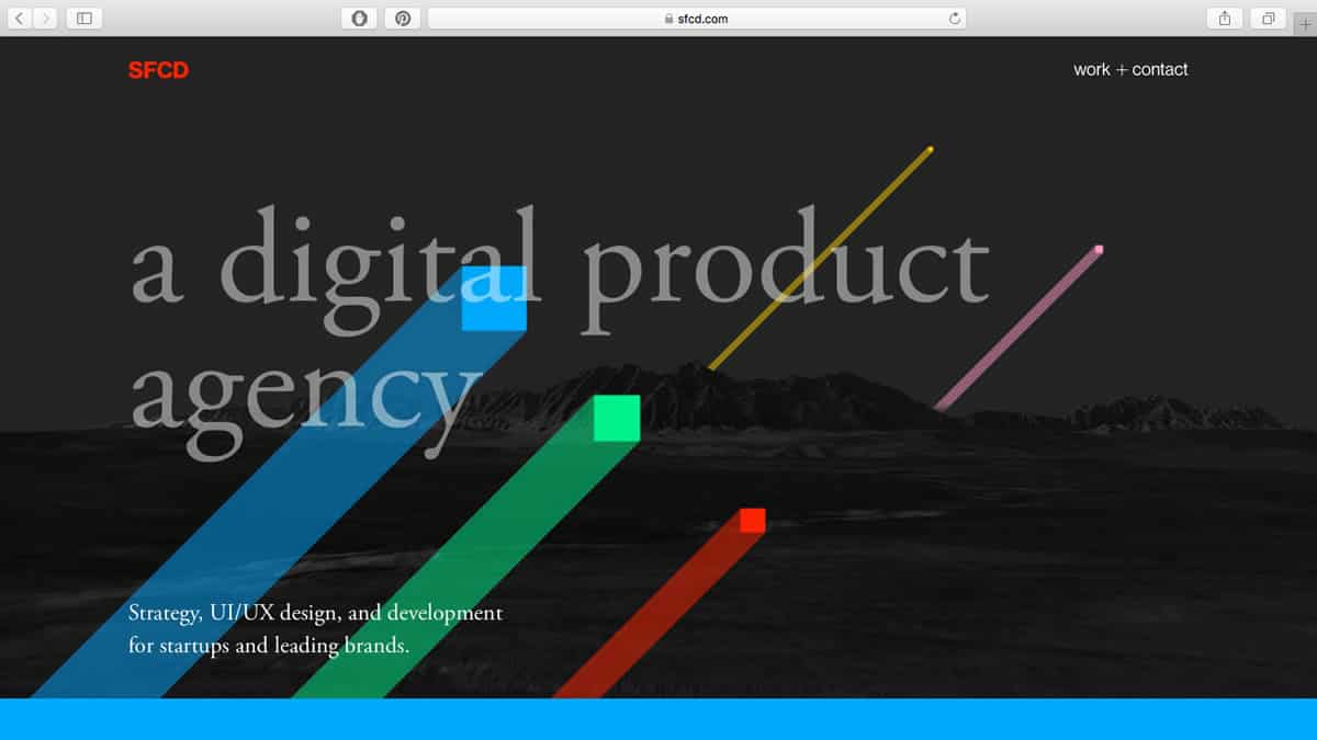
Hello, Proto.io community! I am a Creative Director at SFCD, responsible for the quality of our design work, so I basically work on almost all SFCD projects in some way. Usually, I prefer to work on conceptual and visual design, generating ideas and finding design solutions. I started my journey with SFCD (formerly SoftFacade) in 2009 as an icon designer, polishing my production style and incorporating photography, 3D, video, animation and different new tech in our workflow. Some of my latest works include sfcd.com (in collaboration with Anton Zykin and the rest of our team), SpeedTest GUI video in Iron Man 3, and the design of our own app Miranda.
What was one of your first designs? Looking back today, what would you do differently?
My first design for a real client was a little webpage for my hometown in Siberia, that I designed and my friend developed in 1999… or 1998. What would I do differently? Probably nothing, because I was having so much fun working on it, and having fun is extremely important when you learn new things. I applied Photoshop bevel effect and drop shadow to every single button on that page, and someone paid me for this job; you can not do that today :)
Could you tell us more about your design process?
I think the process is more or less similar among all professional designers, since design is an applied logic, and there’s one logic.
The most important tool for a designer is ‘Why?’ And my process starts with asking as many ‘why’ questions as possible. Identifying the core of a problem is crucial for designing a proper solution. That process usually includes user and stakeholder interviews, studying a particular field of knowledge, market research and competitor analysis.
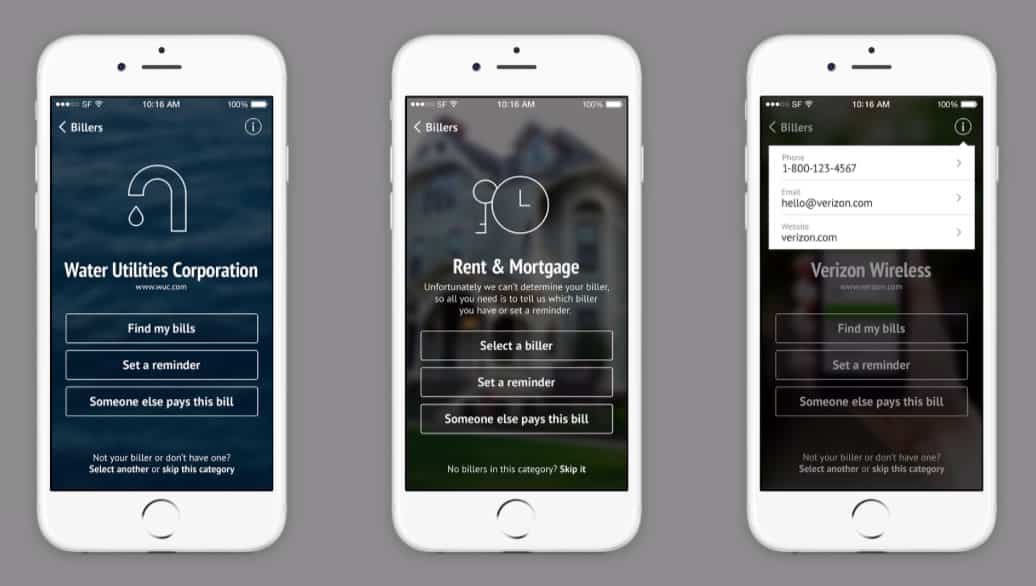
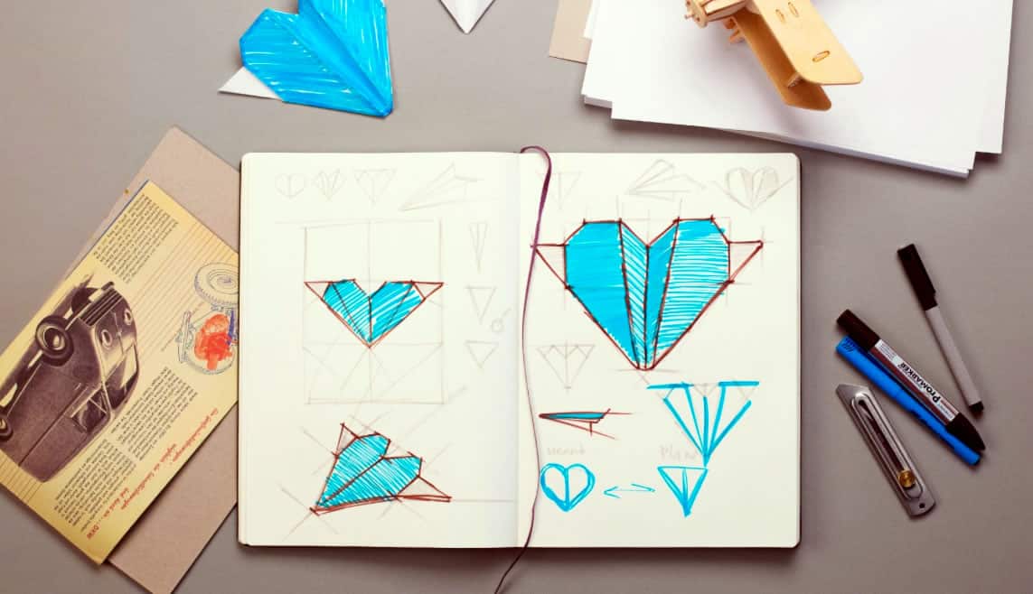
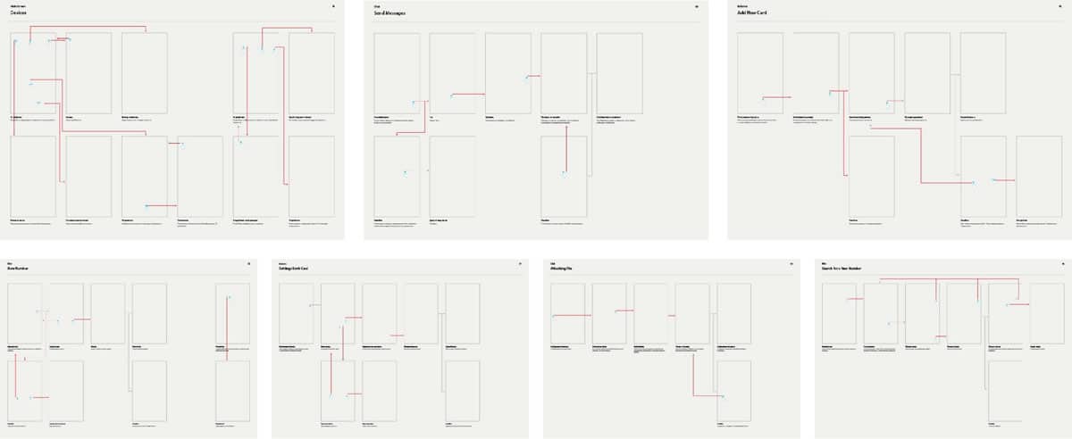
After that, you need an attack plan. You know, they can plan a movie for 5 years, and then shoot it in 5 weeks. And only then you draw the first line of a blueprint — the application flow starts as a bunch of empty interconnected rectangles, then you put a wireframe inside every one of them. Usually, when we have the first iteration of wireframes we build a prototype out of them. Later, those wireframes would be replaced with final renders of mockups, animations and more detailed prototypes.
And the process ends with detailed documentation for developers, in a form of a visual style guide, fully featured prototype, detailed application flow and descriptions for animations.
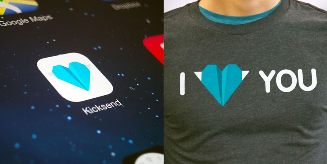
How important is prototyping to your process and from your experience, how should designers incorporate prototyping into their workflow?
Days of static mockups are gone. These days, we prototype everything from the beginning of our process. In many cases, we would run a series of user testing and that’s also why you need to build and update prototypes. Ideally, as soon as you have the first iteration of the application flow, you should build the first iteration of the prototype. Nothing uncovers UX problems better than real hands on experience.
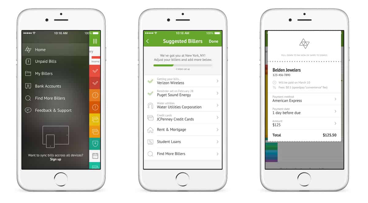
What do you think are some of the most important things to consider when designing for mobile?
Obviously, you should consider human anatomy. Even big players like Google adjust their UI/UX principles when addressing problems caused by the big screens of modern mobile devices. Users don’t care about design guidelines if your product is not comfortable to use.
Also, don’t forget about where and when users would interact with your mobile product. In many cases, you should optimize mobile experience to one hand (or even one thumb) operation, for users standing in a moving subway car. If your app is going to be used outside, you should adjust your UI to be visible in a bright sunlight.
And please consider actual user goals first. Users don’t want to think about your design ideas, or that fancy typeface you’ve wanted to try, or how smooth your pull-down-to-refresh custom animation is. Users care about their goals, they want to do their thing, fast and easy, reach their goal and forget about UI/UX.
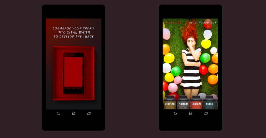
What kind of new technologies for design are you currently exploring? And why those technologies?
Not a new technology per se, but I’m trying to learn how to code my UIs. My belief is that everything user can see/hear/experience in a product is a part of UX. So ideally I would love to ship a complete front end solution — design, animations, code — as “design”. I’ve started with ActionScript in Flash many years ago, html/css later, switched to After Effects’ scripts for animations but now, I want to focus on dynamic app prototypes and front end design. Proto.io gives you good amount of control to start with.
As a side note, I’m all into VR/AR right now! Finally, after my whole life, I can design for something without a rectangle screen limit.
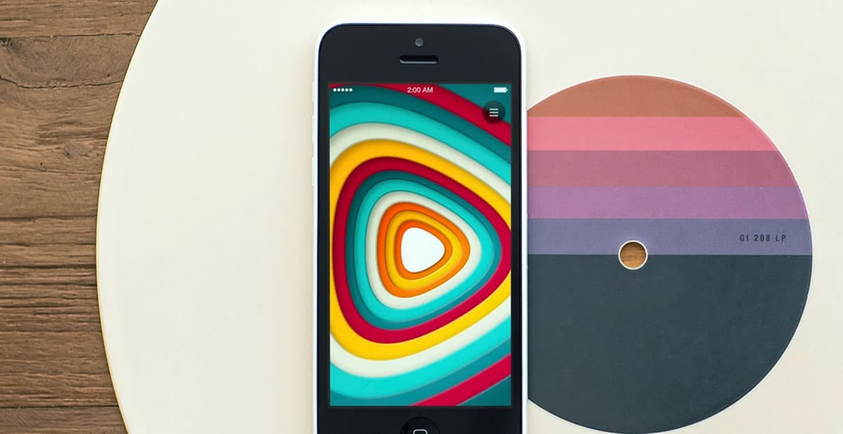
How can designers go from being ‘good’ to ‘great’? What makes the difference?
No magic there. Just honestly try to find the best approach to every little detail. Including your process of identifying those details. Study great masters, you’ll see that all they do is applying that rule. ‘Good’ is unacceptable. If something can be done better, why waste your life on anything else? But also, remember that a finished project is infinite times better than an unfinished one.
Any words of advice for aspiring UI/UX designers?
Take a look around. Everything you see, use, own, want — was designed by some person like you. They all had lives, problems, bad days, bad projects. None of them was gifted with some kind of magic, talent is a myth for lazy people. As Jake the Dog said: “Sucking at something is the first step to becoming sorta good at something”.
Learning from the masters is one of the first steps towards becoming a better designer. What comes after is the dedication to keep on designing, iterating and testing with real users. That’s where Proto.io can help you. Easily create fully interactive prototypes, no coding required. Download the prototypes to your devices and test them on the go. Sounds good? Get started with Proto.io today.
