Art is your foundation, whether you practice it or not. Scientific evidence points to art, along with our burning desire to share our ideas about art, as the defining human characteristic. What that means to an app designer is that artistic principles should guide you in connecting with and motivating the widest possible audience.
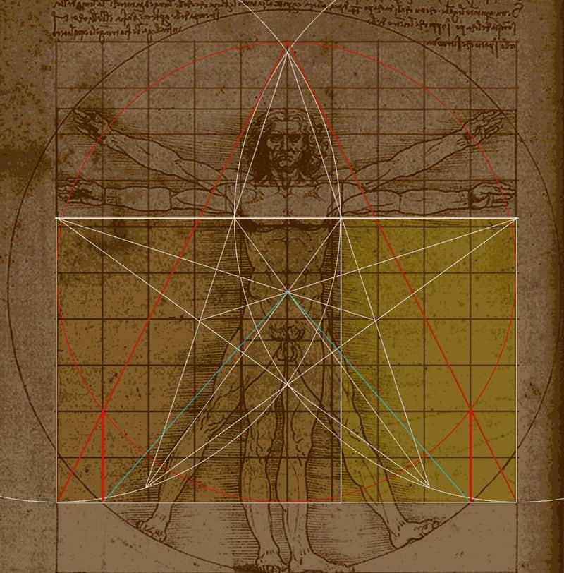
Fortunately, you don’t have to study art history. Experts in the field have distilled approximately 30,000 years of experimentation into three core principles. The work of Marcus Vitruvius is the best place to begin. He is the classical Roman engineer who is considered the father of architecture and the inspiration for the Premiere Master Builder in “The Lego Movie.” Vitruvius guided the aesthetics of Leonardo da Vinci, Michelangelo and many other amazing artists. You can put all these masters to work in crafting a higher-quality UX for your app. That’s quite a pedigree.
Here are the three Vitruvian principles of fine art and how you can apply them to UX design.
1. Utilitas: Make it useful. Throw out anything that inhibits usability.
User frustration is fatal. Mobile users are under greater time pressure and will abandon apps that slow them down. UI is only a small part of UX, but it is the most important aspect in achieving positive adoption rates by new users. Testing is crucial at this stage because what may be intuitive to you could confuse your target audience. Apps may have to be complex out of necessity, and that’s fine as long as your design patterns offer convenient walk-throughs and coach marks. Your goal here is for the UI to be virtually invisible. When the user goes to your app automatically, you’ve won.
(Source: Web Designer Depot)
Example: Many web and UI designers have turned to Sketch instead of Photoshop for its streamlined utility. Sketch is a lightweight app that simplifies design and rapidly renders web-ready graphics.
2. Venustas: Make it beautiful. Delight users and make them feel good while using your app.
Beauty is not as subjective as you think. It is a measurement of proportion, symmetry and a dedication to the removal of flaws. Also consider that “delight” involves more than simple happiness or pleasure. Delight involves evoking a deep emotional response that draws the user back into the work. While usability is concerned with UI issues, beauty has a more expansive quality, touching on every aspect of the experience. Take a look at the most beautifully designed apps on the market, and use them as templates for your own original design.
Example: Monument Valley is a tribute to imaginary architecture that would have delighted Vitruvius. Consider it a virtual primer in classical balance, proportion and the muted use of color.
3. Firmitas: Make it last. Design with an eye to changes on the horizon.
The big debate among app builders is Android vs. iOS. Each side has its benefits and drawbacks, but the simple answer is that everyone will eventually desire the best apps. Keep that in mind from the very beginning. Decide which audience serves the best interest of the app in the beginning and what will need to change for another platform. Keep an eye on wearable tech, and think how you will adapt this app to new channels. The Internet of Things is rapidly approaching, with all new devices and environments. Think ahead and amaze everyone.
The Essence of It All
It’s critical to think of art as more than decoration. Art must be a basic element of your construction if you want people to notice and spend time with whatever you’ve made. For thousands of years, art has been the study of attraction and engagement. Those two factors are precisely what your app needs to survive in an overcrowded market.


