It seems like every day, there is a new crop of UX design tools competing for the attention of freshly minted designers and veteran mobile app gurus alike. With so many options, it’s important to parse out which are essential timesavers and game changers, and which ones will simply take up space on your hard drive.
We asked five mobile app designers and entrepreneur what their favorite UX design tools of the trade are, and how and why they result in the best experience not only for users, but also for designers and developers. We were surprised by how many of the experts we spoke to felt their most important tools were not software at all — take, for example, the first tool we heard about:
1. Good old fashioned pen and paper.
James Clifton is a Senior Creative at Verb (@verbbrands), a London, UK-based digital creative agency whose work includes branding, websites and mobile apps for luxury, fashion and lifestyle brands.
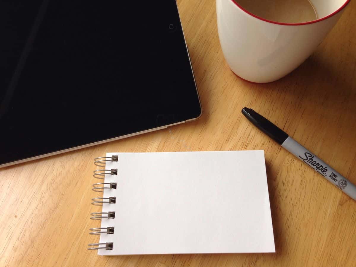
For Clifton, a creative process that ends in the digital realm starts in meatspace, with simple ink and paper: “I like to use simple Post-it notes and a marker when I’m scoping out and exploring things. There’s something about the lack of confinement and the roughness of it that just helps me to see things in a different way.”
If you find yourself stuck in a creative rut, there’s a good reason the “jotting ideas down on a napkin” trope has become iconic — it works! Try sitting down with a notebook and drawing freely for fifteen minutes, turning off your internal UX designer. You might find you come up with your best ideas this way.
2. A whiteboard — physical or digital.
Unless you’re a mobile app design and development team of one, collaboration will be an important step in your process. That’s why a simple whiteboard is one of the most important UX design tools in your arsenal.
Anna Boyarkina, Head of Product Marketing at RealtimeBoard (@RealtimeBoard), is a big believer in the “Eat your own dogfood” credo (for the uninitiated, “Eat your own dogfood” roughly translates to “If you create a product, you should be using it internally.”) RealtimeBoard is a digital whiteboard, concepting and collaboration tool, which she describes as “the one and only tool we use to visualize, map process, create hypotheses and discuss mock-ups before production and testing.”
So even if one or more of your team members (or clients) is working remotely, you can still get that whiteboard experience digitally during the initial concepting phase of your mobile app. Either way, getting all project stakeholders on the same page early on will save you a lot of time and frustration down the line.
3. Keynote, PowerPoint or another quick presentation tool for initial feedback.
While you’re still in the early phases of designing your mobile app, two of the best UX design tools might already be on your computer.
“I actually find that using something as simple and crude as Keynote is very helpful. It is quick, and makes it far easier to get an idea across,” says Clifton.
Michael Faddis, Director of UX at Chicago-based digital experience firm, Vokal (@VokalTweets), agrees. “With experience comes a better understanding of which tools to use, and when, particularly when it comes to getting things done quickly. And if you’re looking to communicate concepts quickly, I suggest sticking with a marker and whiteboard, pen and paper, PowerPoint or Keynote.”
With PowerPoint and Keynote, you can create and annotate a rough sketch of your layout, perfect for putting up on a projector or sharing a PDF that your stakeholders can mark up and send back. With that initial feedback, you can move into more powerful UX design tools to show a bit more detail.
4. Digital prototyping tools that emulate the final product.
For Clifton, just sketching out his ideas by hand gets him ready to move into prototyping. “When I’m creating the wireframes and exploring ideas for functionality and interfaces, to be honest, I often simply use photos of hand drawn frames, which I then pop into a digital prototyping tool like Proto.io.”
With Proto.io, you can create a lifelike digital prototype of your mobile app quickly, using a simple drag-and-drop interface and a robust library of user interface elements. The end result? A realistic idea of what your user experience will look and feel like, and a great way to get more detailed feedback from your testers.
To see how realistic these prototypes can get, check out the Proto.io demo page or sign up for a free 15-day trial to take it for a spin, yourself!
5. Testing your UX design: KISSmetrics, Inspectlet and Optimizely.
For Boyarkina, the most invaluable UX design tools come into play during the testing and QA phase: “We are real sticklers about user experience and proper features management, so we correlate any testing with a range of visual and analytical applications. They allow us to identify exact user experience, map processes and analyse usability.”
Boyarkina walked us through three UX testing and analytics tools RealtimeBoard uses on a regular basis:
- KISSmetrics (@Kissmetrics).“This is one of the best analytical applications for tracking any key user events,” says Boyarkina. “Reports can be self-adjusted for multiple purposes to see funnels, cohorts or any other parameters.”
- Inspectlet (@Inspectlet). Says Boyarkina, “Inspectlet is a service that displays user sessions records. It really helps to match your expectations to the user’s reality.”
- Optimizely (@Optimizely). “Optimizely is an A/B testing service we love,” says Boyarkina. “It allows you to customize testing sessions, set targets and follow clicks. We use it to test any update for our site.”
With thorough A/B testing and quality assurance, you can fine-tune your user experience based on the feedback of your users while making sure your app is clear of any bugs or usability issues. If you’re as big on testing and analytics as we are, check out 11 Development Tools that Take the Sting Out of Testing Mobile Apps.
6. Your own two hands.
Holly Ferro is the Owner of 5 Nerds Software Development, a design and development agency with services ranging from design and branding to developing mobile apps from the ground up.
“Your own hand is probably one of the best UX design tools you have. You may be thinking, ‘Wait, what?’ but let me explain.
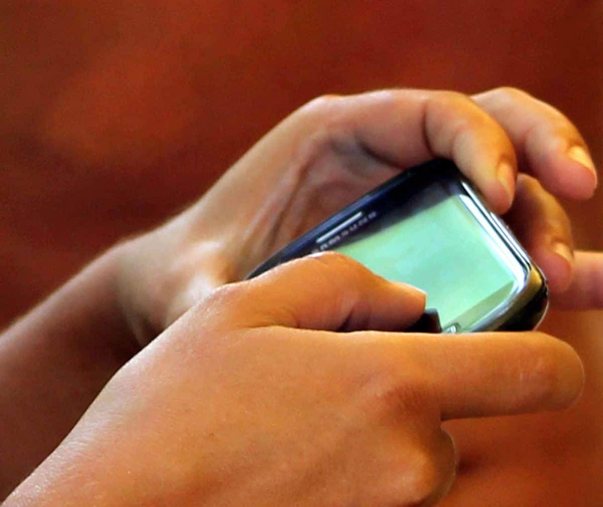
Your user experience is supposed to feel natural and familiar. So as you’re building your app, use it as it’s coming together. And without thinking too much about your set of icons, buttons, frames, etc., think about what your fingers feel like they should do to take the next step in the app or run some function.
Your hand is the greatest resource in this sense. It’s been using apps and software for years, and knows exactly what it should be doing. How many times have you used an app and thought, ‘Hmm, that’s a weird way to accomplish this task.’ That’s your hand telling you the UX is wrong! Listen to it — it will point you in the right direction (pun intended.)”
7. Your grandmother.
No, we’re not saying your grandmother is a UX design tool. But she is a valuable resource, says William Hogben, CEO of Express Checkout (@ExpressChktApp):
“Great user experience shouldn’t rely on the user being a digital native, but these days it’s hard to find someone who isn’t and still wants to test out your app. Enter your grandma, who’ll do it because she loves you.
Express Checkout makes a grocery app that’s designed to save everyone time at the checkout. We wanted the app to appeal to all audiences, so we focussed on usability to no end. We tested using focus groups, and we hired people to try prototypes and followed them around the store, filming their reactions, recording the phone screen — the works.
What we didn’t realize was that all those testers were hired online, and that even though we’d tested a variety of generations, our older testers were self selected and still very comfortable with mobile apps in general. But once we released the app into the wild, we received feedback we didn’t anticipate.
Thanks to the help of our grandmas, people really love the user experience. We get comments on how easy it is all the time, and many of our users are seniors. For quite a few, it’s the first app they’ve downloaded and used beyond the ones that ship with the phone.”
Is Your UX Design Usable for Everyone?
Clifton agrees that getting your app in front of multiple, diverse people is crucial: “Personally my ‘tool’ of choice is simply people. I think the thing that really opened my eyes and helped me to understand the sheer breadth of different user’s understanding of products was to simply put it in front of as many people as I could.
You may be surprised by the results, he says. “Even if you have a full slate of UX design tools, it’s very difficult to actually analyse user experience without the end users. The first time I did this, I was really surprised at the amount of people that either couldn’t find their way around the app, or just simply didn’t know what a certain icon meant or what a button did. We always tend to presume things, and it’s such a fatal trap to fall into.”
Diversifying your test audience is key to success, Clifton explains. “Simply putting your design in front of as many people as you can find, from all different backgrounds and different levels of knowledge of your product sector, is essential. Only this way will you truly know what’s going wrong — not just what, but why.”
What Are Your Most Essential UX Design Tools?
As these mobile app experts show, having the right UX design tools is not nearly as important as being creative, putting in the effort and knowing when to use what. However, having the right resources in your kit is still critical, whether you’re a novice entrepreneur or a seasoned designer.
What would you add to this list? What software (or non-digital tools) would you recommend to someone just starting out, and what would you recommend to veteran designers looking to hone their process a bit further? Let us know by tweeting us @Proto.io!


