What’s the value of a digital prototype? Having your user experience completely mapped out — from page transitions to interactions — prior to writing the first line of code can not only save you precious time and budget, but it can also avert a potential crisis. From mobile UI designs that look good on paper but translate poorly to the screen, to project management SNAFUs that wear down team morale while hacking away at the quality of your final product, the headaches your interactive prototype can solve are numerous.
Let’s take a look at six invaluable ways digital prototyping can save your mobile UI design, according to designers, developers and entrepreneurs:
1. Your prototype helps get all stakeholders on the same page.
What’s the one uniting force between clients, account managers, designers, developers, testers and users? The digital prototype, says Sarah Doody (@sarahdoody) a UX designer in NYC who also publishes a weekly UX newsletter:
“In mobile app design, prototyping is critical because it helps teams rapidly bring ideas to life so that everyone involved can vet and contribute to the idea early in the product development process. A big challenge teams often face is too much hypothetical talking and debating. A prototype allows a team to talk about something tangible, which fosters better discussion, ideas and collaboration.
The balancing act of a mobile UI designer is to identify the business goals or opportunity with what value the app could provide to to the user. Once a prototype is in place, it serves as a tool to validate ideas with users, as well as a conversation tool to help everyone working on the project get on the same page about expected features and functionality.
If prototyping is removed from the mobile UI design process, companies end up investing thousands of dollars and hours into creating a fully functional app that will fail to provide value to the end user.”
2. Your prototype can prevent HR disasters between designers and developers.
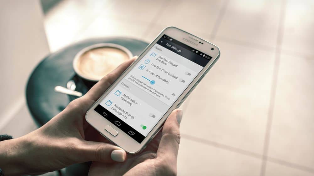
Can designers and developers ever be friends? According to Peter Murphy, Co-Founder and CEO of Pocket Prep (@pocketprep), an e-learning app platform offering study solutions for standardized tests and professional certifications, they absolutely can
— provided the designer creates a true-to-life digital prototype.
Without that prototype, says Murphy, the relationship between the two can get dicey:
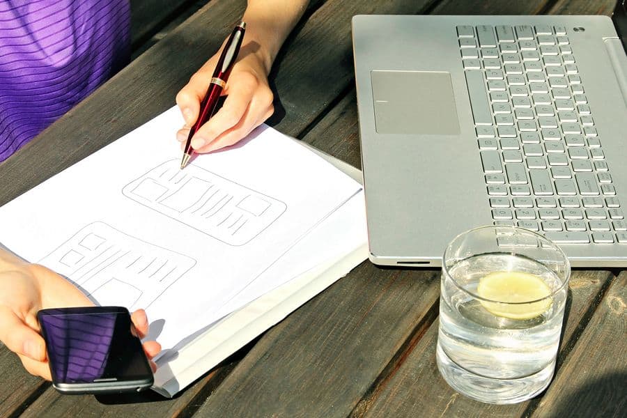
“Prototyping helps build cohesion between the UI and UX. An interactive app prototype allows the designer to express more than just how the app will look. It also lets him or her express the way the app should flow. Often times, companies on a budget will forgo the prototyping process in favor of simple wireframes or collections of notes, which often include hand sketches and diagrams. The designer’s good intentions are there, but they fall flat when the development phase begins.
In our recent Android app overhaul, the app was mocked up using an online prototype service, and the new design looked awesome. Our small team had many questions about what would happen with a few of the missing screens, but we were reassured by the design team that the design, gestures and flow would follow Android best practices. Oops! When the design team handed off the prototype to the development team, all the strings came loose and details at the very core of our app business were missed.
Creating an interactive prototype, regardless of the app’s intended level of complexity, can prevent so many design and development disasters. Those still wireframes and lifeless mockups can suggest the app is more straightforward than it really is. What does tapping a user portrait do? What about gestures? Where does tapping the back button take the user? The devil is always in the details, and it’s only when you take the time to map out the user’s experience that you see just how intricate the project requirements really are.
‘It’s Like the Designer Just Doesn’t Understand What a Developer Can and Can’t Do!’
Since Pocket Prep is based in the tech-booming city of Seattle, we’re often immersed in lengthy app development conversations. With the launch of iOS 9, we’ve recently been bombarded by questions about our upcoming iOS app design overhaul. A friend, who is a developer at a local gaming studio, happened to blurt out, ‘Developers hate designers! We always fight with each other; at least where I work. It’s like the designer just doesn’t understand what a developer can and can’t do!’
This is the exact reason why a detailed, fully-finished app prototype is necessary. Going without it is like a restaurant patron ordering half a meal and expecting the waitress to telepathically know everything else that they want. While interactive prototypes are absolutely necessary, they are no replacement for a solid understanding of an app’s limitations. There will always need to be synergy between design and development teams. The key is to prevent a disaster that sets the team back and would otherwise create lengthy and avoidable rework.”
3. Your prototype can spare you from creating a mobile UI design your client or users hate.
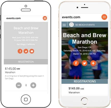
Cassie Byers is a Visual Designer and Kenna Hasson is a UX Designer at Events.com (@eventsdotcom), an online marketplace uniting event organizers and event participants in a single place. For them, the greatest value of a digital prototype is getting detailed feedback from clients and testers.
Says Byers, “Prototyping is important to me as a mobile designer because it’s the best way to fail. You can do as many ‘bad’ prototypes as you want — they help everyone get on the same page. Diving straight into visual design or development does not lend enough time to think about every possible scenery.”
Hasson adds, “There’s no better way to gather honest feedback. People are less hesitant to voice their concerns when they’re looking at something they think is still in progress, and not final.”
Byers notes that the prototyping process has helped her avert UX crises several times. “That’s what prototypes are for, after all. I prefer workable prototypes so that all of the interactions can be thought out. This is also a great way to do user testing before the final mobile UI design.”
Hasson agrees. “From button placement to interaction design, we identify user experience issues in prototypes on a daily basis.”
“Removing interactive prototypes from your mobile UI design process is like a contractor trying to build a house without floor plans,” says Byers. “The framework needs to be laid out before the details can be added.”
“It would be a disaster!” Byers adds. “Without prototypes, we would have no way to collaborate over interactions, designs, or conduct any feasible user testing.”
4. An interactive prototype can save you from budget and bandwidth disasters.
Mobile app account managers, take heart: prototypes can make your life much easier when scoping projects for a team with strained bandwidth. This is one of the major payoffs for Roger Dickey, CEO of Gigster (@trygigster), an on-demand software development firm:
“In my experience, prototyping can save hundreds, if not thousands of dev hours. Many technical founders prefer to do what they’re comfortable with, which is to sit down and write code. If you can instead quickly build a clickable prototype, then you can put your product into the palm of potential users and get immediate feedback. This lets you iterate until you have something that gets people really excited — then you can sit down and focus on writing beautiful code.”
5. Your prototype can help you overcome knowledge gaps.
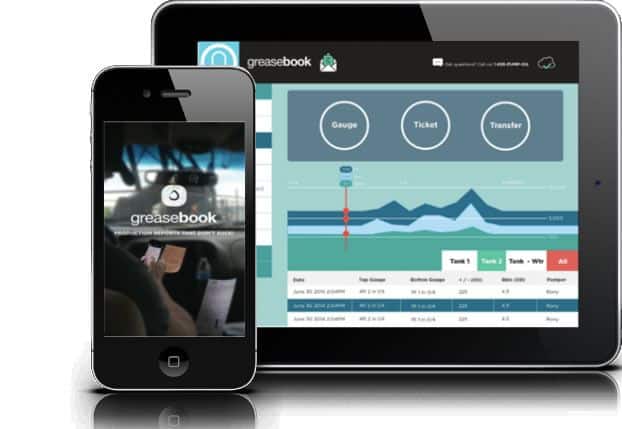
Greg Archbald is the founder and CEO of GreaseBook (@GreaseBook), an oil and gas tech company whose clients range from small businesses to some of the country’s largest independent operators. In such a competitive industry, Archbald says, prototyping can save your life when it comes to understanding what your clients are asking for:
“Although we work in very close conjunction with the oilfield, we are by no means experts in the oilfield. Everything we know we absorb over the phone or online, through conversations with clients.
Prototyping has saved our butts more times than you can imagine. By using prototyping tools, non-coders (like myself) can put together a an app that looks and works exactly how our app is planned. Not only does this give us great turn around times with our clients (usually next day!), but it has thwarted some very nasty and very expensive disasters. Communication with developers becomes a breeze because you’re showing them a finished product.
All this prototyping helps us stay ahead of the competition — competition that is usually much larger and much better funded than we are. And, any new project we start on the side can be prototyped (and sometimes sold) for very little money and time invested up front.
With a solid prototyping software, you no longer have excuses. All that stands in your way of growing a business (or starting a new one!) is your imagination.”
6. Sometimes, a prototype can even help avert a safety disaster.
Mobile apps aren’t always just ways of making life more convenient or entertaining. For David Sinkinson of AppArmor (@AppArmorMobile), a campus safety and security service, testing a mobile UI design prototype is an important component of keeping people out of harm’s way.
“Our company often uses prototypes to test out our products, but we actually provide them to our customers to vet UX and design issues. For instance, App Armor creates custom mobile safety applications for university, college and private institutions across Canada, the US and Australia. However, each app is customized to meet the need of that unique community. This is true in both the aesthetics (logos, colors, etc) and the literal wireframe.
It’s absolutely critical we test these prototypes, as our apps are meant for use in an emergency. Seconds are valuable in emergencies, so if the mobile UI design is not optimized to be as user friendly as possible, the user is made more at-risk. On a less serious note, building the design in collaboration with the partner institution also tends to guarantee higher downloads.”
Smart Prototyping is Smart Business
A solid digital prototype of your mobile UI design is a crucial component of your app’s overall creative process, but what makes for a good prototype? The more it resembles what will be the finished product, the better. That means nailing not only the overall flow and design of the app, but also making the animations, transitions and interactions as lifelike as possible. That way, your developers know exactly what the beta should look and feel like when they’re done.
If that sounds like a tall order, or difficult to achieve, it doesn’t have to be. Whether you’re a veteran mobile UI designer or an entrepreneur with little to no experience making apps, the right tool can make prototyping a snap. With Proto.io, you can create a living, breathing digital prototype of your mobile app in minutes using a simple-to-use drag and drop editor and a rich library of ready-to-use digital assets and interactions.
Ready to get started? Sign up for a free 15-day trial of Proto.io today.
