There may not be a more perfect example of gorgeous visual design than Mother Nature herself. She is effortless. Powerful. Spontaneous. She even switches up her look a couple times a year. She is amazing in many ways, from color to symmetry to adaptation, so if you are in search of some design inspiration, she should be your go-to.
The problem here is that most of us are stuck inside for a large portion of the day. We might get into work between 8:00 and 9:00am, starting our commute as early as 7:00. By the time we leave work, it’s at least 5:00, getting us home around 6:00. And then there is dinner and kids and baths and dishes. Before we know it, it’s 10:00pm and time to get ready for bed and we didn’t spend any time outside.

There is a copious amount of research that suggests sitting all day is hazardous to our health. Bodies weren’t meant to sit for 8-10 hours a day. So let’s fight our sedentary lifestyles (and diabetes) together by taking a brisk walk to get your blood pumping. And while you’re out there, let’s look at some of the things visual designers can learn from your time spent with Mother Nature.
The Weeds Steal the Water
You’re out on your lunchtime walk. As you go across the street to the park and head to the path that goes around the lagoon, you get excited about staring at anything other than your computer screen for the next half hour. You see the tall trees, the growing grass, and the flowers opening wide to bask in the warm rays of the sun — and an ugly weed next to the lilies that wasn’t there yesterday. It’s like it came out of nowhere.
Have you ever noticed that weeds grow faster than flowers, or herbs, or literally any kind of plant you want to grow? That’s because weeds fight the good plants for water and they generally win. They’re bullies. You’ll see them periodically throughout the summer — weaving their way through the landscaping paper designed to subdue them, popping up from the mulch, and stealing the spotlight from the soft, colorful blooms. They’re greedy little buggers, aren’t they?
Weeds are important details for visual designers to watch for precisely because you don’t want them around. Weeds are distracting. They soak up attention intended for real content. It doesn’t matter if they are obtrusive ads, a barrage of menu options, a messy UI, pop-up “helpful” tips, or any other distraction — if it distracts a user and prevents them from getting to where they want to go, it needs to be plucked from your garden.
Tablets provide a bit more leeway because of the additional screen real estate, but people using your app on phones will have a harder time fighting through the weeds. Whether it’s through a static navigation bar or a pop out menu on the side, make sure that your UI allows for information to be easily accessible. Users want to get in, find what they need, and get out. Be a cognizant UX visual designer — don’t let weeds clutter up the screen.
A Pop of Color Might Do the Trick

Take a look at this photo. What is the first thing that you see? Probably the guy on the bike wearing a red shirt and helmet, right? But why him, rather than the fence post on the right? Or the clouds in the sky? You could argue that you notice him first for any number of reasons: he is the only object that isn’t natural to the scene or he is in the forefront of the photo.
But the biggest reason he stands out here is that he’s wearing red — a color that does not appear in any other area in this photograph. Not to mention, of course, that red is a color that demands attention. We would see him even if he were further down the path simply because of what he is wearing. Visual designers, take note.
We’re not advising that you use red in all your mobile apps, but we are saying that you should use color to your advantage. Is there a new feature that you want to highlight? Or a new tab introduced into your toolbar? Experiment with the background color behind the text. A subtle modification like that could make the change stand out and get the user to notice.
The devil’s in the details of UX visual design, so be sure to think about your mobile app from the user’s perspective. You will see any changes right off the bat because you are the one making them. But as we’ve discussed before, users aren’t necessarily looking for “new things” — they are looking for the thing they need, which means that your exciting new feature may be overlooked.
Adding a pop of color might just be the thing that makes the user pause long enough to recognize that something is different. Color is a powerful tool in your visual design arsenal, but it can also actively work against you. Use it wisely and it will be your best friend.
Sound it Out
On your lunchtime walk, you will hear a lot of different sounds: birds chirping, the wind blowing through the leaves, squirrels chasing each other around tree trunks, perhaps even woodpeckers tapping around for bugs. If you listen long enough, you might notice that Mother Nature has a way of developing its own rhythm.

We know, we know. You’re visual designers. You don’t care what sounds your app will make. That’s someone else’s decision, right? You handle visual design. So why are we even bringing this up? Because mobile devices make a lot of sounds. When we type, we hear little clicks. When we tweet, we get a little chirp. When we pull down to refresh a page, we might hear a pop. These are default sounds that came with the OS, therefore not utilizing sound means neglecting a basic feature.
It’s important to note that sound is vital to some and distracting to others. Some people cannot concentrate at work without listening to podcasts or music, while others need absolute silence. This may vary depending on the type of app or even according to age — kids might want to listen to the music of Candy Crush, while adults mute the sound because it makes them feel childish (or they don’t want their boss to know what they are doing).
Adding sound effects or sound support to your app could be helpful. For example, the Fitbit app supports music, allowing users to access a playlist without needing to switch between apps — a feature that could be incredibly useful for people who are mid-run and need to hear that hype song again to push up that next hill. The Etsy app sends a push notification when your order ships, accompanied by a sound. The Sell by Etsy app acts similarly, using a cash register sound when you make a sale.
Sound effects can be satisfying (that cash register ring never gets old). They can take a mobile app experience to the next level, which means that visual designers should think about sound when they are working on mobile apps. But again, not everyone appreciates their genius, so don’t forget to include a mute button somewhere in your visual design.
Balance and Symmetry
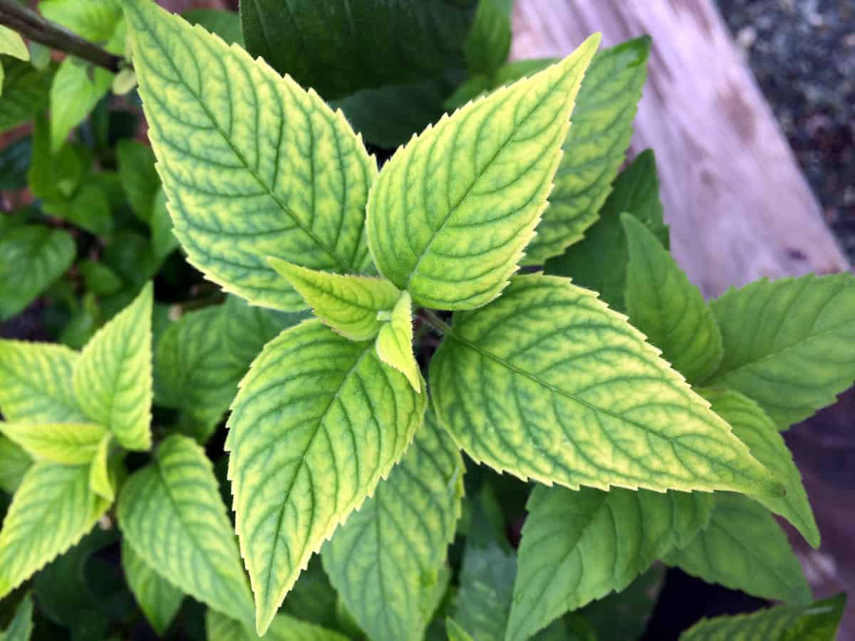
There are certainly exceptions, but for the most part, nature is pretty symmetrical. If you look at the photo above, the leaves on this plant are directly opposite each other. As you know, this isn’t always the case, as some plants grow their leaves alternatively. Even in whorled patterns where the number of leaves is odd (as opposed to even), they are situated in a way that keeps them balanced.
Look also to each individual leaf. Each side looks basically like the other, with a few minor differences that (magically) even themselves out. The greens deepen where the veins are and the edges are perfect little teeth. It looks effortless.
Mother Nature teaches visual designers an important lesson here: symmetry is easy on the eyes. It’s even. It’s satisfying, in a strange way. Because it surrounds us everyday, we almost expect it. So when visual design is unbalanced, it throws us off.
All this goes to show that UX visual designers have a tough job. After all, it takes a lot of effort to make something look effortless, but symmetry isn’t a decision you need to waste time thinking about. It’s a simple thing you can do for your user to make your design more visually appealing and prevent app fatigue too early.
Survival of the Fittest
Sometimes by rivers or creeks, you’ll see trees jutting horizontally outward and then making a near 90 degree turn to go straight up. Or maybe the trunk is growing diagonally, but all the branches are pointing directly toward the sky. It looks weird for sure, but it’s also pretty amazing.
The trees growing at a diagonal are probably doing so because there is (or was) a larger tree in its path above it. It might look like like the Leaning Tower of Pisa, but it’s really just doing what nature does best: it’s surviving by reaching toward the sun.
Charles Darwin first taught us this lesson — that only the fittest will survive. Now, the theory he was referencing is far more complicated than mobile app design, but the thought process holds true in many situations and visual design is no exception. Only the most adaptive (and the best) will be in it for the long haul, so visual designers should heed this warning as well.
Trends in every industry shift over time, whether it’s web design, fashion, or manufacturing. Cars from the 60’s look like boats to us now. Web pages from the 90’s look amateur and boring — and don’t even get us started on 90’s fashion. It’s important to keep our products fresh and clean, so for mobile app designers, that means keeping the visual design in line with trends — even if that means ditching a well-loved design of the past.

Find Inspiration in New Places
Visual designers all have their own tricks for breaking through creative slumps, but sometimes, you might find that old faithful isn’t cutting it. There are plenty of places to find inspiration, but we think that good ole Mother Nature is the perfect place to start. Get up from your desk and take a brisk walk. You’ll get your blood pumping in no time, which increases oxygen to your brain and will surely get those creative juices flowing. If you don’t have a park near work, there’s nothing wrong with taking a walk around the block or to your favorite building in the city.
The path to success is rarely the straight line we anticipate it will be. Oftentimes, it’s twisty and winding. It’s full of sharp turns and frequently, uphill. Don’t let a huge pine tree stand in the way of your visual design goals. Instead, draw some inspiration from the Leaning Tower Tree. Create a sharp left turn of your own and shoot right past it.
Proto.io lets anyone build mobile app prototypes that feel real. No coding or design skills required. Bring your ideas to life quickly! Sign up for a free 15-day trial of Proto.io today and get started on your next mobile app design.
What visual design tips have you learned from Mother Nature? Let us know by tweeting us @Protoio!


