Ever since Lester William Polsfuss (better known as Les Paul) put the finishing touches on the first Gibson, the guitar has been more than a mere musical instrument — it’s also been a way to show off your design tastes or fashion sense, a playable work of art.
For guitarists, choosing the right axe isn’t just a matter of picking the type of wood, pickups and strings to get the tone just so, though that’s a big part of it. It’s also a process of choosing a visual accessory. The best musicians regard their instruments as extensions of themselves, so the look of the guitar becomes as much a part of their image as their very faces.
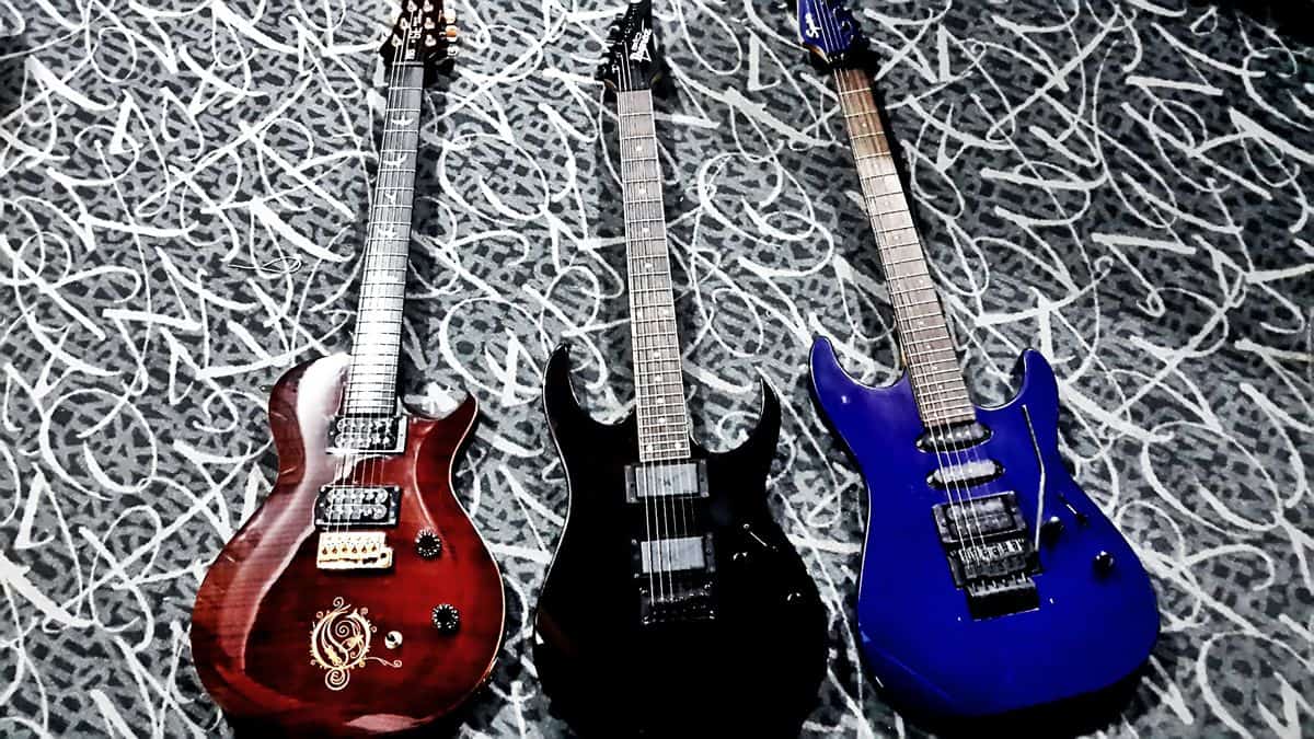
So what does this have to do with beautiful UI design? As it turns out, mobile app designers and developers can learn a lot from the master guitar makers of the world. After all, a musical instrument has its own sort of user interface — in the guitar’s case, the fretboard, the tuning machines, the curved body. And many things that make a well-designed guitar so successful are equally important in mobile UI design, for example:
1. It never hurts to have a recognizable brand.
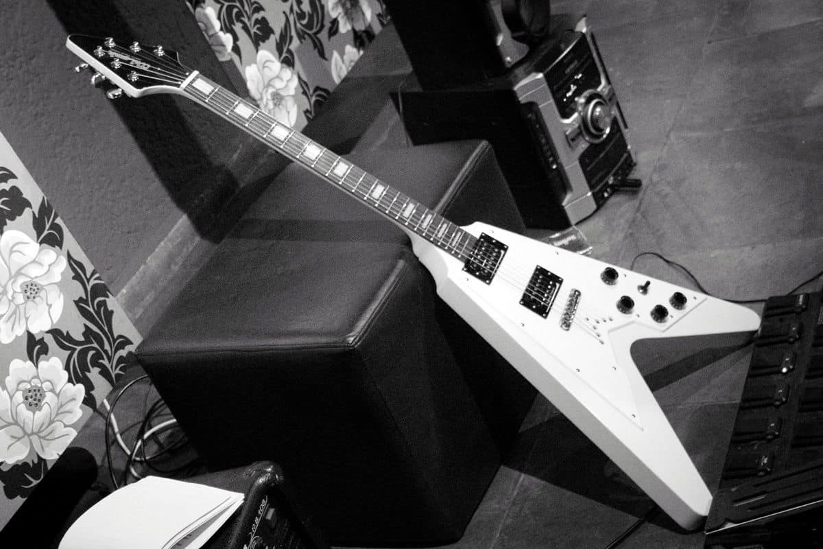
Even if you know nothing about guitars, you can probably draw a picture of a Gibson Flying V if someone put you up to it. The arrow-shaped axe has become an icon among shredders who want to add a bit more literal edge to their performance. Sure, it sounds pretty great, but let’s be honest: if you’re a teenager shopping for your first electric guitar and really want to make an impression on your would-be fans, you’ll probably gravitate toward the Flying V not because of the music it makes, but because it looks amazing.
Similarly, the Paul Reed Smith (PRS) fanboys and fangirls of the guitar world rival the most zealous Apple aficionado you know. There are many reasons for this, including a cult following from certain smaller subgenres of music and a soulful sound that makes it a favorite of Carlos Santana, whose tone is one of the most coveted in rock, pop and latin music.
How does the PRS exemplify branding? You can tell one from a mile away by a few characteristic features, including beautiful fret marker art. Where many guitar makers are content to mark guitar frets with simple dots, PRS guitar necks are covered in artwork, most frequently birds in various stages of flight. A guitar that sings covered in an animal known for song? Now that’s a powerful brand.
Mobile apps with the most beautiful UI designs have the same effect — people can identify them immediately, whether it’s Tinder’s swipable sea of faces or Hello Heart’s clean typography and wearable-ready data visualization. When you’re reviewing your mobile app prototype, ask yourself: is this a no-name, generic guitar, or is this a Flying V?
2. The physical experience of the instrument is almost as important as the sound.
One of the most important aspects of a well-designed guitar is how “playable” it is. A few things go into playability, but a big part of it is how the instrument feels in your hands. Guitarists often talk about “action” — that is, how high the strings are above the fingerboard. While this is adjustable based on a musician’s hands and playing style, some guitars just have better action than others. Likewise, some are just shaped perfectly to be cradled by the human body, while others might jab you in the ribs.
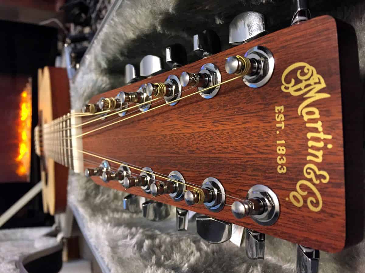
To someone who isn’t well-versed on what goes into guitar design, a Martin acoustic guitar might not look all that different from an entry-level $200 Epiphone. But as with beautiful UI design, what makes a Martin perfect is often invisible to the untrained eye: high quality materials, painstaking attention to detail and a body that feels as good as it sounds. Sure, the tone is incredible, somehow both rich and crisp, but holding a Martin dreadnought to your body for the first time and strumming a simple chord is akin to a religious experience for many guitarists.
No doubt, Martins tend to be good-looking guitars in an understated way, but it isn’t until you hold them that you realize how sublime their design is. This is also true for mobile app UX in the age of touchscreens. Beautiful UI design doesn’t just look stunning, but it should also feel natural and comfortable in the user’s hand. That might mean swiping instead of tapping a button, positioning elements close to where the user’s hand will sit and guiding the user with animations and interactions.
3. More isn’t necessarily better (but will always have an audience).
We’re not trying to hate on the progressive rock here — on the contrary, there are good arguments to be made that Rush’s 2112 is one of the greatest contributions to the annals of music history since Tchaikovsky first decided that artillery had a place in orchestral music.
However, there’s a reason that record store denizens and music critics don’t spare the genre of weird time signatures, half-hour “suites” and sci-fi concept albums a well-deserved ribbing. Progressive rock often prioritizes excess over actual musicality, earning players and fans a reputation for the kind of nerdery and misguided obsession we usually associate with the most devoted and sleep-deprived World of Warcraft guilds (not that there’s anything wrong with laying into a few ogres once in a while).
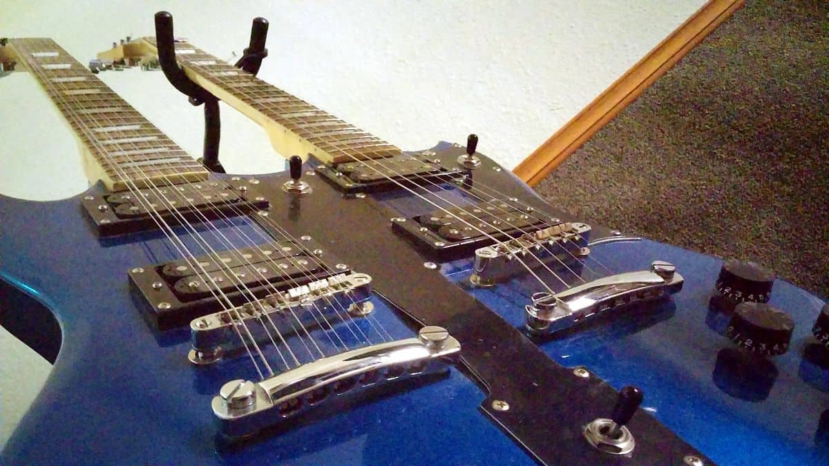
This sometimes came through in the prog rockers’ choice of instruments. To be fair, if anyone has an excuse to wield a double-neck Gibson, it’s Alex Lifeson, who was one of only three people responsible for producing Rush’s huge sound. Even Mike Rutherford (of Genesis fame) had a good excuse for his fleet of double-necked instruments: he often did double duty on bass and guitar. Grandeur isn’t the sole domain of progressive rock guitarists, though — to see how excessive the genre can get, take a look at Rick Wakeman’s keyboard rigs or Neil Peart’s drum kits.
If anything, metal picked up where prog left off when it came to the “more is more” theory of guitar design. “Six-string” is no longer adequate shorthand for guitars when musicians regularly use seven- and even nine-string guitars. Perhaps nobody epitomizes metal guitar excess quite like Michael Angelo Batio who, not quite content with two necks, has moved on to “quad guitars.” That’s right: four necks, 64 strings. (Last we checked, he only has 10 fingers.)
What Do We Mean By “Keep It Simple?”
Heavy metal and progressive rock are both regularly lambasted for their tendency to overdo and overcomplicate, but what does this have to do with beautiful UI design? While we often parrot the mantra “keep it simple,” the urge to lay on excess goes beyond fonts, colors, and copy. It’s also a question of features and functionality. Does the mobile version of your website really need every piece of content on your website? Will a GPS function add something of purpose to your app, or will it only slow it down and hurt the user experience? Is your hamburger menu so long, the user is too overwhelmed to select the right option?
Beautiful UI Design Is In The Eye of the Beholder… Sort Of
Simplicity may be at the heart of the beautiful UI design, but some exceptions can be made. For every guitarist who only needs a Gibson Les Paul with six strings and a handful of pedals to produce an iconic sound, there’s a prog or metal enthusiast who will want more. More strings. More pickups. More effects pedals. More necks. More guitars.
That’s right: depending on the type of app you’re making, a little (or a lot of) complexity may be a good thing.
To make this real for UI designers, consider the software you likely use every day: the Adobe Creative Suite. If you can, travel back in time to the first time you opened up Photoshop or Illustrator. While using these programs may be second nature to you now, most people find them extremely overwhelming at first, with their countless menu options, multiple toolbars, and huge learning curves.
The payoff, of course, is power. There’s a reason Adobe is the gold standard for designers, illustrators, photographers, and other visual artists. It takes some mastery — not unlike Alex Lifeson’s double-neck EDS-1275 — but it’s the right program for the audience (creative professionals). The same could be said for Microsoft Word and Excel, both of which are known to cause headaches among neophytes but produce powerful results for experienced users.
There’s a Right Way and a Wrong Way to Go Big
Should your app lay on the features like a progressive metal guitarist’s effects rig? The only way to know for sure is to determine your target audience, figure out which features they require and A/B test your prototype like there’s no tomorrow.
And remember — an app rich in features can still have an elegant, even beautiful UI design. Case in point: Evernote. From its robust note-taking functionality (and seamless syncing) and collaboration features in the Basic version, to a full-fledged office suite in the Premium version (complete with CRM integration, presentation features and scanning and PDF functionality), Evernote seems to do everything you could possibly want from a productivity app, short of making your coffee. (And with the Internet of Things, we wouldn’t be surprised if that were included in a future update.)
If you must jam-pack your app with more features than most mobile users really need from a mobile application, look to Evernote’s beautiful UI design for pointers. With an intuitive flow, smart user onboarding and careful menu optimization, Evernote still manages to be a very elegant app to look at and interact with. The type is large and readable, the elephant head logo is both recognizable and unobtrusive, and the app simply feels great in the palm of your hand.
4. And sometimes, the Rule of Cool prevails.
A lot of things go into great visual design. Sure, a beautiful mobile UI design will be usable. It will be simple and elegant, with form following function. There will be a clear visual language throughout the experience, guiding the user through an intuitive, even magical process. This is true not only for mobile apps, but also for guitars.
But some guitars are just cool. Ridiculously cool. So cool, they can get away with some shortcomings.
According to TVTropes, the Rule of Cool makes the following true: “The limit of willing suspension of disbelief for a given element is directly proportional to the element’s awesomeness.” Think Fonzi’s ability to turn on any jukebox simply by hitting it on Happy Days — no, that’s not actually how a jukebox works, but Fonzi is so cool we’ll let it slide.
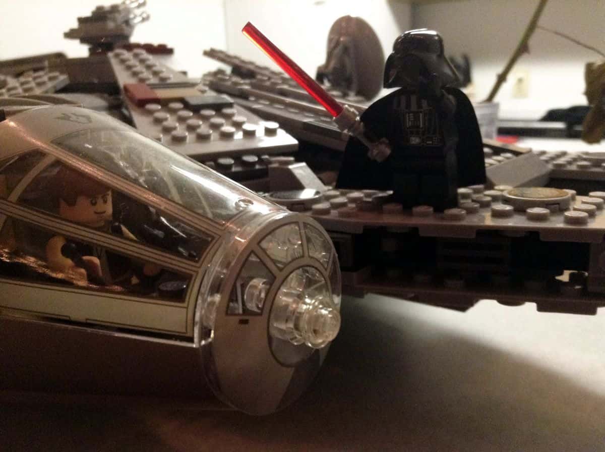
For an example of the Rule of Cool in the guitar world, see the Millennium Falcon guitar, designed to resemble the Star Wars ship of the same name. Is it usable? Well, it can certainly be played, and it doesn’t sound terrible, but the eponymous ship wasn’t designed with a guitarist’s comfort in mind — our armpits hurt just looking at the thing.
But let’s be honest: let’s say you’re at a show, and the band is playing to the audience. Maybe they’ve covered a few iconic tunes just for smiles, taken some requests. There’s only one song left, and the guitarist has a gear change. Suddenly, she straps on the Millennium Falcon guitar, and launches into a metal version of the “Imperial March.”
Despite the design flaws in the guitar, you know that show will end on a high note.
Delighting Music Fans and Mobile Users Alike
Some mobile apps manage to pull off the Rule of Cool. While we’re on the topic of a certain George Lucas franchise, consider the myriad lightsaber apps that have been available ever since Steve Jobs unveiled the first ever iPhone. Will an app that appears to unsheath a laser sword and makes swooshy noises while you gesticulate wildly ever serve a practical purpose?
No — but you have to admit, it is a killer user experience, particularly for those users who have been Star Wars fans since they were little kids. There’s a place in the world for novelty mobile apps just as there is for novelty guitars shaped like Pac-Man or even the continental United States. Whether either can be said to represent “beautiful design” is debatable, but if your mobile app design can put a smile on someone’s face the way a lightsaber can, there’s certainly beauty in that.
Building a Beautiful UI Design Prototype
Whether you’re building the next Stratocaster or the next Uber, it all begins with a prototype. That’s where you can visualize your beautiful UI design, swap out any elements that might be out of whack (whether it’s an ill-placed humbucker or a poorly worded CTA) and do all of the necessary tuning and polishing that makes mobile apps — as well as musical instruments — really shine.
To get started, sign up for a free 15-day trial of Proto.io and see how easy it is to create a lifelike digital prototype of your app, complete with the interactions that make for a delightful user experience.
What other lessons can mobile app designers learn from the world of music? Let us know by tweeting us @Protoio!


