Summer is here and so are the hot mobile interaction designs. This month we’ve got some sleek app concepts for you to enjoy. They range from note taking apps to rating experiences that might actually encourage you to leave detailed feedback.
Let’s get right into why we chose these 5 mobile interaction designs and what designers can learn from them.
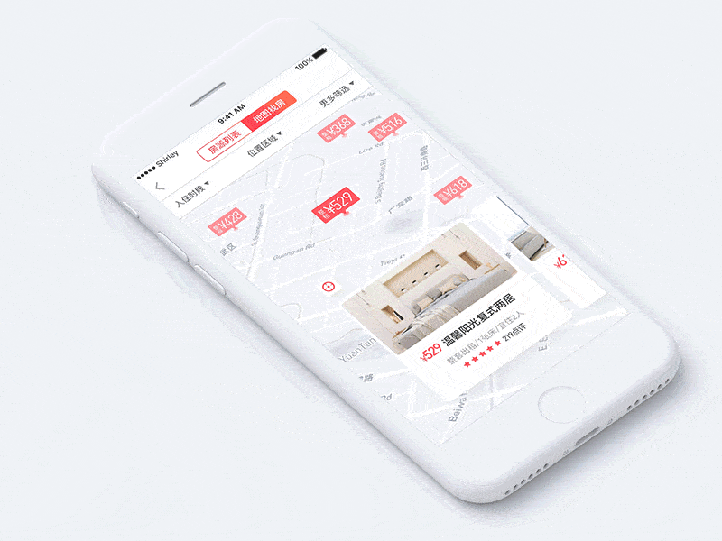
1. Travel Short Rent App by Shirley for UIGREAT
Finding a place to rent is often a stressful experience, but this app concept cuts down on that and even makes it a bit enjoyable. Swiping through the room pictures at the bottom of the app moves the map so that you are aware of exactly where the apartment is located before you explore it further. The movements are quite rigid, which I don’t mind at all as if there is a full stop after each swipe. Once you tap on the apartment you’d like to learn more about, the basic rating and price expand to take over the screen with a larger image and a prominent call to action button. Clicking the image again expands the apartment information further, giving potential users even more insight into the place and what others think about it. This time the transition is more fluid, with the review information sliding up the screen to meet the apartment image.
 Source: Dribbble
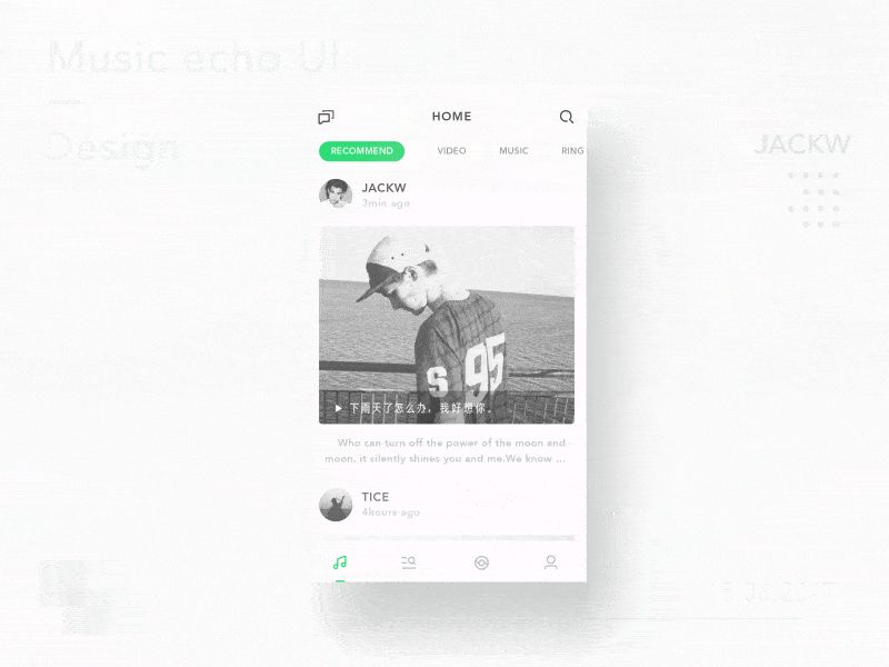
2. Music Echo UI by JACKW for Wizard Alliance
This mobile interaction design takes place in the chat function in a music app. My favorite parts of it are the screen transitions. When you tap the messages button, the message section pops up to take over the majority of the screen. And tapping into a group message shows all of the participants in a nice green banner. Tapping a specific person in the group swipes their message up the screen to take over the green header and replaces it with their name. Overall, this app concept has a mobile app design that has great transitions.
 Source: Dribbble
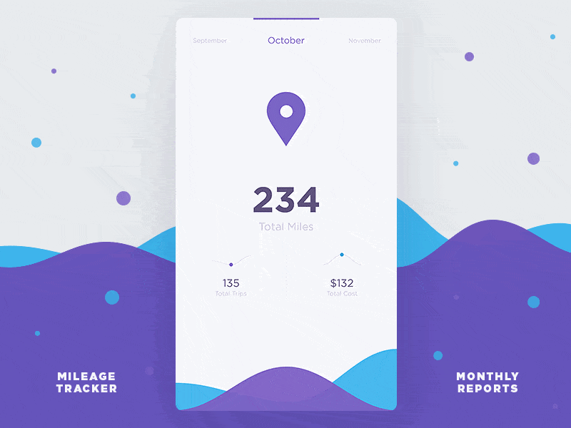
3. Monthly Data Reports by Stanislav Hristov for DtailStudio
There are so many great things happening with this mobile interaction design, it’s difficult to know where to start! First, the arrow movement as your swipe left and right is a lot of fun. It reminds me of the arrow on a prize wheel, as it moves in the direction you swipe in and comes to an oscillating stop. That shaky movement is present throughout all the screen transitions, which I think adds a bit of personality to the app. Swiping up shows more metrics in the app and one of my favorite transitions is when the arrow smoothly turns into a graph showing the number of trips the user took. Beyond that, it also turns into a teardrop shape to show the total cost. This mobile interaction design is one of the best I’ve seen recently because not only does it have delightful transitions between screens, it also shows how much thought the designers put into the family of shapes they use to convey information and kept it all consistent in a beautiful way.
 Source: Dribbble
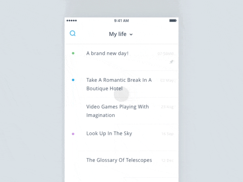
4. Note App by Jadon7 for UIGREAT
This app concept is an effective note taking app. It’s easy to change the note you’re working on, by tapping the down arrow next to the note title. You can easily scroll through your notes or even expand them to change the order or groupings to organize it however works best for you. It’s full of fun microinteractions, such as the spinning “X” button to exit out of the sort management screen. The search function has one as well. With just a quick pull down at the top of the screen, you can access the search bar and a little “pop” occurs at the cursor to show users where to type. These unexpected microinteractions are what make this such a great mobile interaction design.
 Source: Dribbble
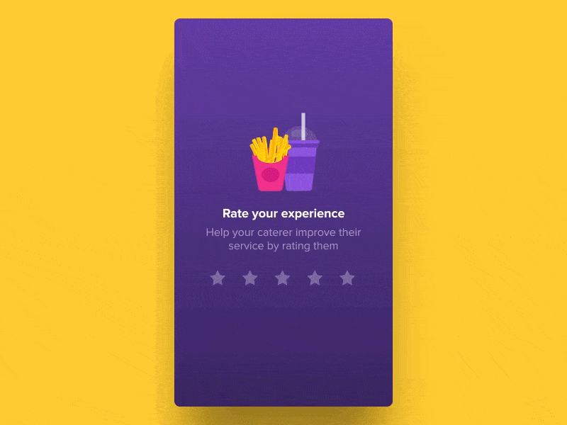
5. Rate Your Experience by Saptarshi Prakash for Zeta
This mobile interaction design is so simple and it makes the rating experience more enjoyable. Many apps ask for a rating after you use the service to get an idea of how they’re doing and what they can improve on. This interaction starts at the initial star rating and when the user chooses the number of stars that describe their experience, that’s when the fun starts. The stars jump up the screen to show a qualitative question to get more insight, asking “what went well?” with multiple choices. But what’s happening at the top of the screen is my favorite. The fries and drink also jump up on the screen and they have lifelike motions, with all the fries jumping up in the container and one on the top flying higher than the others, then settling back in. The drink also does a little jump, with the straw shifting in air and landing on the other side of the cup. These little mobile interactions make a big difference and I’m sure when users see something that makes them smile, they will be more likely to provide additional feedback to the company about their experience by answering the question below.
 Source: Dribbble
That’s all for June, but be sure to check out last month’s edition, featuring the best mobile interaction designs of May 2017.
Feeling inspired? Sign up for free with Proto.io and prototype your own interaction design in minutes.
Proto.io lets anyone build mobile app prototypes that feel real. No coding or design skills required. Bring your ideas to life quickly! Sign up for a free 15-day trial of Proto.io today and get started on your next mobile app design.


