Design is in the details.
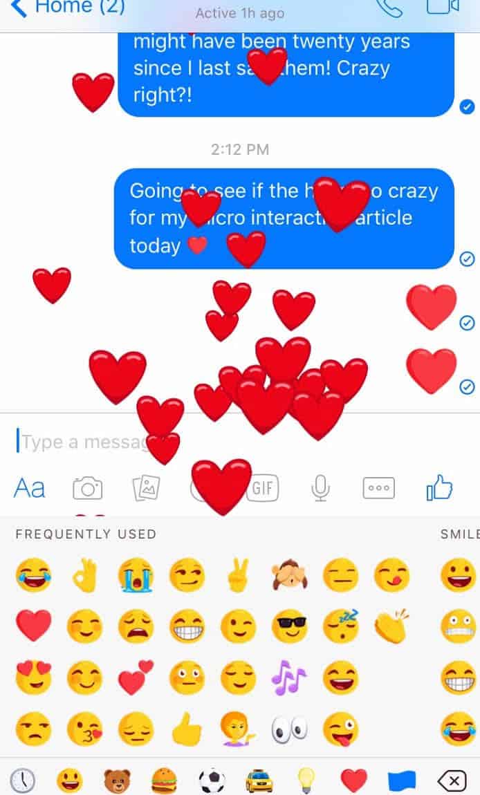
The other day I composed a message to an old friend that was not easy to write because it was a message to express my condolences for the loss of her mother. We had spoken on the phone a few times earlier in the week but I wanted to send her a quick message on the Facebook Messenger app to let her know I was thinking about her. I finished composing the message and decided to add a little “heart” at the end. This simple act of tapping the heart ended up turning into a delightful explosion of floating red hearts on my phone’s screen that was also accompanied by a few silly sound effects. This moment in time, while short and fleeting, brought me a few seconds of surprise and joy during a difficult time.
These tiny details, otherwise known as microinteractions, can make the experience between a user and a device/product more fun, easy, effective, and human. We often don’t even notice these microinteractions. They are cleverly subtle and sometimes almost invisible; but, they can make a product something a user loves, rather than something they feel lukewarm towards.
In other words, microinteractions have the potential to magically bridge the gap between the user and technology through an emotional and human connection, while also encouraging them to keep coming back for more.
What Are Microinteractions?
Microinteractions are based on accomplishing a single moment or task through the provision of a delightful experience and useful feedback for the users. These micro-moments are what ultimately guides a user through a flow in an intuitive and effective way.
Dan Saffer, author of the book Microinteractions and VP of Product for Mayfield Robotics, defines microinteractions as “contained product moments that revolve around a single use case—they have one main task. Every time you change a setting, sync your data or devices, set an alarm, pick a password, log in, set a status message, or favorite or ‘like’ something, you are engaging with a microinteraction. They are everywhere: in the devices we carry, the appliances in our house, the apps on our phones and desktops, even embedded in the environments we live and work in. Most appliances and some apps are built entirely around one microinteraction.”
Check out Saffer’s one-page cheatsheet on microinteractions.
According to Saffer, microinteractions are good for:
- accomplishing a single task and a single task only
- interacting with a single piece of data, such as the temperature or rating a song
- controlling an ongoing process, such as the volume for a song on Spotify
- adjusting a setting
- viewing or creating a small piece of content, like a status on Facebook
- turning a feature or function on or off
Why should you incorporate microinteractions into your designs?
- They help encourage users to interact with your site, whether it is clicking on a button, sharing content, or responding to a message or notification
- They give users feedback immediately
- They help users navigate through the site
- They help guide users through the flow in an intuitive and easy way
4 Parts to a Microinteraction
Saffer describes the four parts of microinteractions as a trigger, rules, feedback, and loops and modes. Let’s dive a little deeper into what each of these steps means.
#1 Trigger
The trigger is what initiates an interaction. It is a cue, visual or otherwise, that encourages a user to take action. A trigger can be the fluttering of an icon to encourage a user to tap or click on it. The blue button that floats down to the top of your Twitter feed that says “new tweets” with an arrow pointing up triggers you to click on it to see all the new tweets that have been posted since you were away.
Some of the best triggers are those that actually anticipate a user’s need without them having to state their needs. This requires the designer to collect user research and behavioral data to help predict what the user’s needs will be and design the triggers accordingly.
#2 Rules
The trigger engages with the rules. These rules lay out what happens during the interaction. The rules should feel natural for a user to accomplish and they exist to help minimize errors. A great example of this is if you try to send an email through Gmail without entering a subject line, Gmail will inform you that your “email doesn’t have a subject line” asking if you still want to send it.
Image Name: gmail_no_subject.png
Alt text: “Screenshot of Gmail screen that states ‘this message has no subject’ asking users if they want to send it anyway.”
Source: Gmail App
#3 Feedback
Feedback is based on the rules and gives users information on what is occurring at that moment in time. I am particularly fond of the feedback I receive on forms that are designed with the user in mind. Incorporating inline validation in your design within the right context can be really helpful for the user. For example, while entering a username, if I see a green checkmark I know I can move on to fill in the password field. I can’t tell you how many times I fill out the username and password fields, press submit, and am told in red that the username or password are incorrect.
The problem with this situation is that I have absolutely no idea which field or letter is incorrect. If I can make the correct changes along the way, it makes the whole process a lot easier. Those little green check marks, as insignificant as they may seem, make all the difference in how a user feels during and after the form filling process and have the potential to lead to higher completion rates.
The Twitter sign up form is a great and simple example of how inline validation should be used. The check marks appear on the right-side of the form field as I am completing the action. The red error message also proves useful by telling me what I need to do to complete the form properly.
The Hopper travel app also uses microinteractions wisely. After entering the dates and destinations I am interested in learning more about, the cute little rabbit hops around while the app is “thinking” and pulling results for me to view. Nobody likes waiting. However, seeing the bunny jump around brings a little piece of delight to that short waiting experience, while also letting the user know that something is actually happening and the results will be shown soon.
#4 Loops & Modes
Loops and modes determine the larger, meta-rules of the interaction. If a microinteraction is used repeatedly, it is important to consider how the interactions change accordingly. Think about how this interaction adapts based on user behavior. What is the difference between the microinteraction the first time it is used compared to the 7th time?
Try creating loops that adapt over time, making the experience richer each time they interact with it. Facebook’s On This Day Memories feature is a great example of how to create experiences that adapt each time it is engaged with.
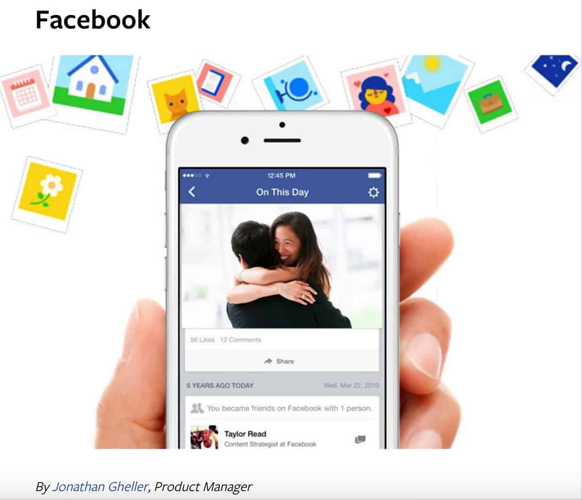
The majority of Facebook users check their news feeds several times a day. Having a feature that on occasion pulls a status update or picture from 4 years ago can have an emotional (hopefully positive) effect on the user. There is potential for this particular microinteraction to have a negative effect. For example, showing an old post that can make the user sad or stressed has unintended negative consequences. I suggest Facebook look into how to keep those negative experiences from occurring.
Things to Keep in Mind When Designing Microinteractions
- Don’t over design. Microinteractions should not feel strange or take too much time to load. They should serve a purpose while seamlessly flowing within your overall design.
- The first time someone experiences the microinteraction, he/she shouldn’t feel the same as when they use it the 10th time or the 100th. Make the microinteractions adaptable to the context. If it is a user’s first time, have arrows help navigate the app. Give them the option to not show that message again, so it doesn’t become annoying in the future.
- This brings me to the third tip. Don’t start from nothing. Understand your users, their motivations, and the context by conducting user research. The information you gather will give you the information you need to make your decision more effective and usable. If they are there for the 20th time, figure out what their motivations and goals are and create microinteractions based on your findings.
- Remember, the goal is for these interactions to be subtle and effective. Make sure the style of the microinteraction fits naturally with the style of your overall interface design. The interactions shouldn’t seem out of place or confusing and the microinteractions should be connected to the overall design of the app.
6 Examples of Microinteractions Done Right
Surprise On Your Sleeve
I heard someone describe having the same soft, cozy long-sleeve shirt for years. One day while taking a run on a shaded tree-lined trail wearing the same long sleeved shirt, the runner described getting chilly and pulling the extra fabric, meant for cold days to cover her hands, to flip over the tops over her hands. The fabric underneath revealed the statement “you are loved.” These words, secretly printed in the exact spot of the fabric, were hidden away to be shown during moments like these surprising those wearing it with a micro-moment of delight.
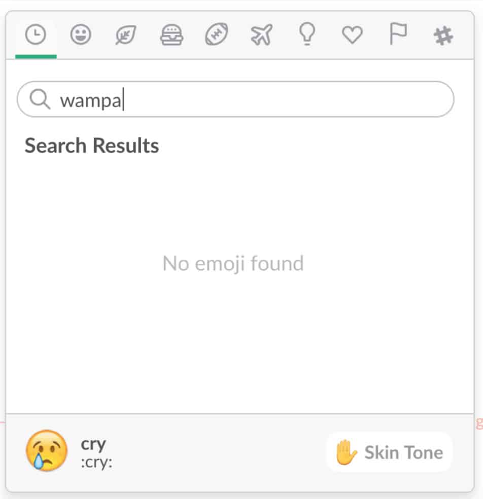
Slack Emojis
The website Little Big Details curates some great examples of microinteractions. One of the ones they showcase is when searching for an emoji in Slack and the emoji you are looking for doesn’t exist, the “cry” emoji is suggested as an option. Instead of the user getting annoyed when they can’t find what they want, the “cry” emoji leaves them feeling amused.
Google Translate
When you press the “listen” button for the second time on Google Translate, it repeats the translation in a slower speed assuming you need a little extra time to understand what it said.
Night Mode on Google Maps
I always loved how the background of the Google Maps app turns black according to the time. Night Mode is intended to help with night vision and safety and is entirely automatic.
Make Me Pulse
Check out this site Make Me Pulse for a truly delightful interactive experience. The use of microinteractions (progress bars, sounds, colors) help guide users through the flow through triggers, rules, feedback and loops.
Scroll Bars
Even the little gray scroll bar on the right side of this page is a wonderful and simple example of how a microinteraction can be useful and effective letting you as a reader know how much material is left to read of this article.
Hopefully this article inspires you to start incorporating microinteractions into your designs. They have the potential to transform the experience your users have with your design from just ok to something truly memorable.
While creating micro-interactions for your mobile app design, keep Proto.io in your plans. Proto.io lets anyone build mobile app prototypes that feel real. No coding or design skills required. Bring your ideas to life quickly! Sign up for a free 15-day trial of Proto.io today and get started on your next mobile app design.


