Fifteen years ago, undergoing a website redesign was a much more straightforward endeavor — you simply decided how your desktop experience would look, organized your content accordingly and built out the website. Unbelievably, some websites still lack a true mobile experience, whether that’s a separate website redesign altogether or a well-planned responsive design.

Design can feel like an endless game of catch-up sometimes, but these mobile app experts can help guide you through the process of redesigning your web experience so that it looks great on any device, desktop or mobile.
How to Redesign a Website for a Handsome Mobile Experience
Handsome (@HandsomeMade) is a design and technology company whose core values include “human-centered thinking at every level” and “purposefully beautiful and delightful software.” Creative Director Brandon Termini and Technical Director Alex Zub explain how they apply those principles to mobile website redesign:
Says Termini, the key to a Handsome website redesign is to take a “mobile-first design approach,” making the user experience as elegant and easy to use as possible. “One way we apply mobile-first design is to start with smaller screen sizes, which forces us to simplify the interface as much as possible and only put what truly matters most on the screen.”
Zub adds, “Utilizing technologies and best practices – such as responsive design and adaptive design, with their compatible technical implementation – is the key. For many products, it makes sense to stick to responsive grid systems, which simplifies the effort required to build it, while maintaining the great look on all kinds of screens.”
How to Redesign a Website to Look Beautiful on Mobile
We asked Termini to share a few of his visual design best practices. “There are hundreds of do’s and don’ts we’ve compiled over the years,” he says. These are the top three best practices he puts into place at handsome:
- Put careful thought into your layout hierarchy. “A successful layout means that a user should be able to walk you through what they see/read in the order you intended. Good use of white space, color theory, typography, etc. all play a pivotal role in this.”
- Use color appropriately. “Pick colors that are appropriate for your brand and make sure they harmonize well together. Use a hero color that you associate with important UI elements such as a call to action buttons. Make sure you use color sparingly in the right places that have your user flow through the interface and not get stuck.”
- Typography should be easy on the eyes. “Make sure your typography is appropriate for the brand and legible on the devices you are designing for, and use ornamental type sparingly.”
Testing Your Mobile Website Redesign
Of course, once you’ve built out the mobile site, you have to put it through its paces to ensure a great user experience. Says Termini, “Testing frequently and adjusting is critical. Start testing as soon as you show the first hand-drawn sketches with potential users, and keep testing throughout your process, all the way to fully built designed systems. Being set up to be able to hear, synthesize and iterate on feedback is very important to the success of any product.”
Zub adds, “Quality assurance is an essential part of building a product that’s used on different kinds of devices. And since it’s virtually impossible to have every possible device in the office, we make use of online services that provide access to dozens of ‘virtual’ devices in the cloud, automating it as much as possible. With proper automation investments, it’s easy and fast to perform cross-device testing down the road.”
We wanted to learn even more about how to test and QA a mobile website redesign. For that, we heard from Simon Papineau, CEO of Crowdsourced Testing (@crowdsourcingqa). Papineau created Crowdsourced Testing to address some of the pain points he had encountered in his experience testing numerous mobile apps, websites, games and more.
What Works on Desktop Doesn’t Always Work on Mobile — And Vice Versa
Says Papineau, “The one thing that developers tend to forget is that you don’t need the same depth or the same content on your mobile site that you would display on your desktop site. The intent, the mindset, and the objective of the mobile user are completely different. Visitors will not spend 20 minutes on their phone reading about your company’s history and its fine prints.
Instead, give them what they want as directly and as quickly as possible. If it’s your contact information, put that directly on the homepage without any additional fluff.”
One of the challenges, says Papineau, is ensuring that your mobile website redesign will look good and perform well on a multitude of devices: “Testing to see if websites are responsive can be very time consuming and costly. The best thing that a company can do is focus on the top 15-20 devices that represent the majority of its visits. There will always be a mobile device on which the site doesn’t look perfect. But if that device represents 0.05% of your visitors, it’s probably not worth the extra development effort.”
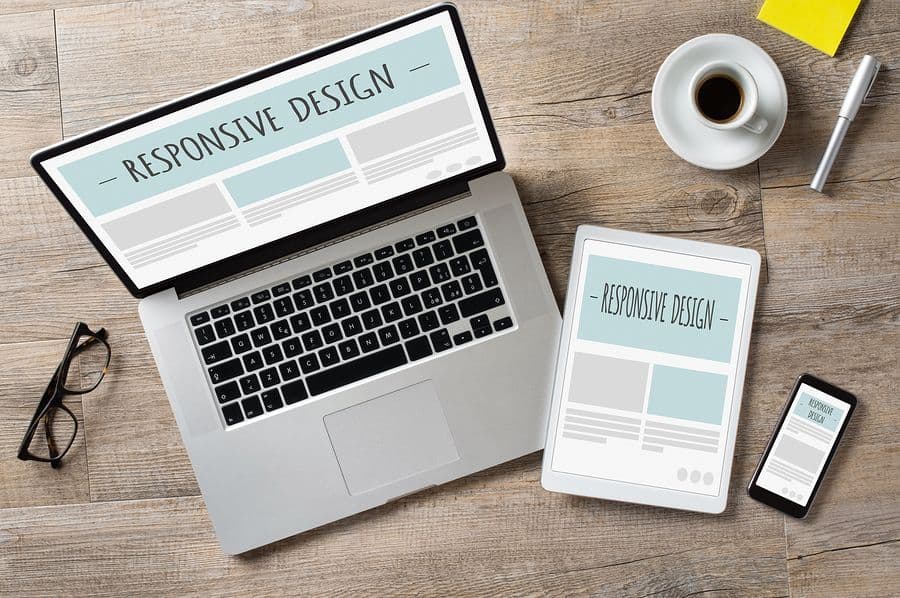
How to Redesign a Website Using Responsive Design
Bob Bentz is president of ATS Mobile (@atsMobile), a full-service mobile marketing agency that oversees a website redesign for clients across multiple industries. Bentz is passionate about making sure that a website experience looks and feels as good in a mobile device as it does on a high-resolution desktop monitor, and one of the main ways ATS Mobile accomplishes that for its clients is by using responsive design.
Why Responsive Design? A Primer
“Responsive web design (RWD), most commonly designed with HTML5, is going to be the likely choice in nearly all new mobile web builds,” says Bentz. “It can also be designed using CSS3 and Javascript. Responsive design has the striking advantage of being highly flexible as it fluidly changes to accommodate any device. RWD works by sending the same code, regardless of device, and then rearranging it on the client side, thus allowing the same webpage to be displayed on any device.”
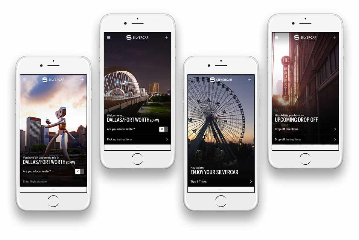
To see responsive design in action, pull up this blog post on a desktop screen if you haven’t done so already (we’ll wait!). You’ll notice that there are multiple window sizes at which the user interface “breaks” and rearranges itself so that the page looks different based on what device you use (and how large the window is inside of that device).
So how, exactly, does responsive design work — and why should you use it for your website redesign? “A responsive website redesign serves the same HTML code on the same URL, regardless of whether the user’s device is a desktop, tablet, phablet, smartphone, feature phone or wearable (such as the Apple Watch),” says Bentz. “It can also respond differently based on the screen size of the site. Developers can decide which graphics and content will be used for mobile and tablet users. Text and images can adjust based on any browser or screen size.”
With responsive design, you insure yourself against making a new update every time something changes in the mobile device status quo. “When a new device hits the market and accesses your website, there is no additional programming required if the site is built on responsive design,” says Bentz. “Most importantly, however, responsive design is Google’s recommended design best practice. For many websites, RWD achieves a reasonable balance between mobile-friendliness and ease of implementation.”
Best Practices in Responsive Visual Design

According to Bentz, taking the following best practices into account will help make your responsive website redesign look and operate at its best:
- A simple, striking header. “The header and masthead should be simple so as to not take away from the key selling points. The logo is the key brand image; an overly horizontal logo may not look great on smaller vertical screens.”
- Easy-to-use navigation. “Navigation is much trickier on a small screen. Often, designers will use a navigation button shown by three horizontal lines, usually in the upper right of the site. This is called a “hamburger menu,” because it looks like a burger surrounded by the bun. Some sites use a left side navigation that can expand outwardly to cover most of the screen.”
- Plenty of images. “It is difficult to include too many images on the mobile screen, but words can quickly overwhelm the UI. Therefore, designers often use image carousels that allow users to swipe through multiple product images instead of cramping the screen with copy.”
- Intelligent use of the footer. “Consumers are used to using the footer as a navigation tool, and it doesn’t take up such valuable space as the above the fold header. It should also include the very important ‘Contact Us’ link.”
A Gorgeous Website Redesign Begins with a Gorgeous Prototype
Learning how to redesign a website for mobile is no small feat, but having a powerful rapid prototyping tool to help you test the experience makes the biggest difference. After trimming the copy, paring down elements and figuring out your navigation scheme, you can quickly gain feedback from users on whether your mobile website redesign is still usable and intuitive. Then, as Termini suggested, keep iterating until you have a prototype you’re truly proud of.
To get started, sign up for a free 15-day trial of Proto.io today, and see how easy it is to create a prototype that looks and feels like the final product. Within minutes, you can have a solid idea of what you want your website redesign to look like — and then put it in your users’ hands for instant feedback!
What are your biggest challenges when it comes to redesigning your website for mobile? Let us know by tweeting us @Protoio.