A designer friend once told me of a meeting she had with a client and a content marketer for a website project, during which she asked whether they already had a draft version of the copy in hand.
The content marketer replied,
“Well, I kind of need to see the design first before being able to think about the copy for that page…”
The designer responded,
“But if I don’t know what’s going to be on that page, how am I supposed to design for it?”
The client interrupted,
“Why don’t you come up with some rough ideas for that page from a design perspective and he’ll send you the copy after?”
Two things struck my mind when she recounted the experience to me.
1. What is this design perspective? Is it to say that design is related only to the visual aspects of a product?
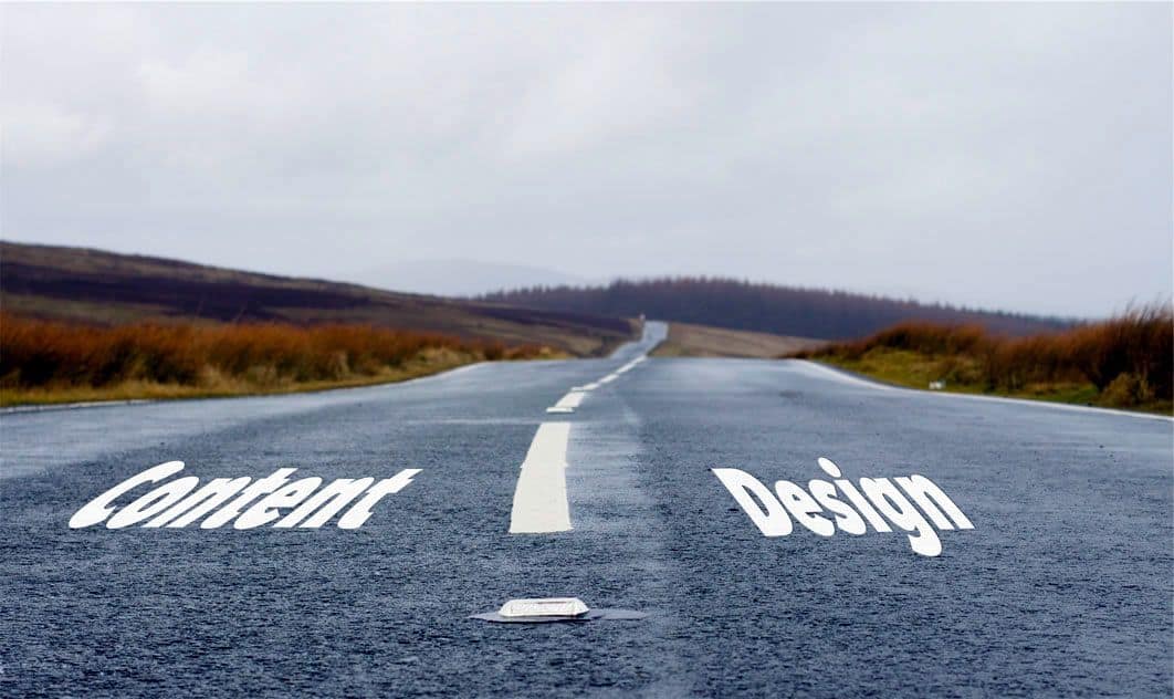
2. This awfully frustrating situation brings us, once again, to the eternal question of which comes first, design or content?
The Problem of Design ≠ Content
“Make it look really beautiful but it should say nothing at all,” says no one ever.
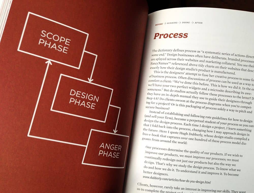
The typical workflow of a designer starts with a brief or a meeting, such as the one attended by my friend. This is followed by the creation of wireframes, mockups, and even more meetings thrown in between before the designs are finally approved and shipped off to the folks who code.
(Source: changeorder)
Content is introduced somewhere in the process as an additional ‘fill in the gap’ exercise. Or a ‘take this bunch of words and create awesome designs out of it’ responsibility. In general, designers do not deal with words. A content-first approach to design is not common.
There is nothing really wrong with such a workflow. It is somewhat typical in today’s world of a highly specialized labor force that emphasizes greatly on productivity. Finding a genius designer who also writes brilliant code and an excellent copy is akin to hunting that much sought-after mythical unicorn.
The problem is not that we are dividing the process of product development into specialized parts but that in doing so, we are grossly neglecting the intricate connections that link each part to the other. Sure, there is a ‘design perspective’ that has a lot to do with visual aspects such as colors, images, symmetry, shapes, and patterns. But it also has a lot to do with content.
Content is part of the design because the design is communication. A product’s design is not just a beautiful empty casing to dump copy in where space permits; it is a form of communicating with users. The design comes hand in hand with the copy that depends on the design and in turn, supports it. When designing for people, we have to consider adopting a content-first approach.
Designing for Conversation
“Design is a conversation between designer and user, one that can go both ways, even though the designer is no longer present once the user enters the scene.” –Don Norman
Since the design is communication, great user experience should feel just like a pretty smooth conversation. What makes for a great conversation is that natural feeling when talking with someone. It leaves you feeling like you have gained something as you walk away from the conversation, whether or not you have been searching for meaning in the first place. A smooth conversation has to be filled with meaningful, enriching content.
So Ditch The Lorem Ipsums…
Not only does no one know what on earth Lorem Ipsum means, its purpose as placeholder text to allow for focus on the graphical elements of an interface is so last century. It contradicts every well-thought out principle of user-centered design by removing content from context.
As a designer, your eye is likely on the typeface. You wonder how it looks and feels on the screens and how readable is it. But your users will not be reading Lorem Ipsums. They will be reading real content that is informative, descriptive, emotive, even persuasive. Real content that holds weight in guiding a user’s next action or shaping their behavior.
After all, no one downloads an app or visits a website just to see how beautiful or creatively-designed it is (unless you are me and it is part of your job but still, a content-free product will not make it to the ‘Top 10 Mobile App UI Design’ lists). Your design needs to reflect this. Not just in terms of choosing typefaces with the right personalities that speak for the brand, but also in making content a serious design issue. Adopting a content-first approach requires ditching the Lorem Ipsums.
And Work Together With Content Marketers…
In an ideal world, all parties involved in building a product come together in harmony to work side by side until the project is completed. This is not meant only for designers and developers, but also for those who research users and those who create content.
To begin such a collaboration, all parties involved must have a good understanding of who the users are, their needs and their goals in using the product. This is essential to knowing how to speak to your users by using their language and tone.
Using a content-first approach, they start out by writing out conversations that they would like to have with their users through the product. They ask key questions such as “Why did you get here?”, “Where would you like to go next?” or “What are you looking for?”. As the conversation flows, the copy gets drafted and the structure of information emerges.
Copywriters work their magic with words while staying focused on the user’s intent and mindset. Content can be tested and perfected with actual users. Meanwhile, design ideas spring up. The implications and restrictions imposed by content on the designs are made clear before full mockups and prototypes are made. The content-first approach helps to reduce designer frustration by eliminating parts of the redesign phases.
Together, the professionals involved decide on important design elements that affect readability and legibility of content such as colors, typeface, line spacing, links formatting and so forth. These are factors that could make or break a product. Users interact with your product through its content. When you focus first on content, it is inevitable that you place the user at center stage.
Or Start Writing Your Own Content
In an ideal world, I would have two cats that do not ruin my furniture. Unfortunately, this is not the case. It is also unlikely the case that you actually do work with your colleagues as described above. Ideal world scenarios are to be strived for but the journey to get there can be a very long one.
So what is a designer to do if the copywriter or content marketer decides to pull off a Houdini act and your deadlines are pressing in hard on you? Start rolling out your own content for a content-first approach to your design strategy.
If both you and the content creator received the same brief or attended the same meeting, it is safe to say that you have more or less the same idea of who your target audience is, what your users’ goals are, and how you’d want to speak with them through the product.
True, the content you roll out probably will not be perfect. It might send the copywriter into convulsions when he or she reads it. But it does not have to be perfect. The content experts can polish it up later. It is meant to derive valuable insights that you would never get from using placeholder texts a.k.a Lorem Ipsums.
If it is a redesign project that you are working on, you would already have a wealth of content to use in your designs. Use the available content and in the meantime, tailor it to the new objectives of the website or app. Go through the content that is already there (even though it will be rewritten) and apply the same conversation-style techniques.
Focusing on content first will help you to better design for what is important to the user. Try out the content-first approach in your next design project and let us know how the results are by tweeting us @protoio


