Satisfying users’ needs is the core of user-centered design approach. UX research methods such as focus groups, interviews and personas aim to discover the specific needs of the target users. Live chat, explainer videos, account sign up via social media, distraction free mode – these are only a few examples of specific features that the users may need. To make a website or an app that works a treat, just find out what these features are with research and design so as to satisfy the users’ needs. Whoa, whoa! Not so fast! Before UX design can address specific needs of the users, it has to start with the basics. In this article, we offer 5 tips to ensure that user safety needs are fulfilled with good UX design.
Maslow’s Hierarchy of Needs
Do you remember Maslow’s hierarchy of needs? Well, everyone has probably seen this colourful pyramid at least once. According to Maslow, the bottom level needs must first be addressed before we can fulfil the ones at the higher levels. Once physiological and biological needs such as sleep, food and warmth are satisfied, one can progress to meet the need for safety. Only then will it be possible to reach the subsequent levels such as love, belonging and so on.
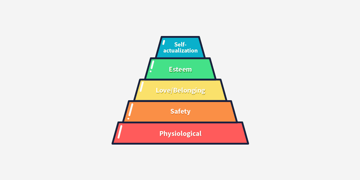
User safety is where we stop for now. Health, financial independence, being free from dangers such as war or natural disasters – all these are examples of what gives us a sound sense of security in our everyday lives. Just as in the real world, safety plays an important role in the virtual world. To appreciate a website, software or application, the users must feel safe using it.
User Safety and UX Design
So how do we satisfy the safety needs of the users? Here are 5 examples of what a good UX design should take into account to ensure user safety.
1. Microcopy
Let’s think about filling in any kind of online form or creating a new account on some website. Isn’t completing all those fields a bit tricky at times? I feel much more assured when I fill them in with the help of someone who knows the form well and can tell me whether I’m filling in the inputs correctly. That doesn’t happen often though, and that’s why users like me appreciate microcopy so much. Seeing instructions, prompts and comments on what to do makes users feel sure that they are going in the right direction.
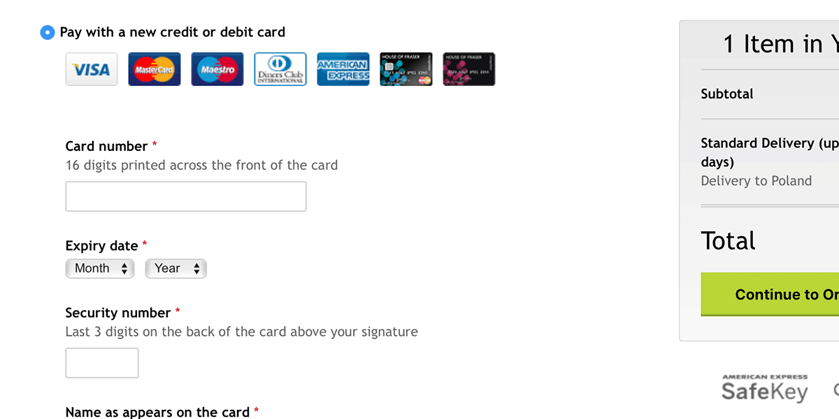
The checkout form on the House of Fraser website definitely takes user safety into account. If you make online payments on a regular basis, you would already know the number of digits in a credit card number or where to find the location of the security code. But believe me, there are many users who really need such information. I definitely did when making my first online payment on a website that is not in my native language.
2. Previews
Displaying any kind of information to the public is stressful, especially when you don’t have a chance to preview it in the exact same conditions in which your audience will. Blog text editors, social media posts or email campaign templates are much more user-friendly if they have a preview feature. Making sure that what is shown to users looks exactly the way you intended it to definitely ensures the feeling of security.
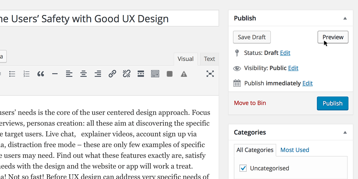
Working closely with writers and bloggers, I’ve noticed that few of them have ever published any content without first clicking the preview button at least a couple of times. The WordPress text editor may have a few shortcomings but the preview feature is definitely one of its stronger points.
3. Editing
No matter how many times I check something, the realization that there is no going back once the “Save” button has been clicked always gives me the shivers. Whether it is a message, blog post or website registration form, ensure user safety by making it known that it will be possible to make changes to it later on. This encourages them to take action.
Slack is a great example here. All the messages that you send can be edited and corrected in the future. Since I started using Slack for communication with my team, every time I write a text message not via Slack and make a typo or forget to say something important, I regret that there’s no way to edit it.
4. Questions and Alerts
I know that questions like “Are you sure that you want to permanently delete the selected items?” are a bit irritating. In most cases, that’s exactly what you want to do and you feel annoyed that you have to click twice to do that. I know that feeling. On the other hand, if the changes you’re about to make can’t be undone or have direct consequences, it’s much better to click once more to confirm rather than do something undesired by mistake.
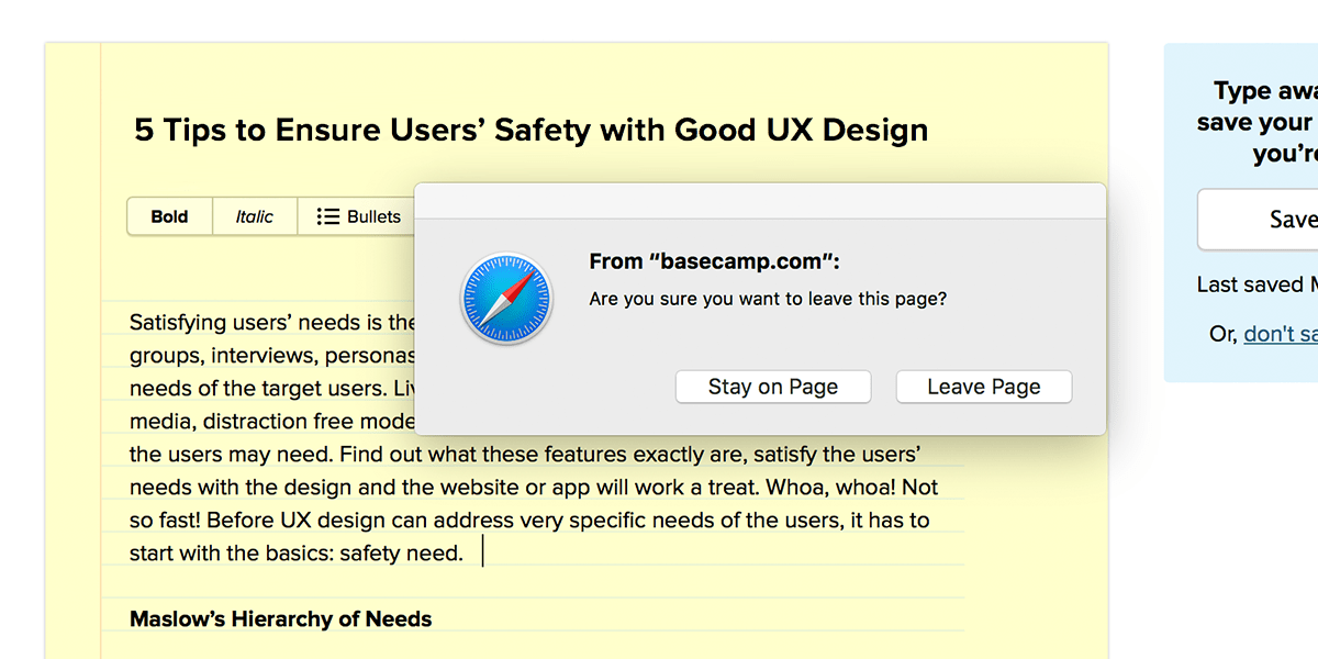
Let’s take Basecamp as an example. If you try to close the tab without saving the changes you’ve made, you’ll see an alert like the one shown above. Since we usually work with dozens of tabs opened, it’s quite probably that we end up closing the wrong one by mistake. I can’t count the number of times that one quick question saved me from wasting hours of my work.
5. Confirmations
Can you recall any situation in which you clicked the “Send”, “Publish” or “Save” button and nothing happened? I always get worried in such cases and I’m left wondering if everything had worked out the way that it should. Did it really send the contact message? Were the changes to my user account saved? I hate asking myself these questions and I’m not the only one who does. Few words of confirmation or even a visual change indicating that the action was successful calms the users down, making them feel certain that everything went according to plan.
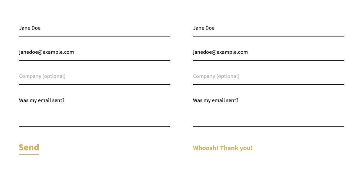
Having user safety in mind, my team at The Rectangles made sure that the contact form on our website shows a confirmation when the message has been sent. The “Send” button disappears and is replaced by a confirmation message that says “Whoosh”, which phonetically imitates the sound of an email being sent. This meaningful visual change to the form gives the user no doubts that the message will reach its recipient.
Small Things that Make a Big Change
These are all little details, so small that they are often forgotten in the UX design process. Some UX designers are so focused on uncovering deeply hidden and specific user needs such that they tend to neglect the most basic ones. It’s a shame how many promising websites, software and applications fail because of that. Unfortunately, the users won’t be able to appreciate all the amazing features of a product unless they feel safe using it. First things first, so let’s start with user safety needs.
About Anna Kulawik: Content writer, UX enthusiast and cat lover. Enjoys exploring psychological theories and their influence on user experience. Works at a small UX design studio – The Rectangles (@therectangles).