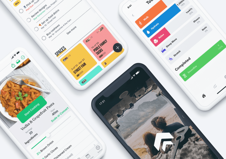
Mobile interaction design brings excitement to the app experience. We use some apps because they provide useful information or services, but others are purely for delight. We’ve rounded up some of the best new mobile interaction designs that are sure to give you a bit of inspiration for your next design project. From fun animations to smooth screen transitions, these designs are not to be missed.
1. Date and Time Picker by Chris Jeffree
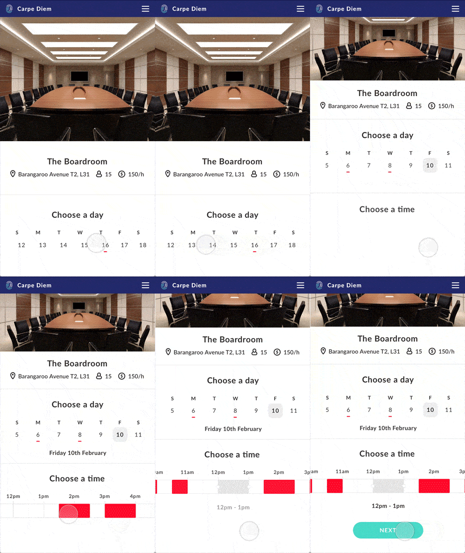
If your calendar is full of meetings, you know booking a place to meet can be a struggle. And if you work remotely or travel a lot, this adds an extra stressful element into the mix. This date and time picker from Chris Jeffree simplifies the process, so you can get back to being productive. His app concept keeps it simple, with a picture of the room you’re booking, the address, how many people it seats, and the price. Then you can get into choosing a day. Instead of showing an entire calendar that takes over the screen, you can swipe through dates on a horizontal timeline to quickly choose a date coming up. Next, you can scroll through time blocks to see when it’s already booked and what slots are open. I appreciate that the app concept shows information sequentially, instead of inundating you with everything at once. The movement through the steps is natural and efficient for busy professionals.
2. Fitness Profile Achievement by SELECTO
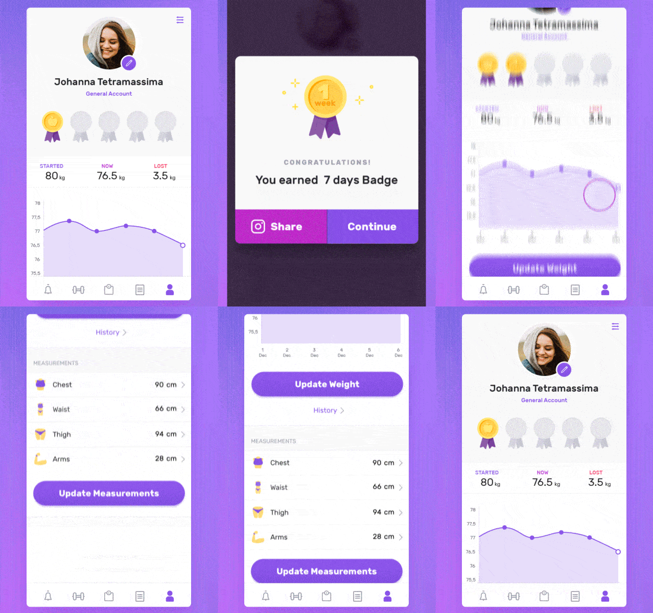
Losing weight can be a long process, but tracking the metrics that matter to you and celebrating little wins along the way can help on the journey. This app concept from SELECTO is for users to track their weight and measurements over time. For this particular user, she can update these numbers as they change and earn badges the longer she uses the app. The badges are my favorite part of this concept, as they add in a little moment of delight in a sometimes arduous process. When the badge pops up to take over the screen, it sways from side to side with sparkles appearing around it, as if you had just put the medal up on the wall. Then when the badge settles into the top of the screen, it glimmers as if a light had just hit it. These small touches bring the badge (and the implied celebration for meeting a goal) to life and can help keep you on track.
3. Photography Community App by lee-snail
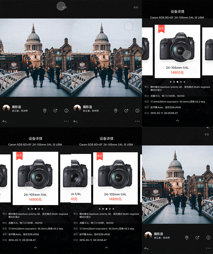
In the photo-driven world we live in, it’s hard not to get swept up in the beauty of photography. But if you’re just starting out or maybe just want to improve your craft, it’s helpful to learn what cameras, lenses, and techniques other photographers are using. That’s where this app concept comes in. It is a photography community that lets users click on the information icon below stunning images and see what equipment made it possible. It lets you move around the image to make sure you catch all of the details. You can also see pricing and buy the cameras and add-ons right from the app. The information icon pulls down the cameras and then you can swipe right and left to see different options. When you tap the bottom arrow, the cameras neatly swipe up and bring you back to the original image.
4. Weather App by Jason Hsu
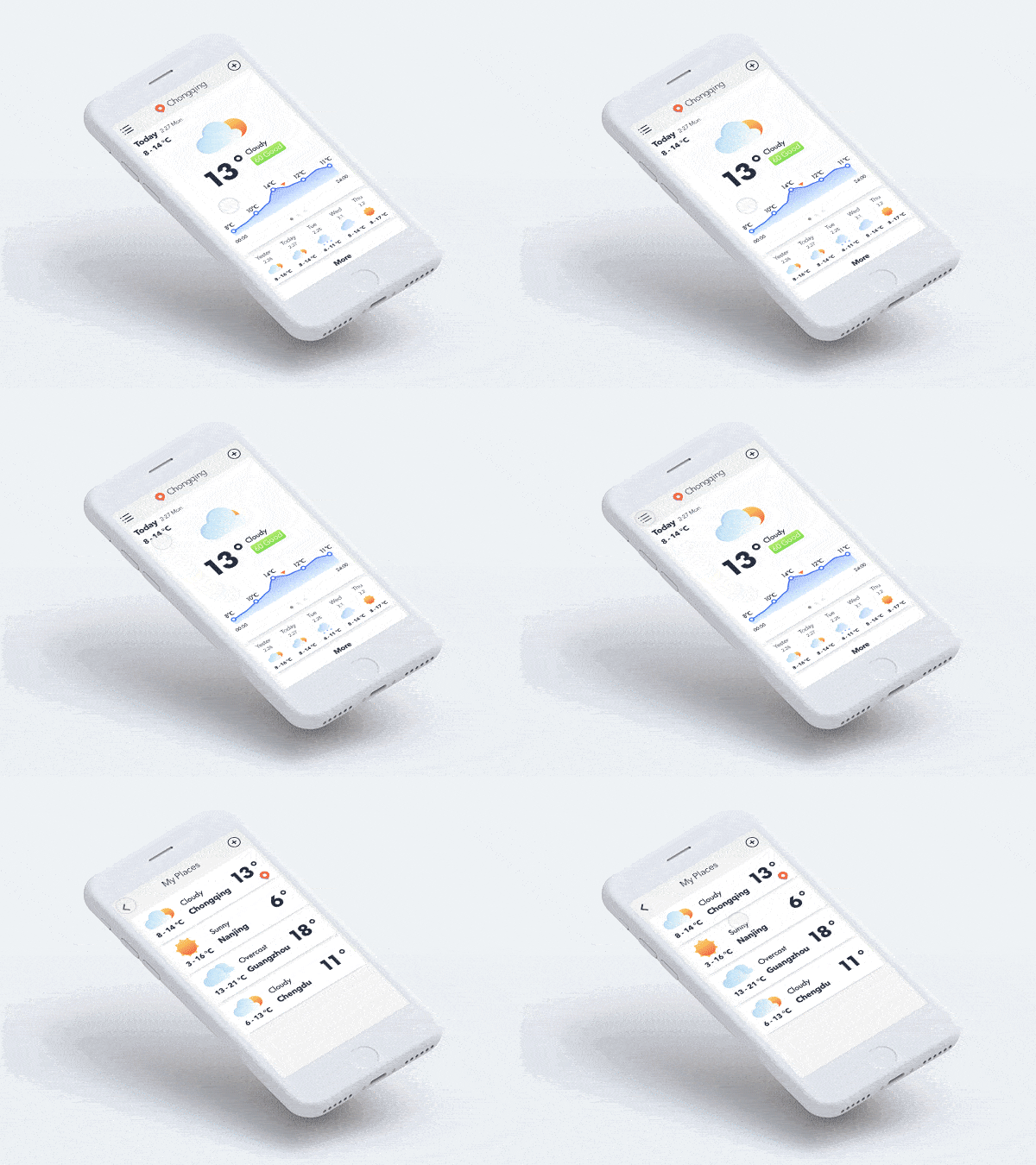
This is a simple weather app that brings weather to life with animation. Most weather apps might have an image of the sun or rain, but not very many of them move. I’m fond of the cloud moving over to cover the sun when the app shows the weather will be cloudy that day. It’s a small touch that goes a long way. Then to return to the list of locations where you’re tracking the weather, you tap the list icon in the top left corner and the locations and their corresponding weather bounce up to the top of the screen. This app concept shows that simplicity is often the best route. Minimal design is something we’ve become used to and adding micro-interactions to those designs is always a good call.
5. Location Alarm by David Lau
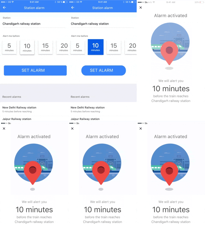
If you have a long commute or travel often, taking naps on trains can be a lifesaver. This app concept alerts you a certain number of minutes before you reach your destination. There are a number of notable mobile interactions going on here. First, when you select the number of minutes before you reach your destination, the blue fills the square, showing your selection. Once you choose to set the alarm, the button morphs from a rectangle into a circle and ever so smoothly takes over the screen with that same blue. Then the alarm activated screen swipes cleanly onto the left side and you’re left with a cheerful bouncing location pin telling you when and where your alarm with go off.
That’s all for May, but be sure to check out last month’s edition, featuring the best mobile interaction designs of April 2017.
Feeling inspired? Sign up for free with Proto.io and prototype your own interaction design in minutes.
Proto.io lets anyone build mobile app prototypes that feel real. No coding or design skills required. Bring your ideas to life quickly! Sign up for a free 15-day trial of Proto.io today and get started on your next mobile app design.


