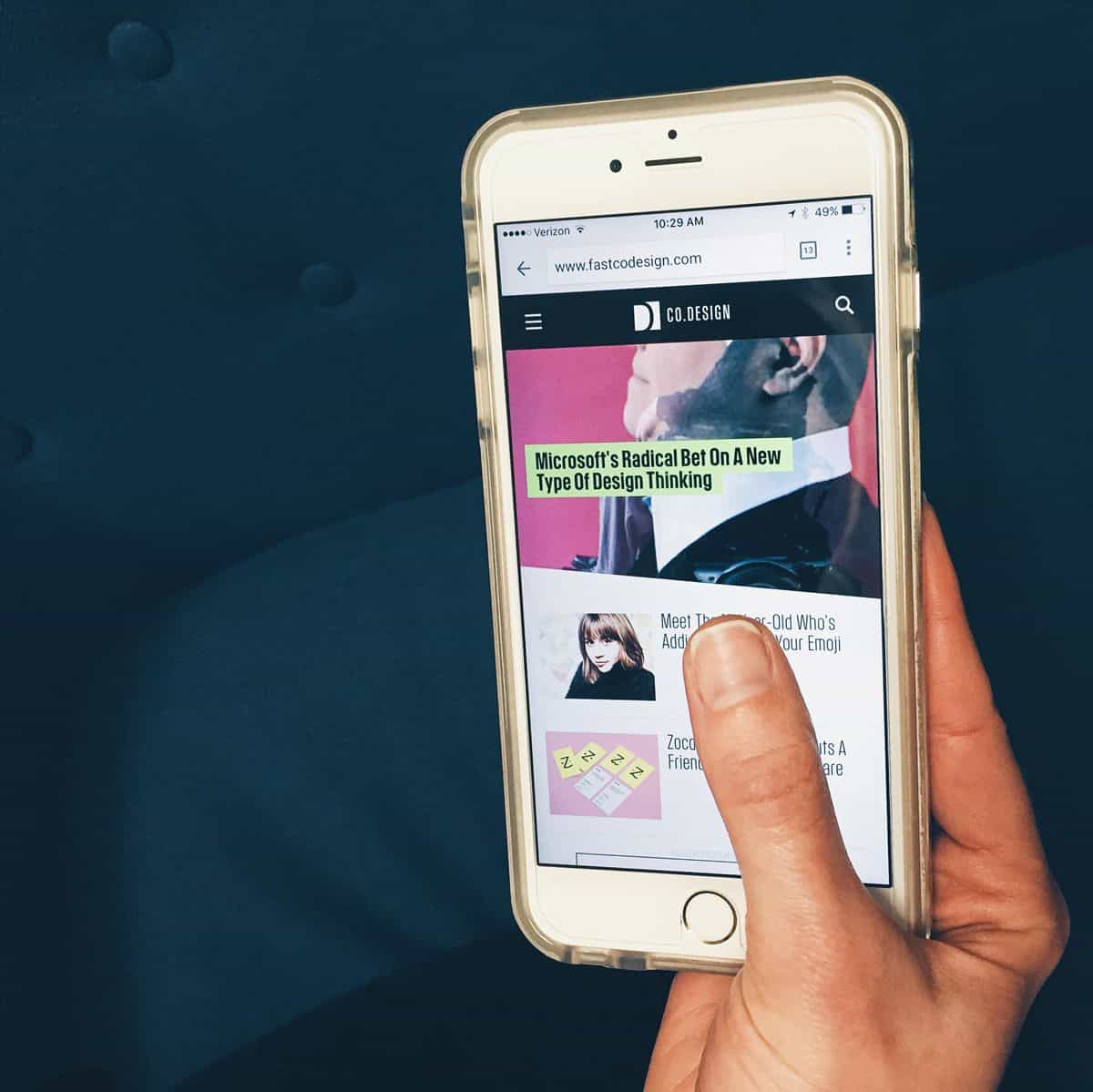
We’ve been living in a mobile-optimized world so long that it’s easy to take mobile UI design for granted. Teenagers entering high school this year were just entering kindergarten when the iPhone first launched. Websites that lack mobile experiences seem like relics of a bygone era, maintained by neo-luddites who would scoff at the idea of carrying a tiny computer in your wallet, or even wearing one on your wrist. At this point, nearly a decade after smartphones became zeitgeist, we’ve surely figured out the answers to all of our mobile UI design challenges, right?
Wrong. Despite the best-laid plans of mice and men, responsive design hasn’t smoothed out every user experience wrinkle when going from desktop to tablet to mobile, and a few thorns continue to prod the sides of mobile UI designers and developers — to speak nothing of users. We’ve all struggled to mentally autocomplete article titles that have been truncated beyond recognition on our smartphones, or grappled with a UI element that simply won’t move no matter how hard we swipe at it.
The following mobile UI design challenges continue to plague designers, developers and entrepreneurs. Here’s how they deal:
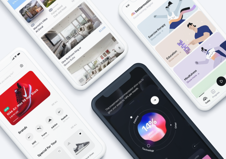
1. Keeping it simple while staying feature-rich.
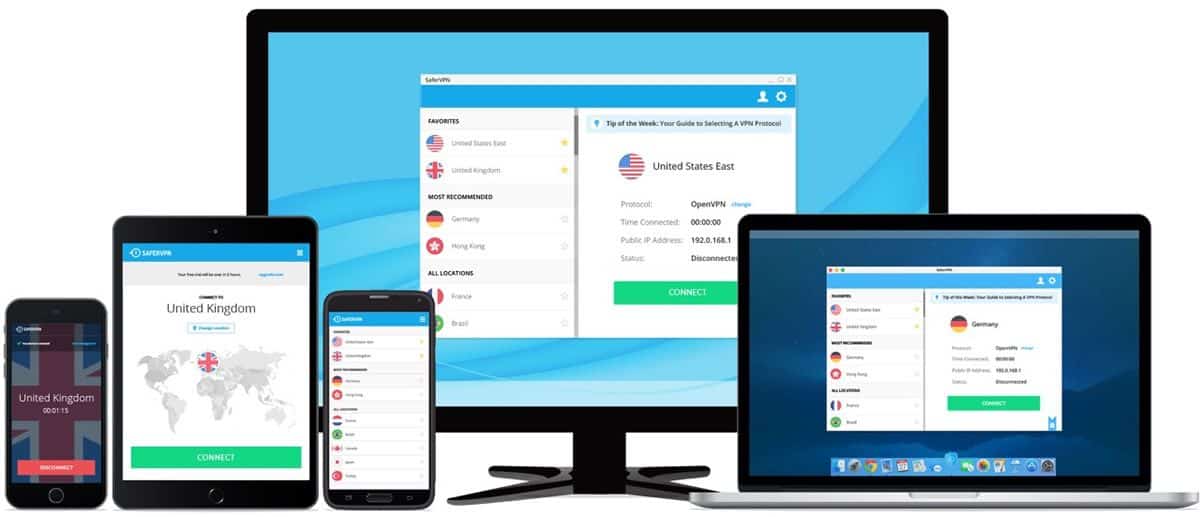
Sagi Gidali is Co-Founder and CPO at SaferVPN (@SaferVPN). With over a decade’s worth of UI and UX expertise, he’s solved quite a few mobile UI design challenges, but the following conundrum remains a thorn in his team’s side:
“I would say our design/UX challenge would be to integrate more complicated features of our app with the least amount of text or visual disturbance possible.
A VPN is a very technical product often used by very tech-savvy users. Our challenge is to make our service as accessible as possible for our users that are less tech-savvy, while also offering customized options for those that are more tech-literate.
So although we have complex features and settings running in the background, in the foreground we keep our UX clean and simple. For instance, many of our most advanced settings are automatically optimized and for those who are more tech-savvy, we provide simple, clear opportunities to further customize their experience in an easily accessible settings menu.
This helps us to keep these more advanced preferences from cluttering our overall UX and interface so that anyone can easily enjoy the benefits of our service with a single click.
In following this design and UX approach, we encourage our all our users — regardless of the technical knowledge and skills they possess — to use our product to access their favorite geo-restricted content and protect their Internet privacy and security.”
2. Mobile search: still an albatross.
Jason Bauman is an SEO Associate at Trinity Insight (@TrinityInsight), a digital marketing and optimization firm. Bauman finds that mobile search remains a thorn in the side of mobile UI designers and developers alike:
“I think a lingering design challenge for mobile UX/UI are advanced filters in search. On a desktop, you can choose exactly what you want to see by checking preferences off a list of dozens of options. This experience doesn’t translate well into mobile, with most sites simply creating a more finger-friendly version of their filter on smaller devices. The underlying problem of requiring multiple finger selections on a small screen remains. Any time you force someone to scroll through dozens of selection options, you’ve failed to solve the UI problem.
I think the best workaround is an intelligent search function, one that understands complex queries like ‘diamond necklace that’s not a heart.’ With the evolution of AI, this should become easier, but it’s something that very few, if any sites fully take advantage of. A more common workaround is by reducing the number of options. Start someone at a high level, e.g., ‘gold or silver chain,’ and then get more specific moving forward — like by asking them what ‘design type’ they are looking for. This isn’t ideal because it still requires multiple clicks, and adds additional pages, but it’s better than presenting customers with a large list of options out of context.”
3. Sometimes it feels like mobile UI design elements wag the dog.
Richard Trigg is the UX/UI Creative Director at Decibel Digital (@DecibelDigital), a user experience agency based in the UK. For Trigg, striking a balance between what needs to happen on the screen and what users are comfortable physically doing remains a mobile UI design challenge.
“The ongoing challenge for many designers relates to buttons. Buttons on mobile apps need to be sized correctly (for fingers of all sizes), but designed so not to dictate the screen. There is less screen real estate on mobile devices, so designers have to make buttons and calls to action clear and concise.
In terms of workarounds, we have seen clear benefits from using CX analytics and usability testing tools to measure levels of effectiveness and engagement. The picture then becomes crystal clear over what interactions users are making. If elements then need tweaking, we tweak the design or positioning of these buttons.”
4. Making thumbs of all sizes happy.
Ryan Colgin is a UI/UX Designer at LookFar (@LookFar_Ideas), a development agency whose clients span multiple industries. Meeting the diverse needs of those clients is a particular sticking point — especially when each of those diverse clients has a unique set of hands:
“One little UI/UX problem we haven’t quite solved is this: how the heck do we position site navigation so that it’s easily reachable by your thumb? Most sites put the menu in the upper right corner, which only makes it convenient for lefties.
As phones get larger, we’re having to use two hands to tap the menu on many sites, even if they’re mobile optimized. If they don’t have a static menu you end up having to scroll up to the top to reach the navigation or get back to the homepage.”
5. Android fragmentation: it got better, but never really went away.
Jason Suriano (@jasonsuriano) is Founder and CEO of Rocketfuel Productions. At this point, the perennial problem of Android OS fragmentation seems age-old, but it still crops up in the nightmares of mobile UI designers:
“One of the main mobile UI and app design challenges that exists in the year 2016, is the nagging fear of fragmentation in the Android ecosystem. This fragmentation includes the number of Android device manufacturers, the variance of devices each manufacturer makes, as well as the problem of operating system discrepancies that inevitably lead to user experience issues.
While most UI/UX designers and developers will claim that they can run an emulator to check for variances and help solve for the problem of fragmentation, the truth is that there is no system that can truly emulate the final application user experience on every Android device on the market.
What this means is that designers and developers will inevitably receive a few poor ratings or reviews on their application in the Google Play store simply because the application is not optimized to run on a specific device or dated version of Android OS which ultimately impacts the overall user experience.”
Adapting to Mobile UI Design Challenges With Consumer Psychology

One way to tackle even the most intransigent mobile UI challenges is simply to get inside the head of your users, according to Sloane Berry (@SloaneBerry), UX designer at BPM Technologies. No matter what the specific issue, she writes, getting to know your user can help you solve it:
“A good mobile app is like Tai Chi, with every action flowing into the next action in a natural, intuitive way. Most UX challenges arise from having too much information or simply a physical limitation. In those cases, less is more. You don’t have to show everything, instead focus on showing enough.
If a user is scrolling through a list and encounters truncated text, you should be able to expand the text while still in the motion of scrolling down the list. Don’t bloat your app by clicking through to a new page and making the user go back and forth. Likewise, if they’re clicking through, they should be able to click to expand without having to move their eyes or thumb much. Just go with the flow of things.
On a very practical level, no matter what you design, you want a customer to feel good. Tinder is a fantastic user experience, because it’s cathartic to swipe away the people you don’t want and you only get the good news that you matched. The hardest challenges UX designers face are the negative things, like if a user has a long wait time or has to make a payment — but practical solutions exist for those things.
Rolling With the Punches: Common Mobile UI Design Pain Points
Response time is a major source of frustrating user experiences, but it can be spun in a way that builds anticipation. Whether it’s a countdown clock from a food-delivery app or a tracking dot for a taxi driver, users like visual confirmation that they made things happen. It’s mostly an aesthetic choice, since your taxi or food will arrive anyway, but it gives users something to come back to. It can even help make your app “sticky.”
Payments can be a very tricky customer experience. Customers both want transparency, but also don’t want to be bothered or burdened with how they’re paying. It’s easy to solve on the backend after the first payment, but when and how to ask a user where to pay is a challenge. If you just tell a customer that service will cost a flat fee it’s not a very exciting or fulfilling experience — the customer is thinking about that fee.
But if you show them what they’re getting at the point of purchase, people will feel better about opening their wallets. Ride sharing apps like Uber/Lyft do a great job mitigating the ‘taxi meter’ effect by simply guaranteeing you a good rate upfront. They don’t burden you with the specifics of the price until the end of the service. At that point, they’re happy to pay since the service got them to ‘Point B’. At all times, a customer needs to feel fulfilled with their experience using your app.”
Overcoming Mobile UI Design Challenges Where It’s Safe: The Prototype
Even though the world of mobile UI design has come a long way since that fateful day in 2007 when the world first lay eyes on the iPhone, it’s clear to anyone who has created a mobile app — or who has ported a desktop user experience to a smartphone or tablet — that plenty of challenges still remain. What’s a designer to do?
One way to knock out these issues without sinking too much time into development is to do extensive UI/UX testing on a lifelike digital prototype of your mobile UI design. With a digital prototyping tool like Proto.io, you can create a realistic interactive mockup of your final design in minutes using a drag-and-drop editor, shaving untold hours from your design process. Additionally, Proto.io allows you to gather feedback from an unlimited number of users, so you can iterate extensively while keeping your notes organized right within the app.
Ready to start conquering today’s hairiest mobile UI design challenges? Sign up for a free 15-day trial of Proto.io today!
What mobile UI design issues still throw a wrench into your process as a designer, or your experience as a user? Tweet us @Protoio to let us know!