With so many companies using the same mobile app visual design conceits over and over, it can sometimes feel like nothing is new under the sun. How can visual designers break out and bring something fresh to the table, while still respecting the visual and tactile language their users have become fluent in?
It can be easy to fall into a design rut, but we’re big believers that when they’re in a creative funk, visual designers should look outside of their industry to find incredible mobile app design ideas. We’ve already written about the many lessons visual designers can learn from the world’s hottest and most interesting cars, the most creatively designed guitars and even uniquely beautiful coffee makers (if nothing else, you can always brew yourself another pot and fuel your productivity with sweet, sweet caffeine).
Album Art: Still Relevant, Especially for Visual Designers
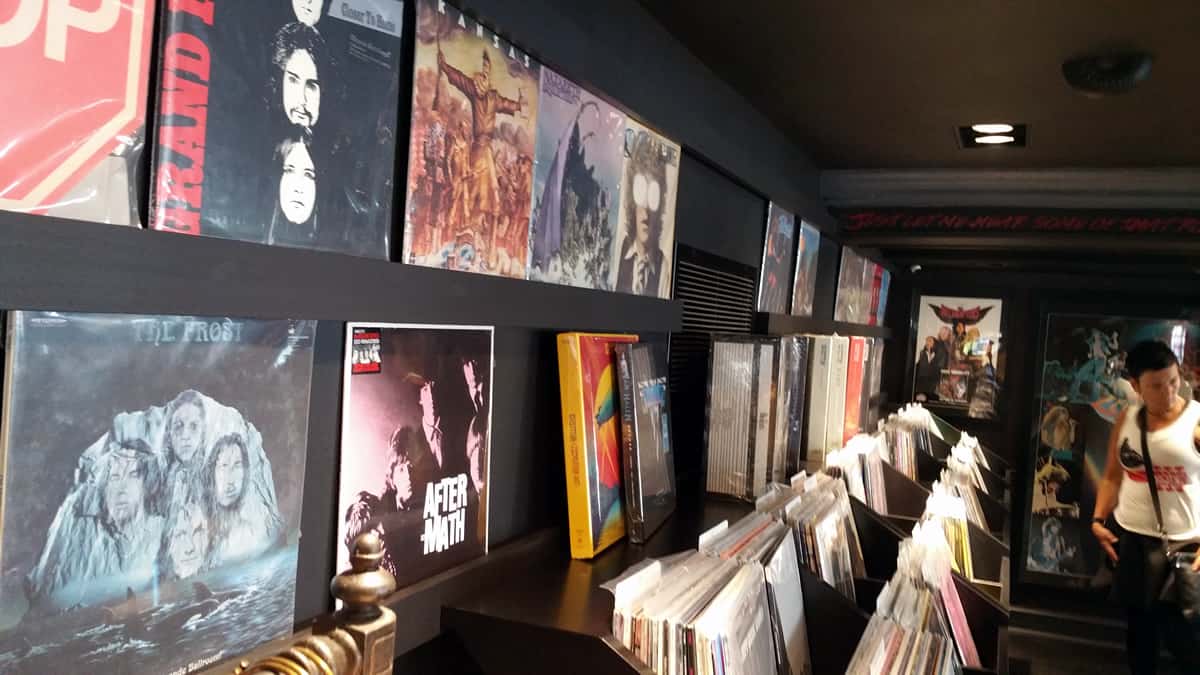
Today, we’re taking a look at another medium which, like mobile app design, bridges the worlds of audio, visual and even tactile: album cover design. Yes, even in a post-iTunes world, album art still remains relevant. If anything, the resurgence of vinyl and other analog audio formats proves that consumers are still eager for actual physical media to accompany their listening experience.
Yes, analogue sound might be warmer, and many producers actually mix albums differently for vinyl releases, appealing to the audiophiles who seek those products out. But there’s also the incomparable physical experience of going to an old-fashioned vinyl shop, flipping through full-sized LPs, gawking at the artwork and, of course, finding out what surprises await you just inside the fold. Is it deeply personal liner notes, with silly tour photos of the musicians? Lyrics? Or, in the case of Jethro Tull’s Thick as a Brick, a fake newspaper detailing the fictional concept behind the album?
The fact that formats like vinyl (and, yes, even CDs) have survived into the 21st century speaks to the fact that there’s still a demand for added value, for product design that clearly thinks outside the box. So if, as mobile app visual designers, any of you are stuck for a new concept, go to your nearest record shop! Even if you don’t have a turntable, you’re sure to find some artistic inspiration that will jump-start your next disruptive idea.
As for which albums to start off with, well, we certainly have a few ideas of our own. Here’s what mobile visual designers can learn from the most beautiful and iconic album covers in popular music:
1. The Beatles: Sgt. Pepper’s Lonely Hearts Club Band — The Power of Meaning
Ah, the album cover that launched a thousand think pieces. There is no shortage of articles seeking to analyze every square centimeter of this classic album cover, which arguably did for the art accompanying music as the album did for music itself.
![By The_Admiralty (Andy MacLarty) profile (Flickr) [CC BY 2.0], via Wikimedia Commons.](https://dbwgapw6amg93.cloudfront.net/wp-content/uploads/2016/06/Sgt._Peppers_band_visual-designers.jpg)
Released in 1967, Sgt. Pepper’s Lonely Hearts Club Band predated the famous (and infamous) Summer of Love by two years, but also set the tone for it with trippy tracks like “Lucy in the Sky With Diamonds,” “Within You Without You” and “Being For the Benefit of Mr. Kite.” (To what extent the Beatles’ experimentation with psychedelic drugs influenced the sound of the album has been hotly disputed in the decades since).
The influence that Sgt. Pepper had on music both in the sixties and ever since can’t be overemphasized, and we won’t belabor the point here. What we will say is that an album that epic deserved packaging that was equally grandiose, and visual designers/ pop artists Jann Haworth and Peter Blake absolutely delivered — enough so that they won the Grammy Award for Best Album Cover, Graphic Design that year.
Visual Designers: Complexity Can Work If You Keep It Cohesive
Let’s start off with the obvious: this art is rich. There’s a lot going on on the cover of Sgt. Pepper, enough that there’s a separate Wikipedia article for “List of images on the cover of Sgt. Pepper’s Lonely Hearts Club Band.” Comprising many photographs of famous people, both contemporary (at the time) and historical, as well as multiple images of the band themselves (both immortalized in wax in mop-tops and “plain clothes” and decked out in their Sgt. Pepper regalia), the cover could function as a cross-section of what we now think of as magical about the sixties.
That magic, of course, is in the cultural revolution that transpired at the time. Represented in the artwork are Bob Dylan, psychologist Carl Jung, occultist Aleister Crowley, writer Aldous Huxley, poet Dylan Thomas — a veritable Who’s Who of counterculture icons, along with film stars of Hollywood’s Golden Age and a handful of mystics, some photographed in color, some in black and white.
This complex collage isn’t all there is to the cover, though. You also have a lush interplay of bright colors with monochrome, the word “Beatles” spelled out in flowers, the name of the album and the fictional band on Ringo’s bass drum, some deliberately placed potted palm trees and a background that evokes the feeling that everyone in this anachronistic gathering is actually on the set of a photoshoot.
That overarching theme — an anachronistic photoshoot — is what ties the entire cover together, despite its disparate elements. Visually, though, the cover succeeds because it’s so painstakingly composed. The members of the band, in their bright Sgt. Pepper costumes, still draw our eyes’ attention to the middle of the cover, around the bass drum with the album name. At the same time, we’re placing the Beatles at the center of the revolution that’s going on around them, which we still do to this day. It’s hard to think of the 60s countercultural zeitgeist without instantly conjuring the image of the Fab Four.
Why This Complexity Works So Well
In an age where simplicity in composition and product design still reigns supreme, visual designers might look at Sgt. Pepper and think: why is this cover so effective? Besides being cohesive, as we just discussed, the richness of the cover art begs us to look more deeply into its meaning. Why is each of the celebrities and gurus featured on this cover? Why are they positioned where they are? Why are there two sets of Beatles, and what is the significance of the wax figures? To put it simply, analyzing a piece of art like this is a lot of fun, especially if you’re already a fan of the music and want to engage more with the artists behind it.
That’s what intricate artwork does, when it’s done well: it pulls us in, and asks us to engage more deeply with the work or the product. Try thinking of a mobile app that does the same thing, whether it’s a game, a utility or even a mobile art experience. What makes it so effective? How can visual designers replicate that success? (Let us know by tweeting us @Protoio — we’d love to hear your thoughts on this!)
2. The Beatles: The Beatles (Also Known As The White Album) — Don’t Be Afraid to Defy Expectations
Look, we promise that this isn’t a Beatles-only list, and that this will be our final entry from John, Paul, George and Ringo (though Abbey Road’s cover photography is a rich source of inspiration for visual designers of all stripes, as well).
It’s just that The Beatles (perhaps better known as The White Album) is the perfect counterpoint to Sgt. Pepper’s complicated visual collage. While Sgt. Pepper speaks to the power of using rich visuals to put together layers of meaning, The White Album shows how much you can communicate with a void. Or, to use a phrase familiar to most visual designers, The Beatles conveys the power of white space — and of defying expectation.
![By Diego Grez (Own work, based on original cover) [Public domain], via Wikimedia Commons](https://dbwgapw6amg93.cloudfront.net/wp-content/uploads/2016/06/626px-Beatles_White_Album_visual-designers.jpg)
The White Album was released in 1968, the year following Sgt. Pepper. In context, that makes its cover design a direct, defiant answer to the vivid visuals of its predecessor. If fans were expecting The Beatles to continue in the same artistic vein, The White Album communicated the message that the band was anything but predictable. So while it would be easy to say that the artistic lesson visual designers should take from The Beatles is to keep it simple, the deeper lesson is that defying expectations and being disruptive is what sets enigmatic artists like The Beatles apart from the rest of the fray.
So in your next project, don’t be afraid to be bold. Harness the power of complexity, or of the void — or somewhere in between. Just make sure to imbue it with meaning. Beautifully designed apps, just like the music of The Beatles, can convey magical experiences.
3. Guns N’ Roses: Appetite For Destruction — The Importance of Branding and Editing
Just as it’s hard to picture the 60s without The Beatles, it’s hard to imagine the hair metal era of the 80s without Guns N’ Roses, who always rocked just a bit harder than the Aquanet aficionados with whom they shared their musical moment.
While a huge part of the reason Guns N’ Roses outshines their glam rock peers is that their music is just that good — we defy you to listen to the opening riff of “Welcome to the Jungle” and resist the urge to headbang — another important component is that Guns N’ Roses had interesting and recognizable characters, namely Slash and Axl Rose. Try to name any members of Poison, and you’ll see what we mean. Great characters can make for great branding, and the cover of Appetite for Destruction, one of the most important albums of rock history, speaks to this truth in a way that couldn’t look any cooler.
![By Deidre Woollard [CC BY 2.0], via Wikimedia Commons.](https://dbwgapw6amg93.cloudfront.net/wp-content/uploads/2016/06/Guns_N_Roses_appetite_for_destruction_Juliens_Auctions_Preview_2011-03-08-visual-designers.jpg)
The album art for Appetite for Destruction depicts four skulls, decorated to resemble the band members, on a cross, against a black background. Slash and Axl are immediately recognizable, with their respective top hat, headband and signature hairdos. The cover truly captures the essence of what makes the Guns N’ Roses brand so special.
But the more important lesson visual designers should take from Appetite for Destruction is the importance of taking feedback and going back to the drawing board when necessary. The album’s cover art is actually a second version. The first version of the album art was highly NSFW, with garish, gruesome depictions of violence. The band’s label, thankfully, wasn’t having it, and ordered a redo.
While user feedback can sometimes feel like a personal affront, it’s important that visual designers take a step back and realize that the whole point of third party feedback is to point out flaws that you, as the creator, may have missed. That isn’t to say that the customer is always right, but in the case of Appetite for Destruction, honoring that feedback resulted in one of the most memorable album covers of all time.
4. Phil Collins: No Jacket Required — It Doesn’t Have to Be Pretty to Be Visually Striking
Okay, to call Phil Collins’ classic No Jacket Required one of music’s most beautiful album covers is, admittedly, a bit of a stretch (unless, of course, you’re Mr. Collins’ mother). Depending on your taste, “beautiful” it may or may not be. But memorable? Iconic? Clever? Absolutely. There’s the self-deprecatory play on words in the album title itself (the album jacket is telling you that the jacket is unnecessary), showing how good copy and good visuals work together in a harmonious whole. That self-effacing cleverness pairs perfectly with Phil Collins’ face.

Collins is no blonde bombshell supermodel (ubiquitous on album covers of that era), or even a Rick Springfield-type artist whose boyish good looks begged to be photographed. He’s about as normal looking as a man can get, but that’s what makes the decision to feature his mug prominently such a bold move. Which, in turn, makes the album artwork memorable. The best part? The 2016 reissue of No Jacket Required featured an updated photo of the now 65-year-old musician, in the same pose — an instant must-have for collectors.
Visual designers know that many apps take pride in elevating function over form. Reddit and Craigslist come to mind as wildly successful case studies in, “It might not be the prettiest, but it gets the job done.” Knowing your audience and subject matter is key in making this decision. Genesis, the band that propelled Phil Collins to superstardom, had already successfully played with this ethos in We Can’t Dance. Just as customers don’t shop at Home Depot expecting an aesthetic experience like that of Pottery Barn, Phil Collins fans don’t shop for his records expecting to see a perfectly coiffed pretty boy on the cover.
What Other Lessons Can Visual Designers Take From Album Art?
If we were to explore everything visual designers can learn from the annals of rock history, we could fill volumes. Whether it’s the surreal beauty of Neutral Milk Hotel’s In the Aeroplane Over the Sea, the desolate visuals of Radiohead’s OK Computer or the still fresh-looking HR Giger artwork on Emerson, Lake and Palmer’s Brain Salad Surgery, modern music is a veritable smorgasbord of visual delight.
What’s your favorite album cover, whether in rock n’ roll or another genre? Let us know by tweeting us @Protoio — and for bonus points, tell us what it can teach visual designers about creating better apps!
Already inspired? Then channel these ideas into your very own mobile app prototype! Proto.io makes it easy for experienced visual designers and novices alike to create stunning digital mockups of their best ideas in mere minutes. Check out our demo page to see Proto.io in action, and then sign up for a free 15-day trial to try it yourself.


